Fritz Rehm Palette 1

Palette Analysis
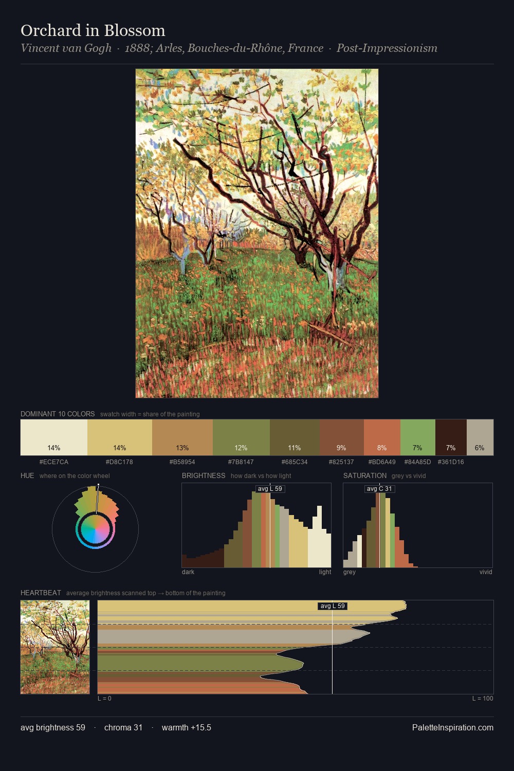
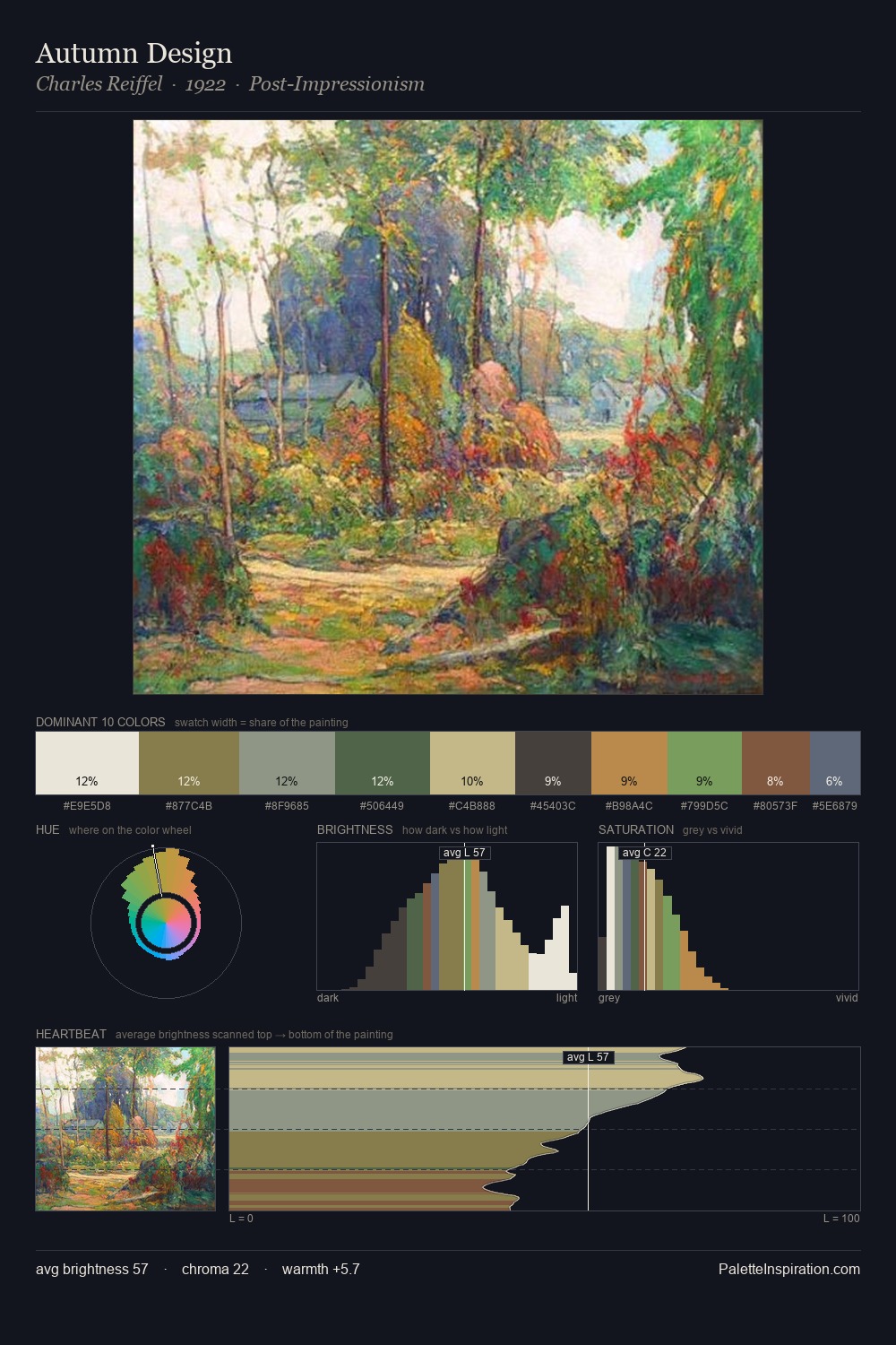
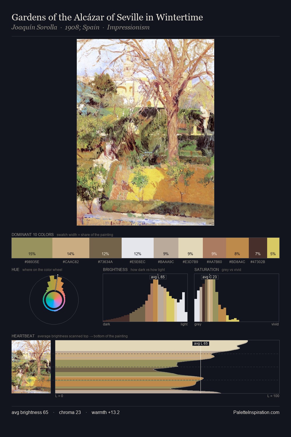
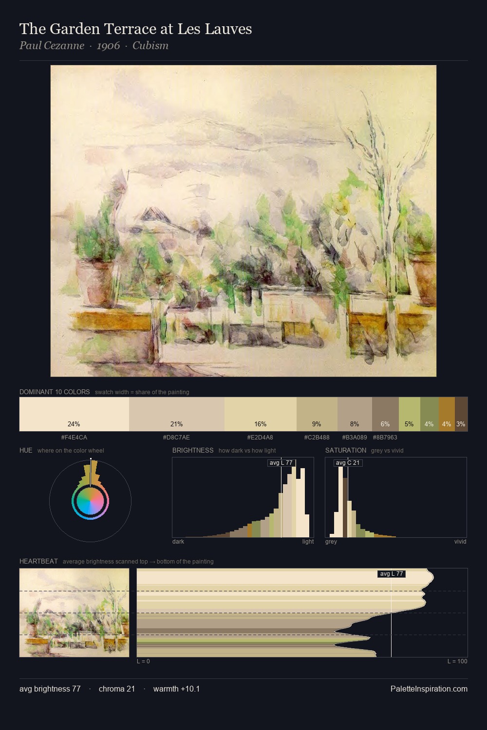
Values in Fritz Rehm tilt decisively toward white, giving the palette its luminous character. Fritz Rehm tilts toward cool - blues and silver-greys carry the structural weight. Saturation is deliberately withheld - the beauty here lies in the near-monochromatic gradations rather than colour difference. At 34.9%, #E4DABC functions less as a colour accent and more as a complete atmospheric environment. Only 2.1% is devoted to #9CB976, yet that small allocation delivers the palette's entire chromatic tension. At 53 units across the value scale, the palette keeps contrast readable without letting it dominate. High luminosity and cool temperature suggest the plein-air condition: unfiltered daylight and open sky. Palette 1 sits within the larger chromatic argument that Fritz Rehm's complete body of work advances.
Example use cases
- publishing
- corporate identity
- consumer apps
- hospitality
- design agencies
I Love This!
Copy, export, or download for your project