Friedrich von Amerling Palette 2
Muted Tawny
Muted Deliberately desaturated - chroma pulled toward gray, the restraint of tonal painting.
Tawny Warm orange-brown - a traditional term for the color of tanned leather or lion fur.

Palette Analysis
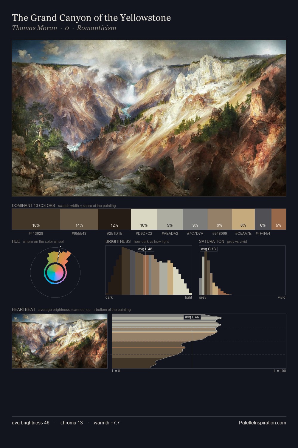
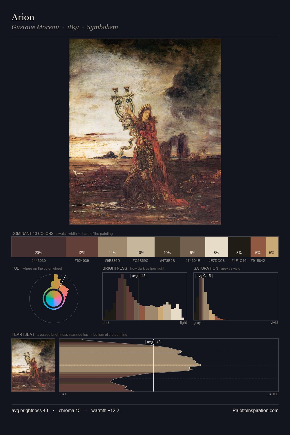
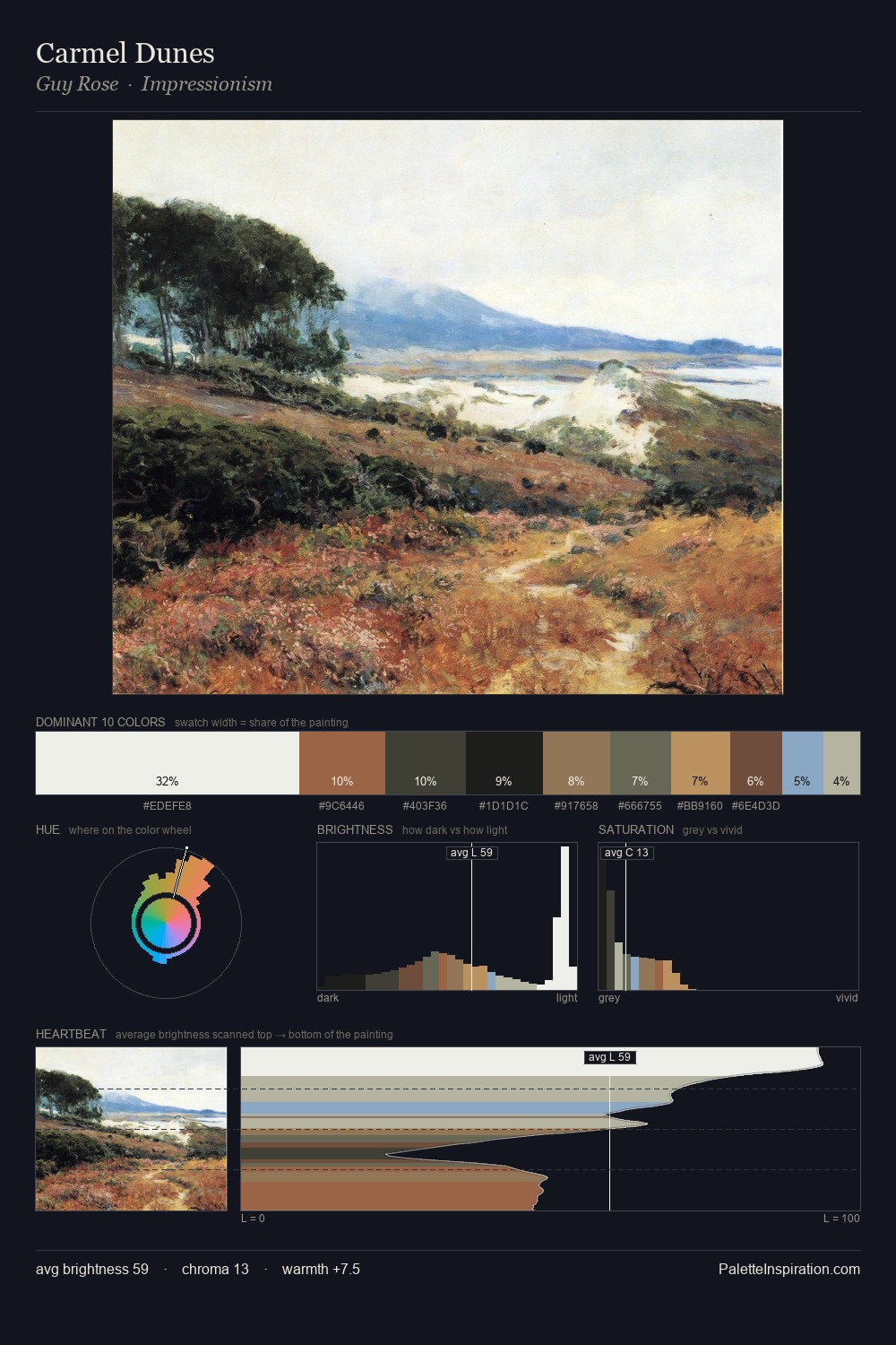
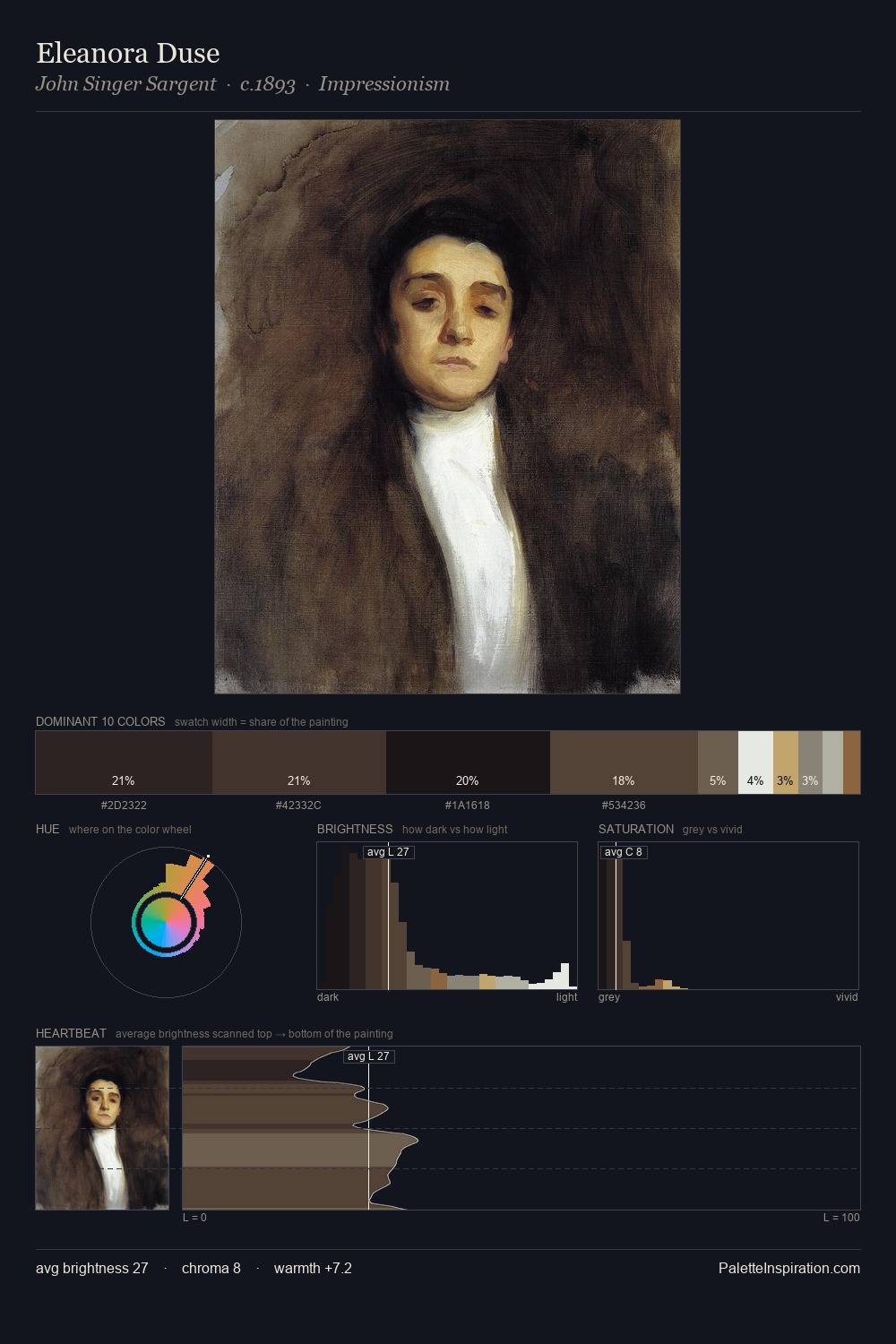
Values in Friedrich von Amerling rest in the mid-range - neither dramatically lit nor steeped in shadow. Temperature reads distinctly warm: the reds and earth tones from Friedrich von Amerling carry the compositional weight. Muted throughout, the palette achieves its effects through value and temperature rather than chromatic force. The most saturated colour, #DDDAC9, is reserved to 5.2% of the surface, where it acts as a focal punctuation. A value spread of 67 units gives the palette both depth and air - shadows are genuinely dark, lights genuinely light. Palette 2 sits within the larger chromatic argument that Friedrich von Amerling's complete body of work advances.
Example use cases
- exhibition design
- foundation branding
- estate management
- art education
- museums & galleries
I Love This!
Use This Palette
Copy, export, or download for your project
Copy, export, or download for your project
Copy:
Download:
Share: