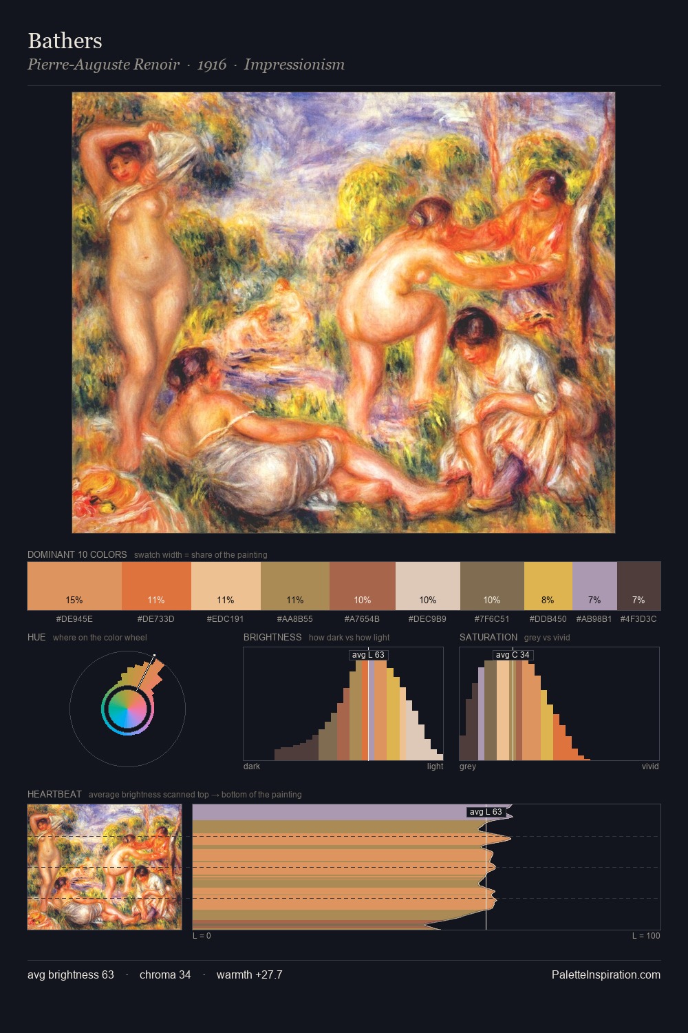
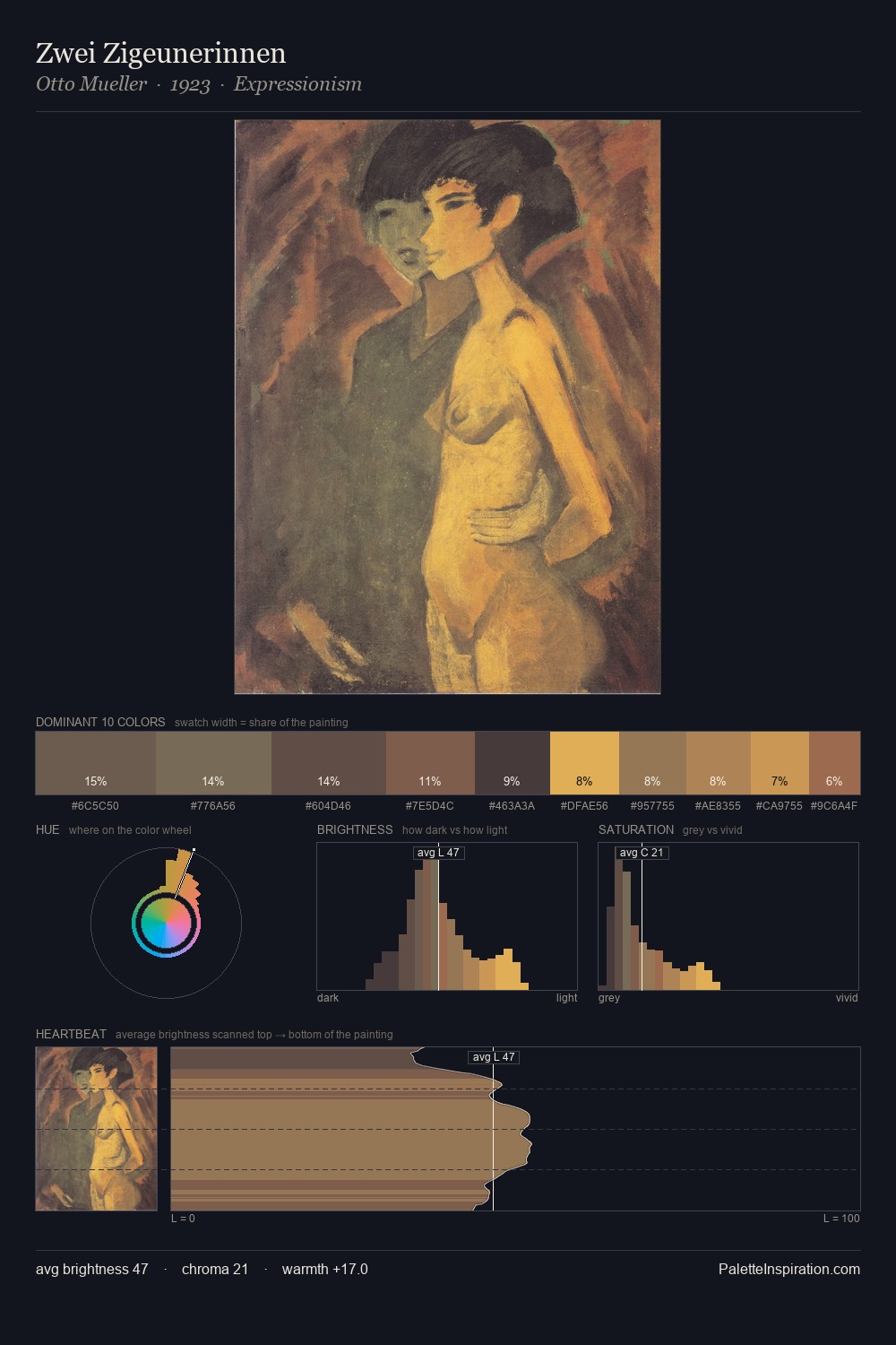
Frantisek Dvorak Palette 2
Muted Apricot
Muted Deliberately desaturated - chroma pulled toward gray, the restraint of tonal painting.
Apricot Soft warm orange - peach-adjacent, the color of ripe stone fruit.

Palette Analysis
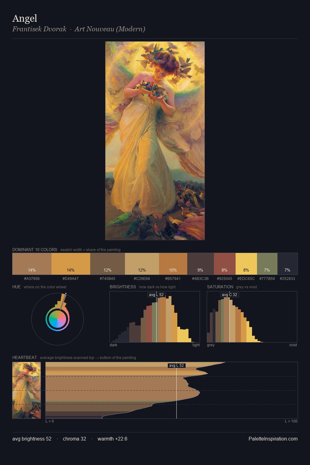
Frantisek Dvorak keeps values measured and balanced, a hallmark of tonal restraint. Warmth dominates - the palette of Frantisek Dvorak leans heavily on the yellow-orange-red arc of the colour wheel. Mid-saturation across the board: the palette has colour character without chromatic excess. #AA5E3D functions as the palette's exclamation mark: highest chroma, lowest percentage (4.4%). At 44 units across the value scale, the palette keeps contrast readable without letting it dominate. In the context of Frantisek Dvorak's full range of palettes, group 2 represents one movement in an ongoing chromatic dialogue.
Example use cases
- ceramics & pottery
- boutique hospitality
- menswear
- heritage food brands
- craft & artisan brands
I Love This!
Use This Palette
Copy, export, or download for your project
Copy, export, or download for your project
Copy:
Download:
Share: