Frans Arnold Breuhaus de Groot Master Palette

Palette Analysis
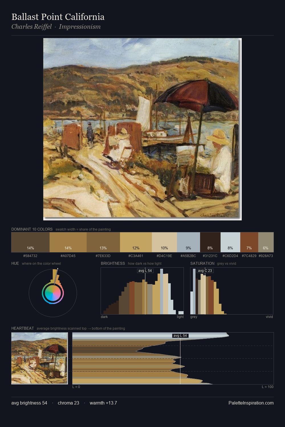
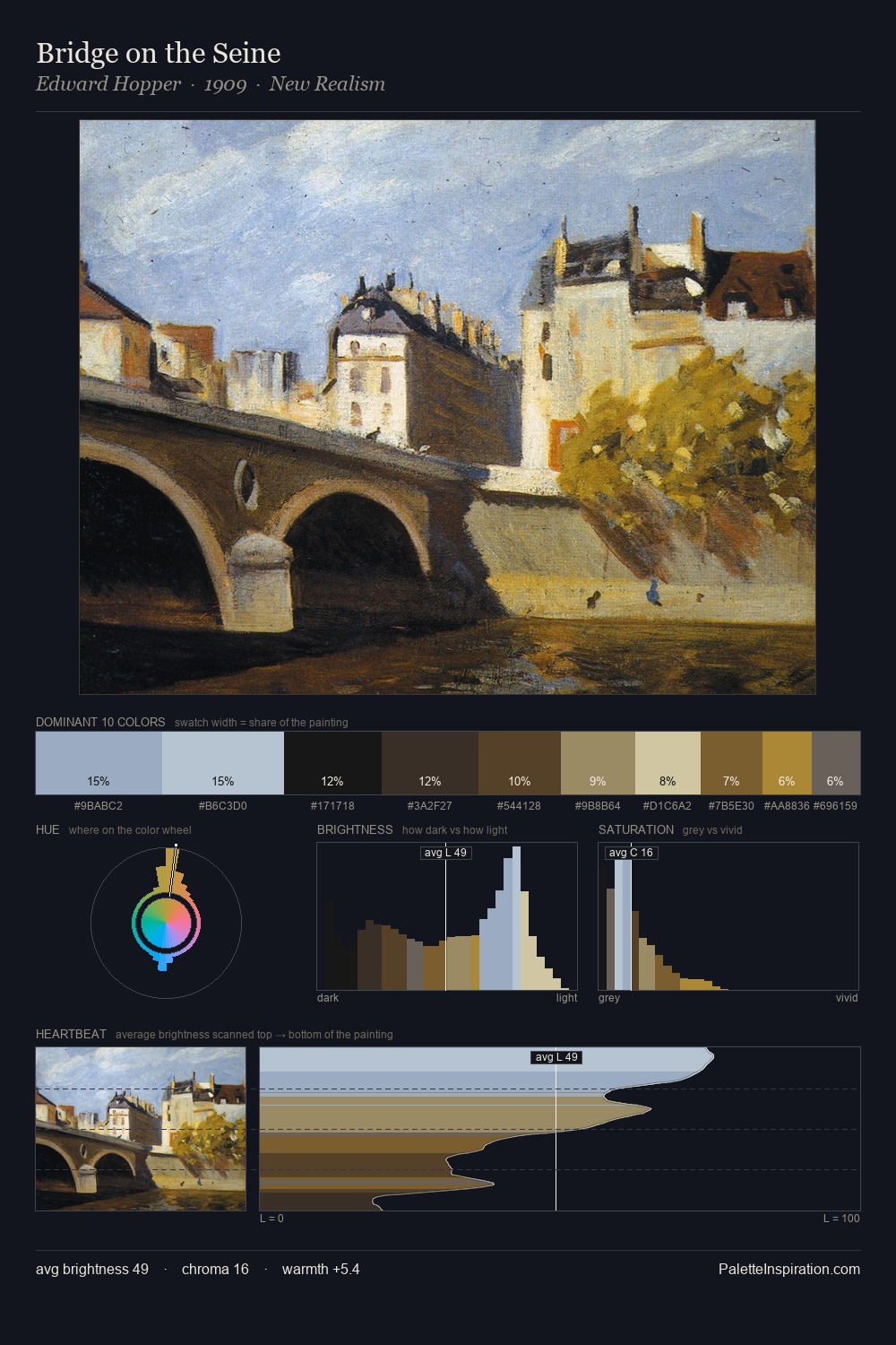
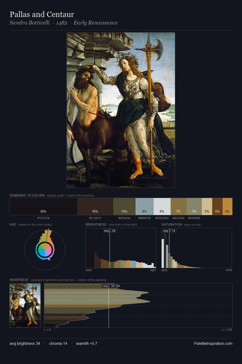
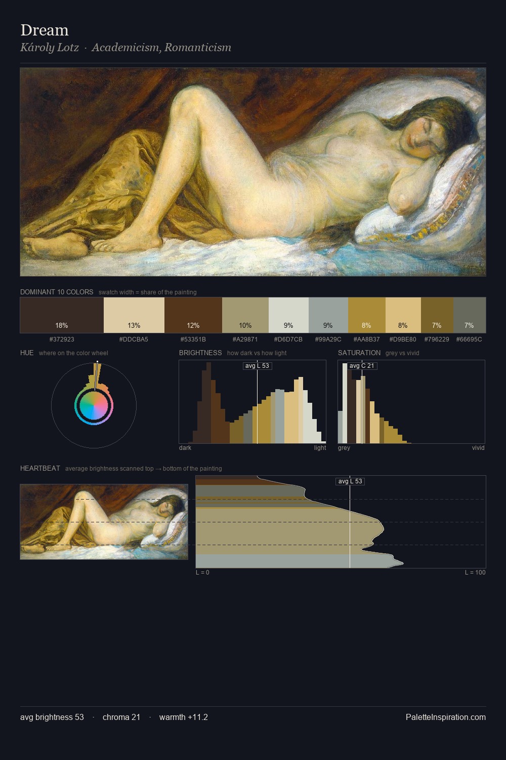
Values in Frans Arnold Breuhaus de Groot rest in the mid-range - neither dramatically lit nor steeped in shadow. Frans Arnold Breuhaus de Groot tilts toward cool - blues and silver-greys carry the structural weight. Saturation is deliberately withheld - the beauty here lies in the near-monochromatic gradations rather than colour difference. The most saturated colour, #A37F37, is reserved to 4.0% of the surface, where it acts as a focal punctuation. From deepest dark to palest light, the palette traverses 62 units of the value scale - a span that creates natural depth. The palette has the character of outdoor light: cool, mid-bright, with colour rendered faithfully rather than expressively. This is the light Frans Arnold Breuhaus de Groot preferred, made measurable.
Example use cases
- ceramics & pottery
- boutique hospitality
- menswear
- heritage food brands
- craft & artisan brands
I Love This!
Copy, export, or download for your project
Related Palettes

Carl Millner Palette 2
Veiled Tawny

Frans Arnold Breuhaus de Groot Palette 1
Gleaming Reverie

Frans Arnold Breuhaus de Groot Palette 2
Soft Ecru

Frans Arnold Breuhaus de Groot Palette 3
Soft Vellum

Frans Arnold Breuhaus de Groot Palette 4
Veiled Bisque

Frans Arnold Breuhaus de Groot Palette 5
Penumbral Sienna