Frans Arnold Breuhaus de Groot Palette 2

Palette Analysis
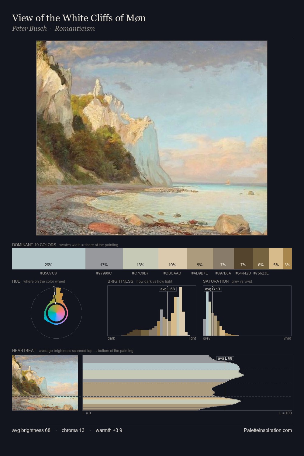
Values in Frans Arnold Breuhaus de Groot rest in the mid-range - neither dramatically lit nor steeped in shadow. Frans Arnold Breuhaus de Groot tilts toward cool - blues and silver-greys carry the structural weight. All colours lean toward grey, building depth through value rather than colour punch. The highest-chroma note - #E2D09B - appears at just 7.0%, deployed as a precision accent against the quieter ground. Value range is moderate at 51 units - enough contrast for legibility, not so much as to fragment the tonal unity. The mid-to-high key, cool bias, and moderate chroma point to outdoor observation - sky and diffused daylight as the dominant light source. This is palette 2 of Frans Arnold Breuhaus de Groot's sequence - a single chapter in a chromatic story told across many works.
Example use cases
- ceramics & pottery
- boutique hospitality
- menswear
- heritage food brands
- craft & artisan brands
I Love This!
Copy, export, or download for your project