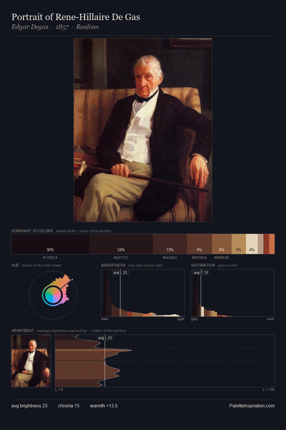
Frank Dicksee Palette 6
Nocturnal Umber
Nocturnal Night-register palette - very low values, the world after dark.
Umber Dark earthy brown - raw or burnt umber, a foundational old-master earth pigment.

Palette Analysis
Frank Dicksee distributes its values across the middle register, creating harmony without high contrast. The dominant temperature is warm, with earth tones and fire-hues setting the emotional key. Saturation is deliberately withheld - the beauty here lies in the near-monochromatic gradations rather than colour difference. #722829 delivers the chromatic peak at only 6.9% - a small shot of colour with outsized visual impact. 70 units of value range underpin the palette's structural clarity: the eye always knows where light falls. Palette 6 sits within the larger chromatic argument that Frank Dicksee's complete body of work advances.
Example use cases
- theater design
- jewelry brands
- tobacco-adjacent retail
- event branding
- film & entertainment
I Love This!
Use This Palette
Copy, export, or download for your project
Copy, export, or download for your project
Copy:
Download:
Share: