Frank Dicksee Palette 1
Pale Vermillion
Pale High-key and low-chroma - delicate, bleached, washed with light.
Vermillion Brilliant red-orange - the classic mercury sulfide pigment, vivid and warm.

Palette Analysis
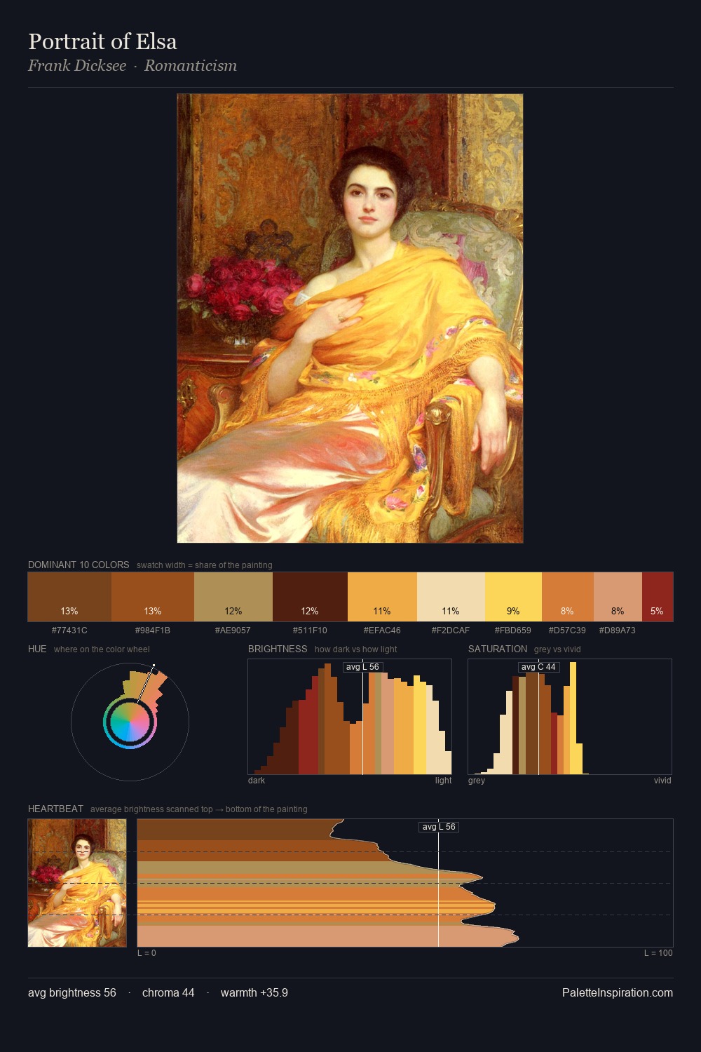
Frank Dicksee occupies the comfortable middle of the value scale, avoiding both extremes to hold the eye in a sustained middle grey. Frank Dicksee orchestrates warmth above all else - reds, ambers, and siennas take the lead. Mid-range chroma keeps the palette grounded - colourful but not strident. The most saturated colour, #FEE05E, is reserved to 6.8% of the surface, where it acts as a focal punctuation. The full value range is 58 units: broad enough to build convincing three-dimensional form. Palette 1 sits within the larger chromatic argument that Frank Dicksee's complete body of work advances.
Example use cases
- design agencies
- product brands
- e-commerce
- editorial sites
- publishing
I Love This!
Use This Palette
Copy, export, or download for your project
Copy, export, or download for your project
Copy:
Download:
Share: