Francesco Didioni Palette 1

Palette Analysis
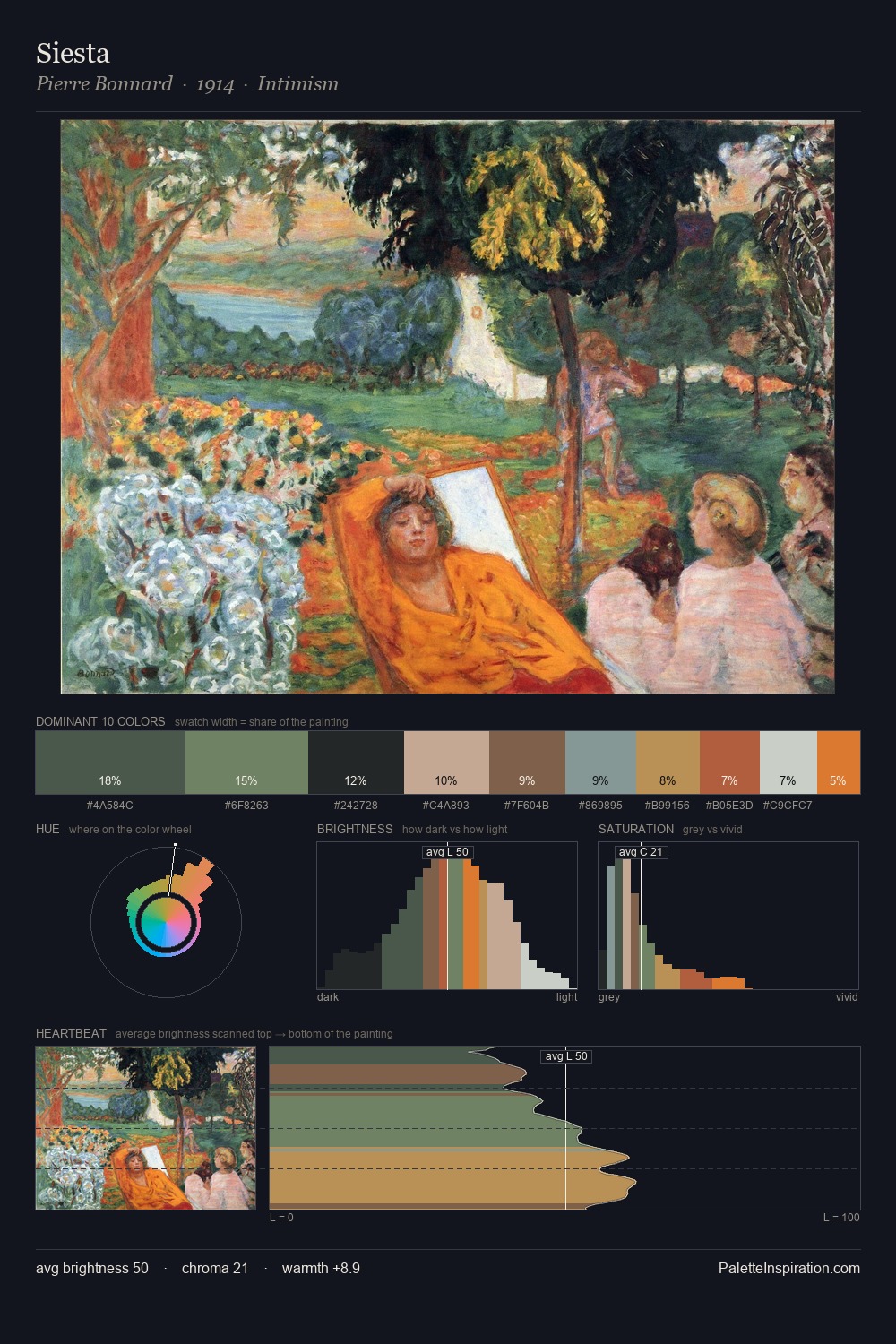
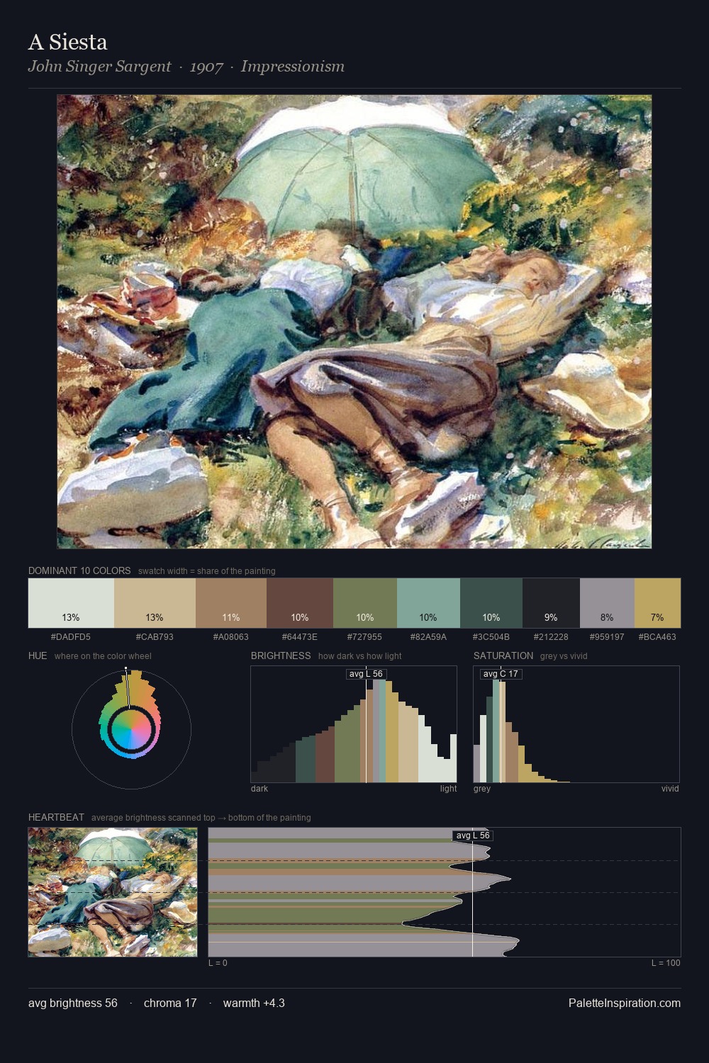
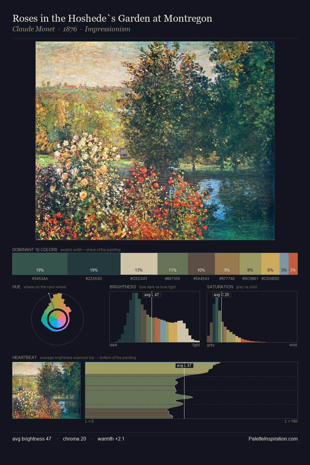
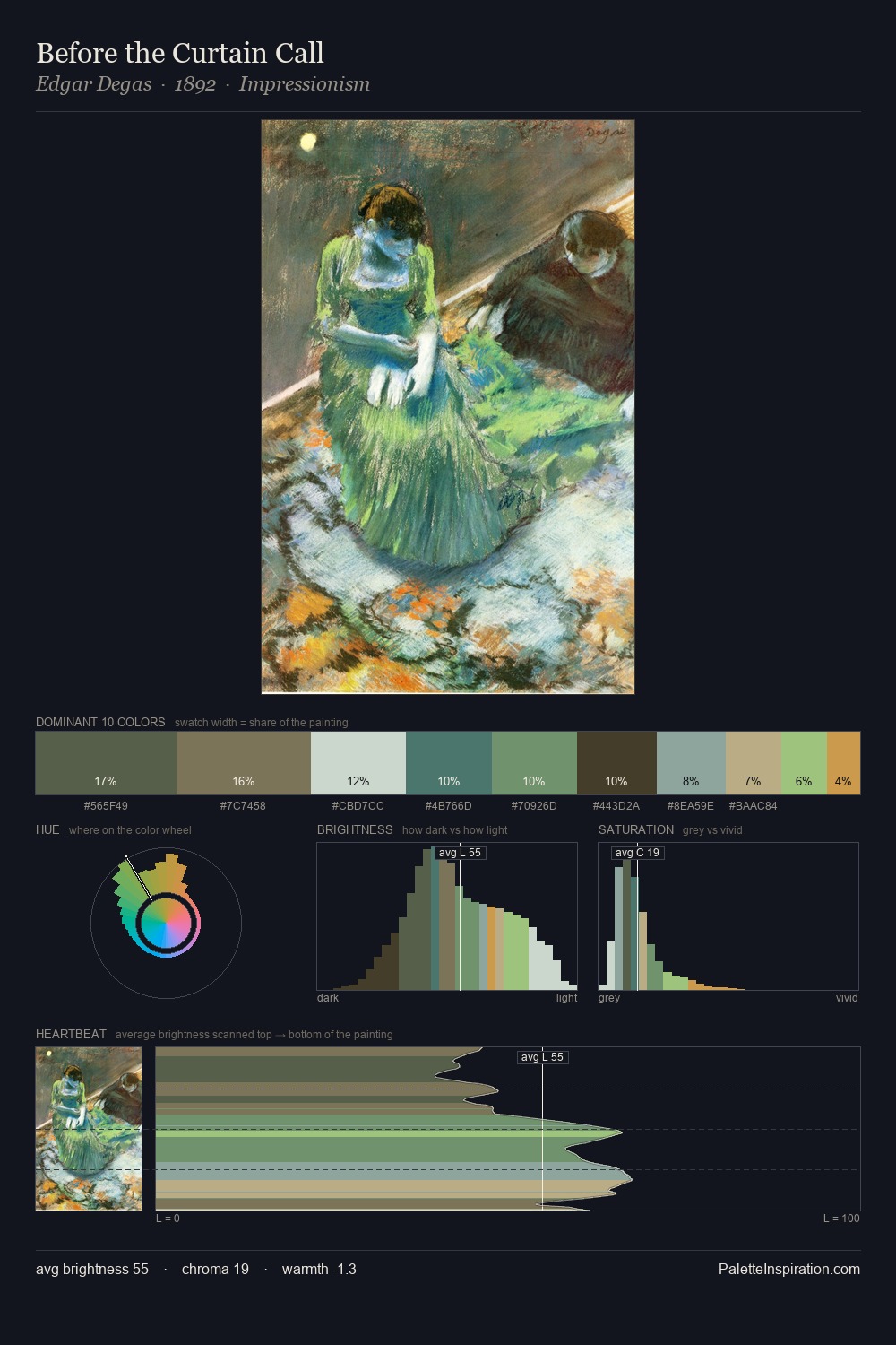
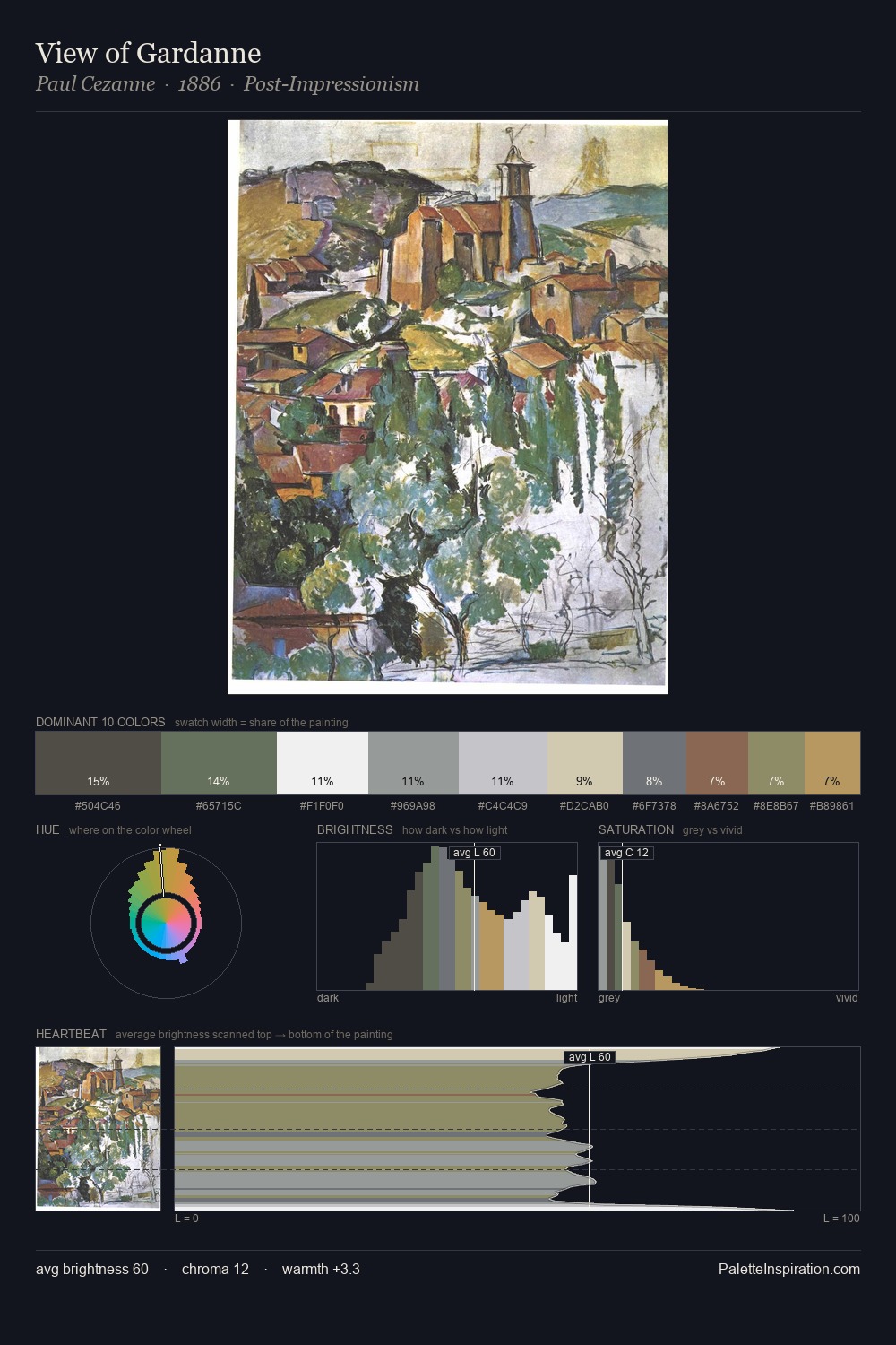
Francesco Didioni distributes its values across the middle register, creating harmony without high contrast. Temperature is cool-dominant, with blue and green families claiming the largest areas. Saturation is deliberately withheld - the beauty here lies in the near-monochromatic gradations rather than colour difference. The most saturated colour, #BB954A, is reserved to 6.3% of the surface, where it acts as a focal punctuation. The palette spans 46 value units: a measured range that delivers coherence over drama. The palette has the character of outdoor light: cool, mid-bright, with colour rendered faithfully rather than expressively. Francesco Didioni's palette 1 carries its own internal logic while remaining in conversation with the artist's broader colour intelligence.
Example use cases
- exhibition design
- foundation branding
- estate management
- art education
- museums & galleries
I Love This!
Copy, export, or download for your project