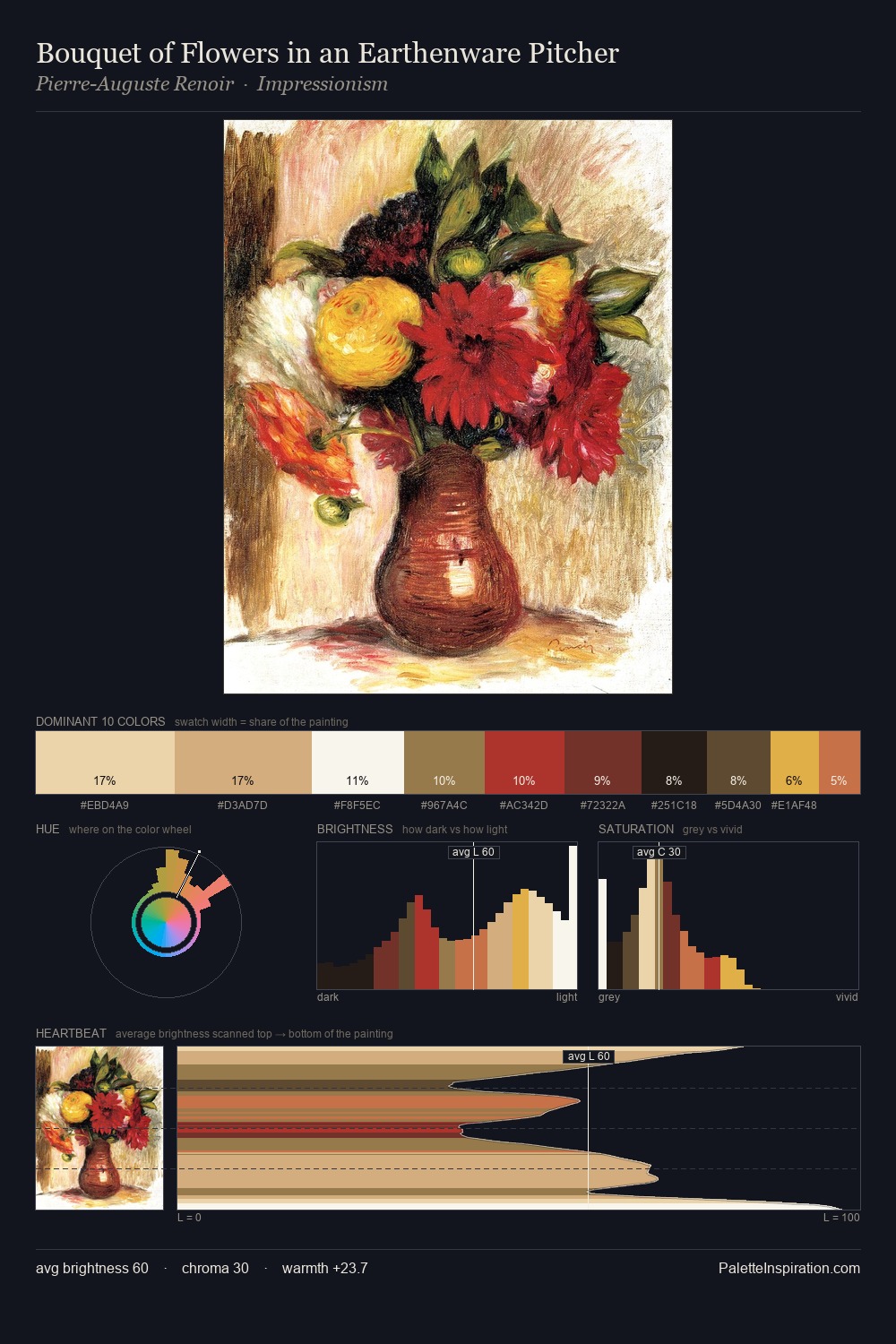
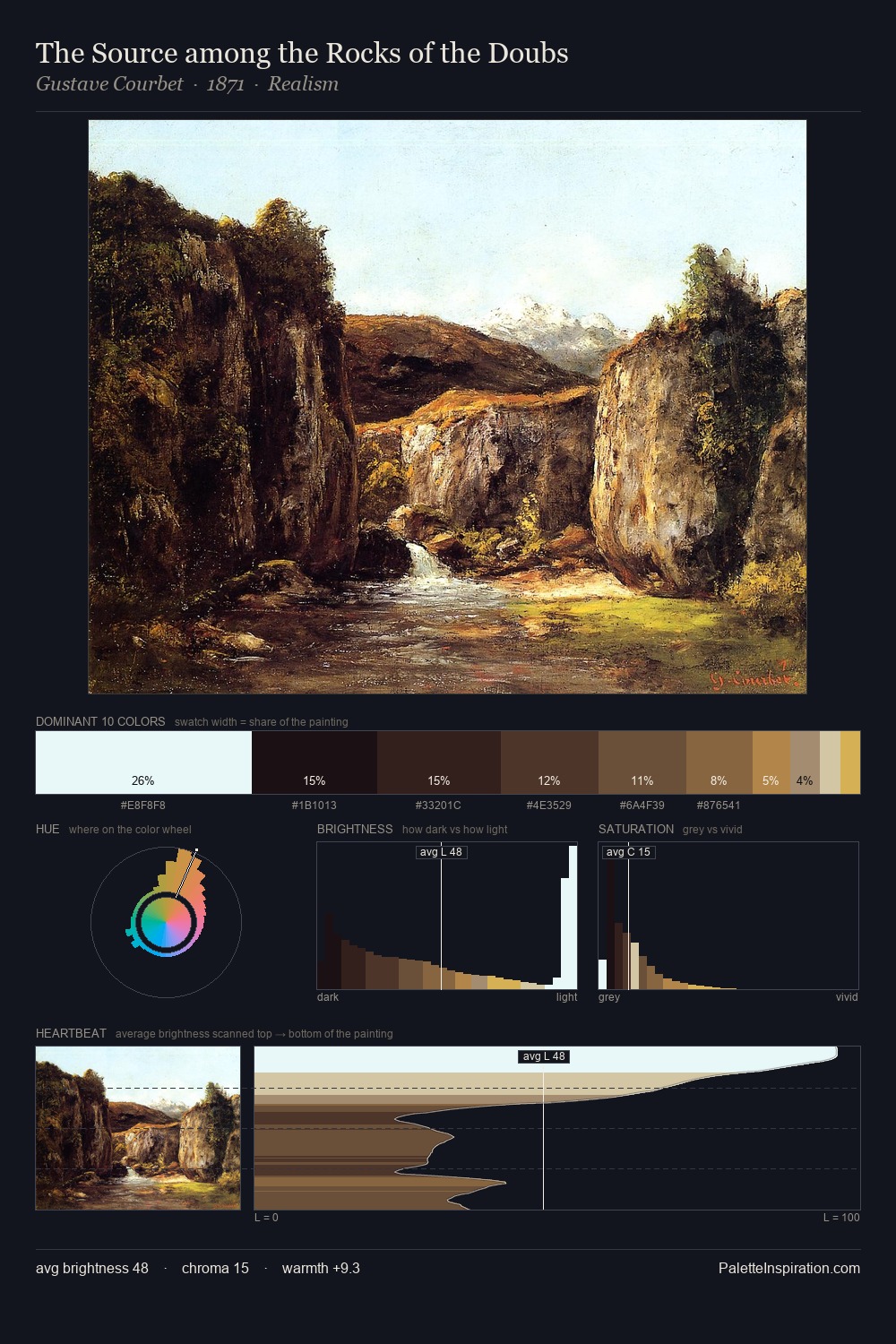
Federico Faruffini Master Palette
Shadowed Gamboge
Shadowed Low-key - values weighted toward shadow, the palette of dim interiors and overcast skies.
Gamboge Deep golden yellow - a traditional warm pigment, rich amber-gold.

Palette Analysis
Federico Faruffini sits in the centre of the value range, lending the palette a sense of even, sustained light. The dominant temperature is warm, with earth tones and fire-hues setting the emotional key. Every colour is desaturated; the palette proceeds through near-neutrals and gently-coloured greys. The most saturated colour, #D7AC71, is reserved to 6.8% of the surface, where it acts as a focal punctuation. A value spread of 75 units gives the palette both depth and air - shadows are genuinely dark, lights genuinely light. This is the light Federico Faruffini preferred, made measurable.
Example use cases
- theater design
- jewelry brands
- tobacco-adjacent retail
- event branding
- film & entertainment
I Love This!
Use This Palette
Copy, export, or download for your project
Copy, export, or download for your project
Copy:
Download:
Share: