Erik Wahlberg Wahlbergson Palette 2

Palette Analysis
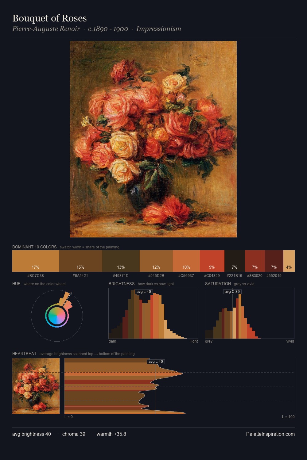
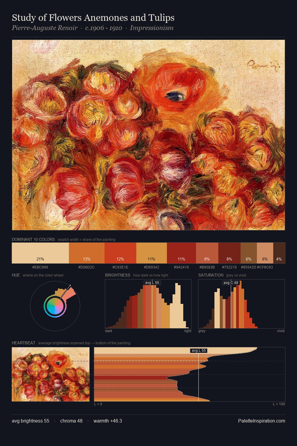
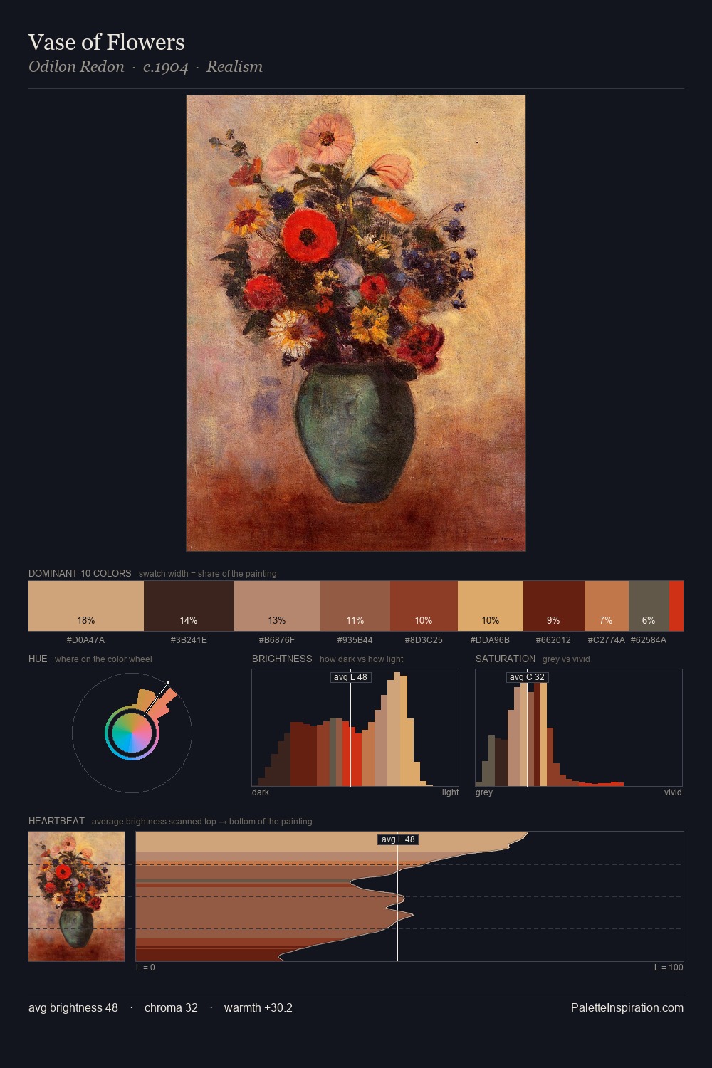
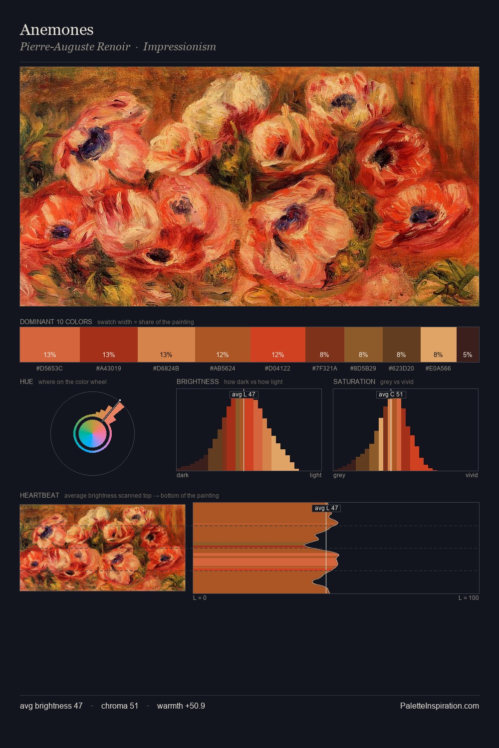
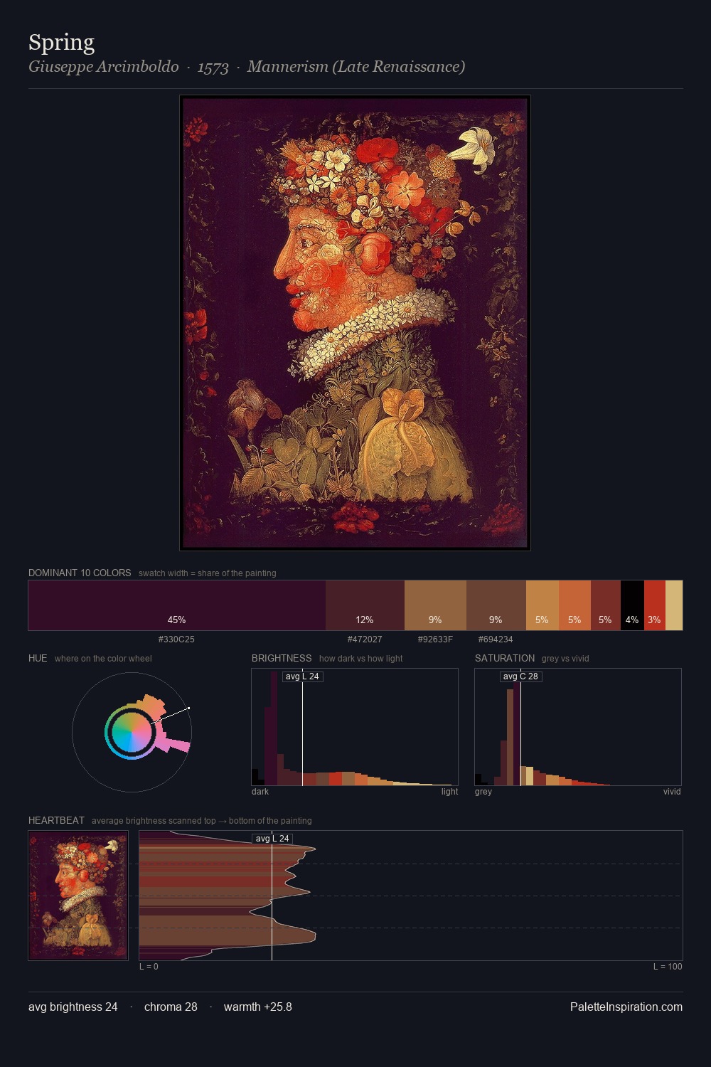
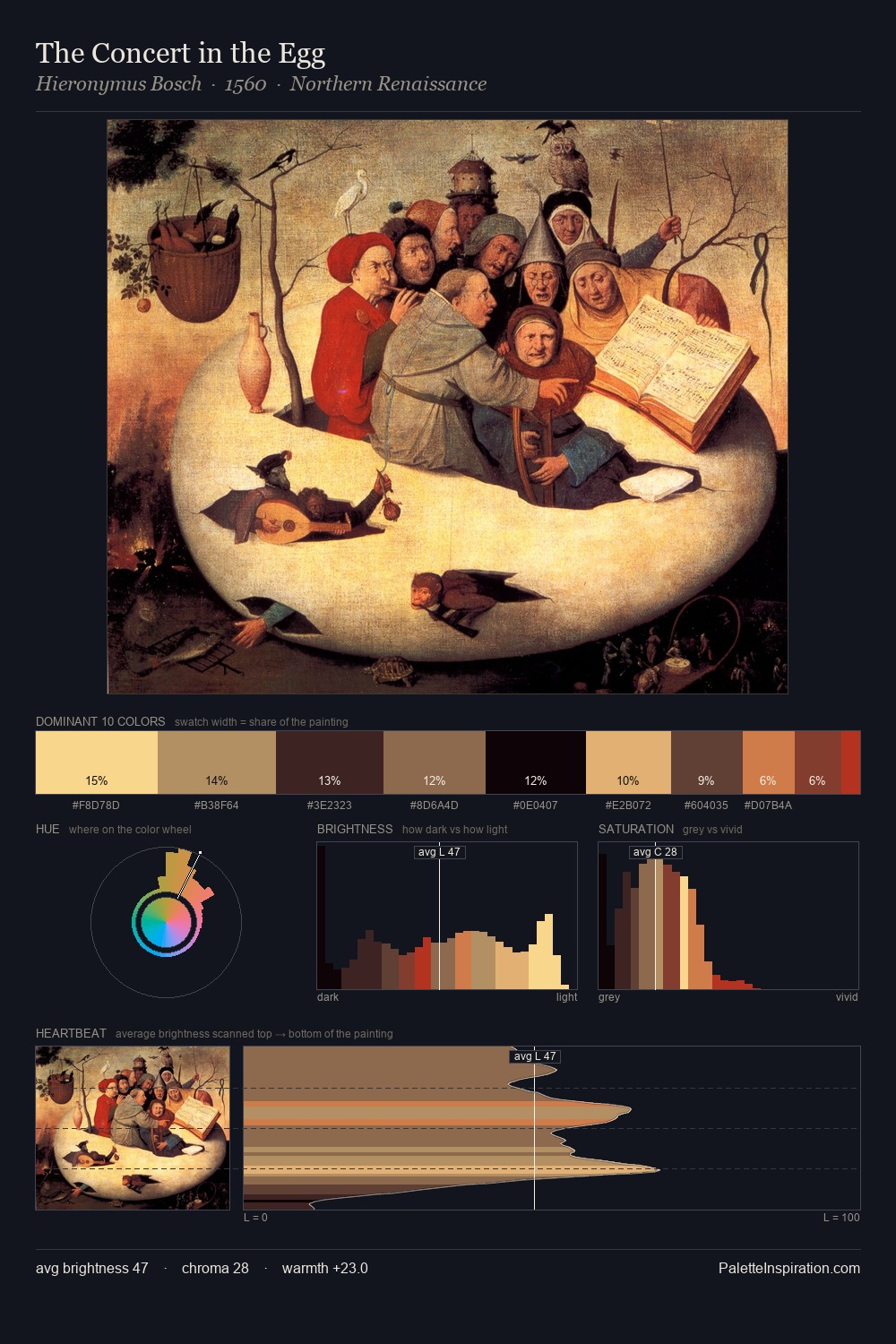
Erik Wahlberg Wahlbergson occupies the comfortable middle of the value scale, avoiding both extremes to hold the eye in a sustained middle grey. Warm hues command this palette; Erik Wahlberg Wahlbergson favours the reds, oranges, and yellows of firelight and earth. Mid-range chroma keeps the palette grounded - colourful but not strident. At 28.4%, #463C36 functions less as a colour accent and more as a complete atmospheric environment. At 7.6%, #901B13 carries the palette's sharpest chromatic charge: an accent that earns its place precisely because it is withheld. Spanning 48 units on the value axis, the palette achieves the balance between tonal flatness and fragmentation. In the context of Erik Wahlberg Wahlbergson's full range of palettes, group 2 represents one movement in an ongoing chromatic dialogue.
Example use cases
- theater design
- jewelry brands
- tobacco-adjacent retail
- event branding
- film & entertainment
I Love This!
Copy, export, or download for your project