Edward R. Taylor Palette 2

Palette Analysis
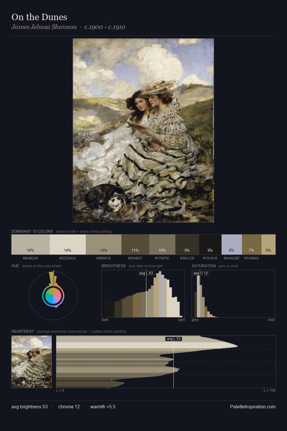
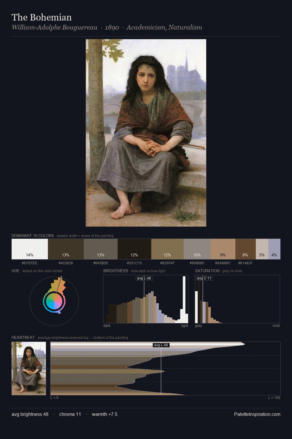
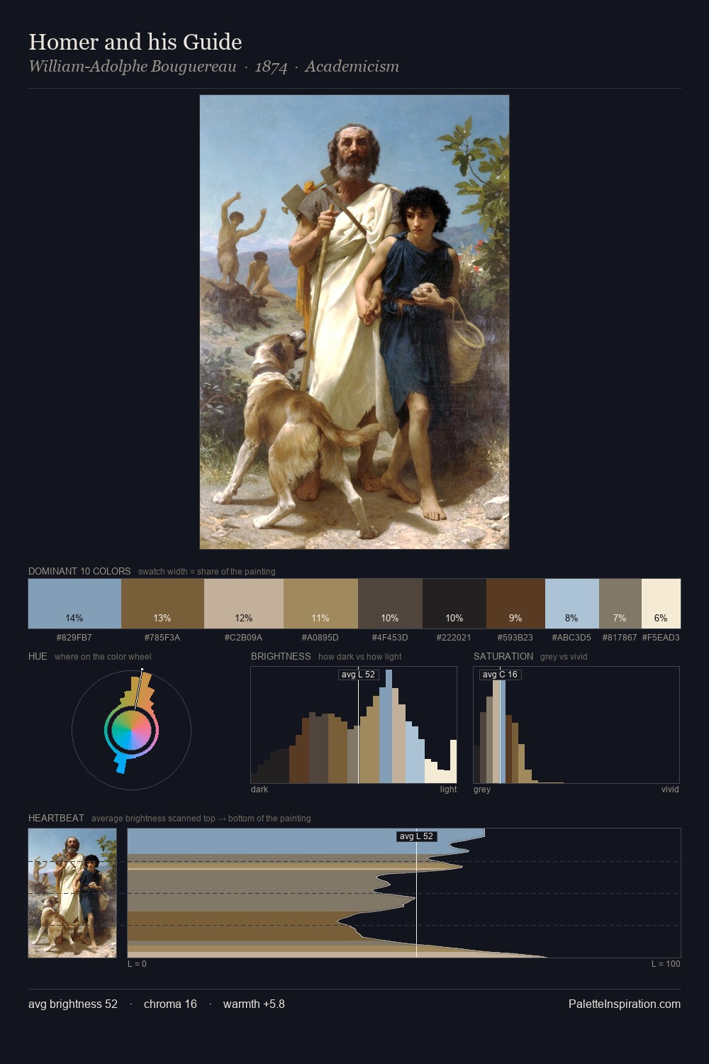
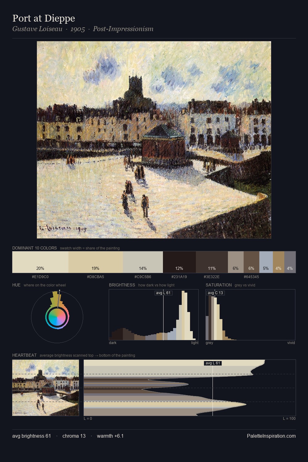
Edward R. Taylor occupies the comfortable middle of the value scale, avoiding both extremes to hold the eye in a sustained middle grey. Edward R. Taylor tilts toward cool - blues and silver-greys carry the structural weight. Saturation is deliberately withheld - the beauty here lies in the near-monochromatic gradations rather than colour difference. The most saturated colour, #45382A, is reserved to 7.8% of the surface, where it acts as a focal punctuation. 73 units of value range underpin the palette's structural clarity: the eye always knows where light falls. The mid-to-high key, cool bias, and moderate chroma point to outdoor observation - sky and diffused daylight as the dominant light source. Palette 2 sits within the larger chromatic argument that Edward R. Taylor's complete body of work advances.
Example use cases
- craft & artisan brands
- specialty coffee
- home goods
- lifestyle retail
- ceramics & pottery
I Love This!
Copy, export, or download for your project