Edward E. Simmons Palette 1

Palette Analysis
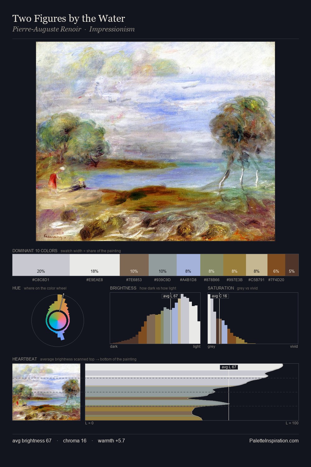
Edward E. Simmons is high in key: pale, luminous, and filled with optical air. Blues and teal-greys govern the palette, lending it an aquatic or atmospheric quality. Muted throughout, the palette achieves its effects through value and temperature rather than chromatic force. 27.3% of the palette belongs to #F1EEE7, a concentration that makes it the unmistakable visual centre. #3C261B delivers the chromatic peak at only 3.0% - a small shot of colour with outsized visual impact. At 66 units of value range, the palette has the tonal breadth to sustain complex spatial readings. The mid-to-high key, cool bias, and moderate chroma point to outdoor observation - sky and diffused daylight as the dominant light source. Palette 1 sits within the larger chromatic argument that Edward E. Simmons's complete body of work advances.
Example use cases
- hospitality branding
- boutique hotels
- restaurant identity
- home goods
- florist branding
I Love This!
Copy, export, or download for your project