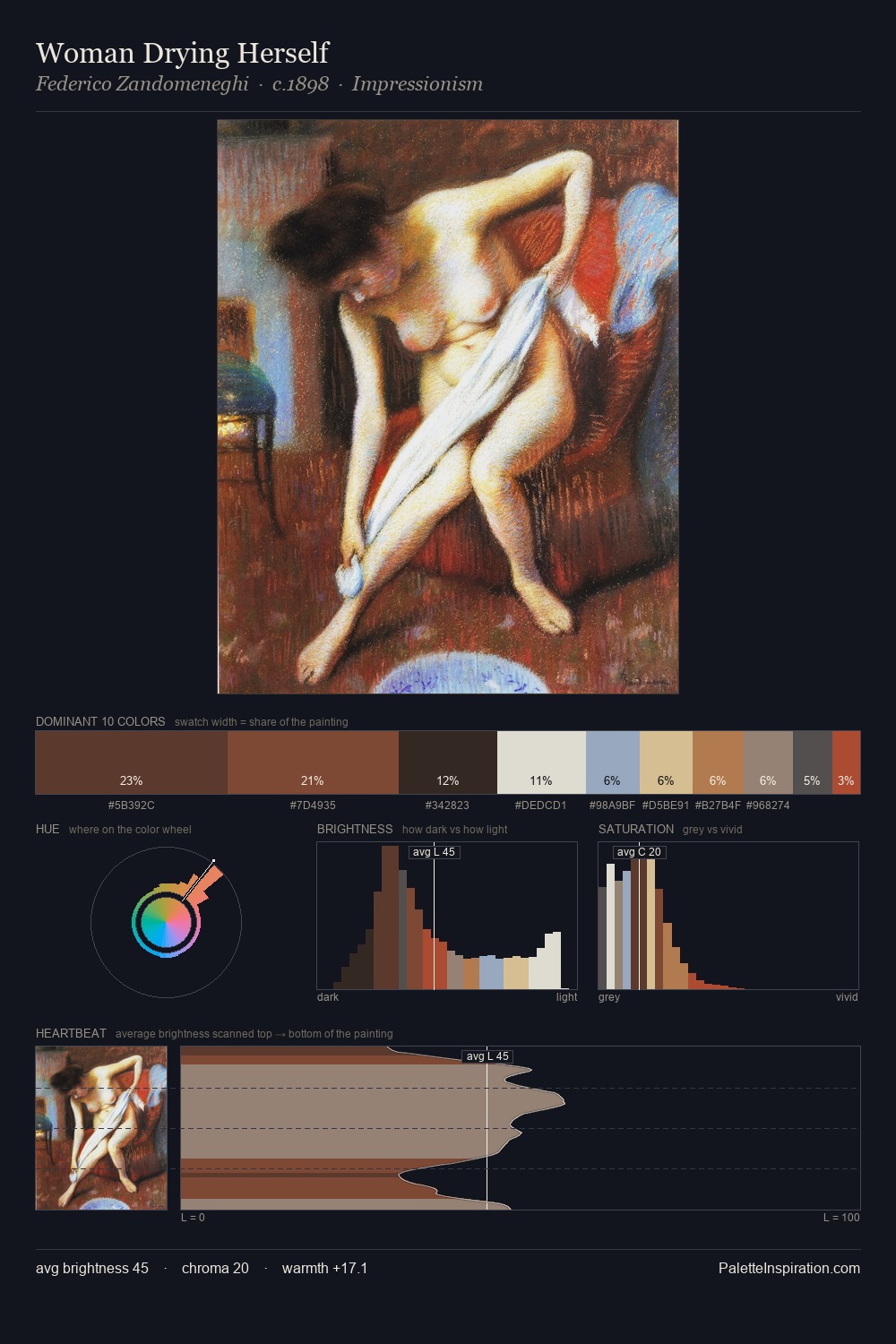
Domenico Tintoretto Master Palette

Palette Analysis
Domenico Tintoretto occupies the comfortable middle of the value scale, avoiding both extremes to hold the eye in a sustained middle grey. Warm hues command this palette; Domenico Tintoretto favours the reds, oranges, and yellows of firelight and earth. Muted throughout, the palette achieves its effects through value and temperature rather than chromatic force. #272320 at 25.3% of the palette: an overwhelming presence that pulls all other colours into its gravitational field. At 6.9%, #D6B287 carries the palette's sharpest chromatic charge: an accent that earns its place precisely because it is withheld. A value spread of 62 units gives the palette both depth and air - shadows are genuinely dark, lights genuinely light. Taken together, these qualities constitute Domenico Tintoretto's chromatic voice - distinctive enough to be read across an entire body of work.
Example use cases
- theater design
- jewelry brands
- tobacco-adjacent retail
- event branding
- film & entertainment
I Love This!
Copy, export, or download for your project