Defendente Ferrari Palette 6

Palette Analysis
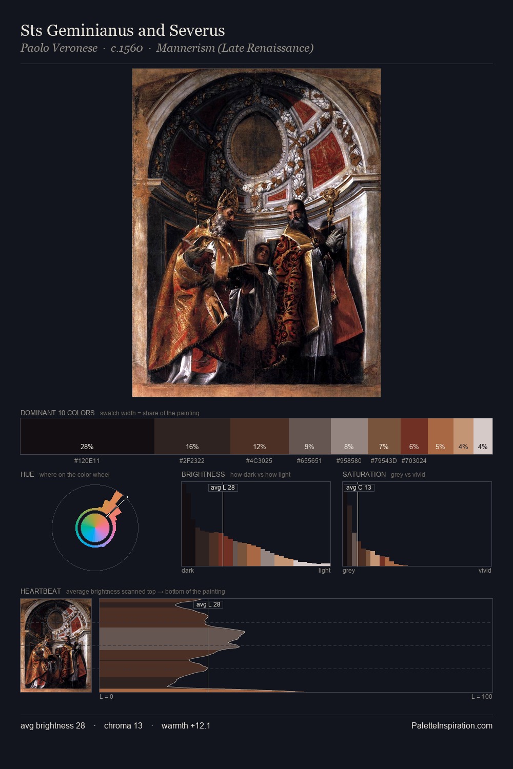
The palette of Defendente Ferrari sits in the lower register of the value scale - dense, contained, and weighted. The dominant temperature is warm, with earth tones and fire-hues setting the emotional key. Every colour is desaturated; the palette proceeds through near-neutrals and gently-coloured greys. The dominant colour, #1A181A, takes 34.8% of the total area, establishing the overall mood before any other hue is introduced. The saturated accent, #682626, registers at 4.1% - sparse enough to feel like a deliberate surprise. 43 units of value spread create a palette that is varied but unified - contrast in the service of harmony. This tonal restraint is characteristic of the Defendente Ferrari approach: colour serves light, not the reverse. This is palette 6 of Defendente Ferrari's sequence - a single chapter in a chromatic story told across many works.
Example use cases
- theater design
- jewelry brands
- tobacco-adjacent retail
- event branding
- film & entertainment
I Love This!
Copy, export, or download for your project