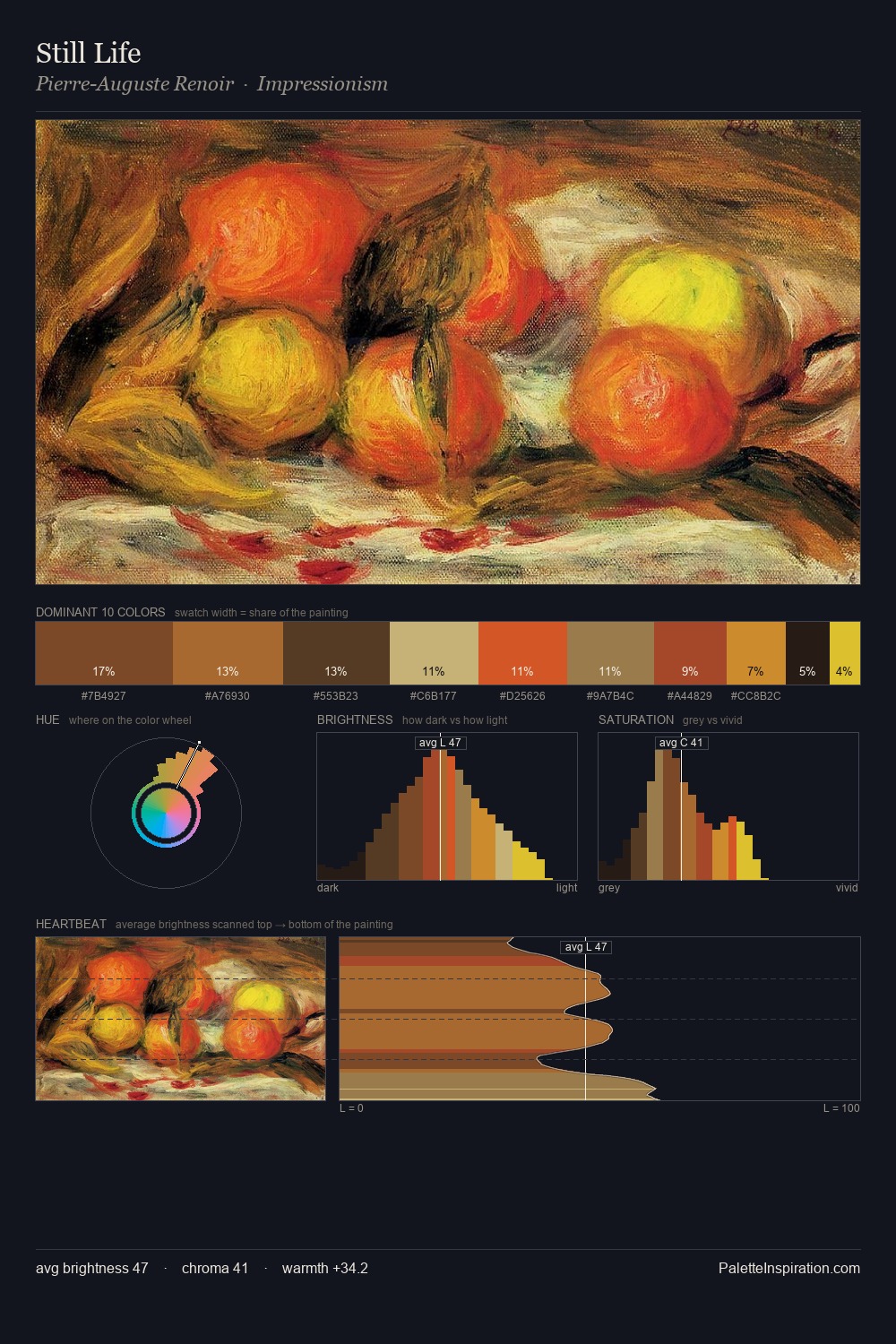
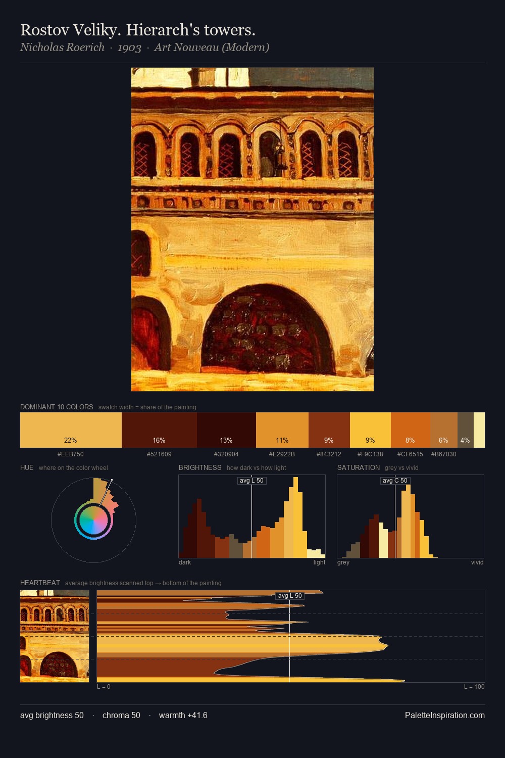
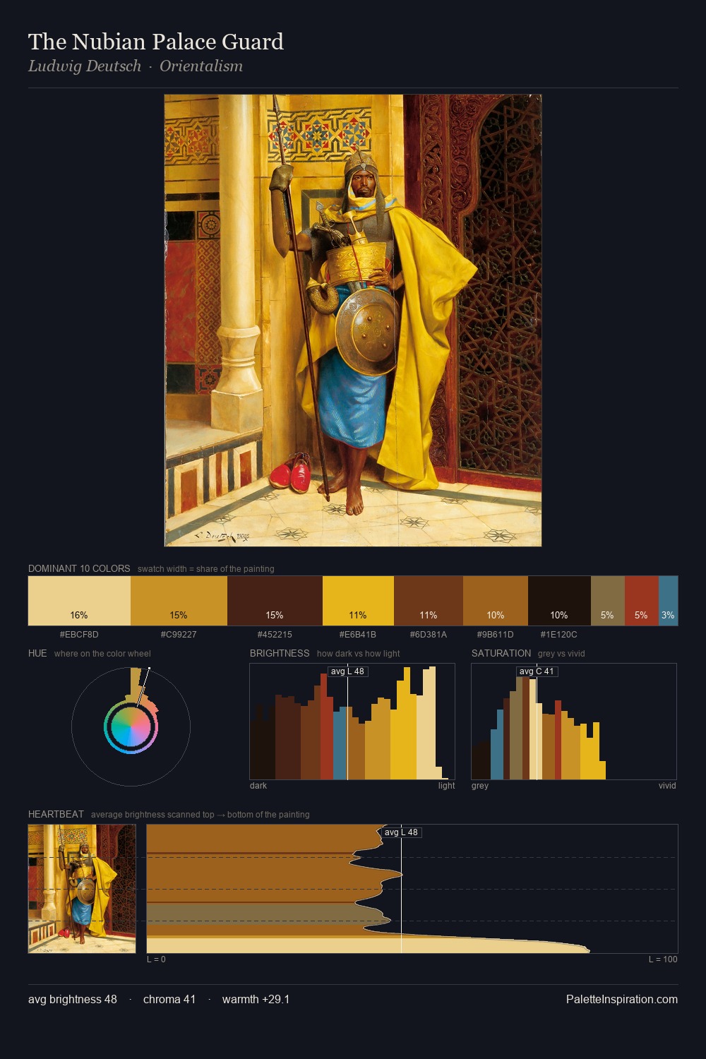
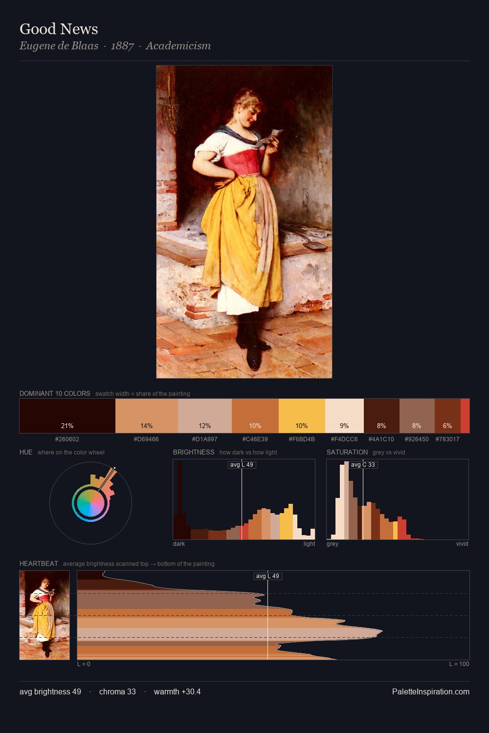
David Wilkie Palette 2

Palette Analysis
David Wilkie is high-key - luminous, open, and weighted toward light. Blues and teal-greys govern the palette, lending it an aquatic or atmospheric quality. Chroma is moderate: colours carry enough saturation to be read as colour, but the palette stops well short of garish intensity. David Wilkie gives 41.5% of the composition to a single #F7CF38 - a decisive chromatic anchor. #F3DBA0 delivers the chromatic peak at only 3.1% - a small shot of colour with outsized visual impact. 71 units of value range underpin the palette's structural clarity: the eye always knows where light falls. The mid-to-high key, cool bias, and moderate chroma point to outdoor observation - sky and diffused daylight as the dominant light source. In the context of David Wilkie's full range of palettes, group 2 represents one movement in an ongoing chromatic dialogue.
Example use cases
- art galleries
- creative studios
- consumer goods
- lifestyle media
- professional services
I Love This!
Copy, export, or download for your project