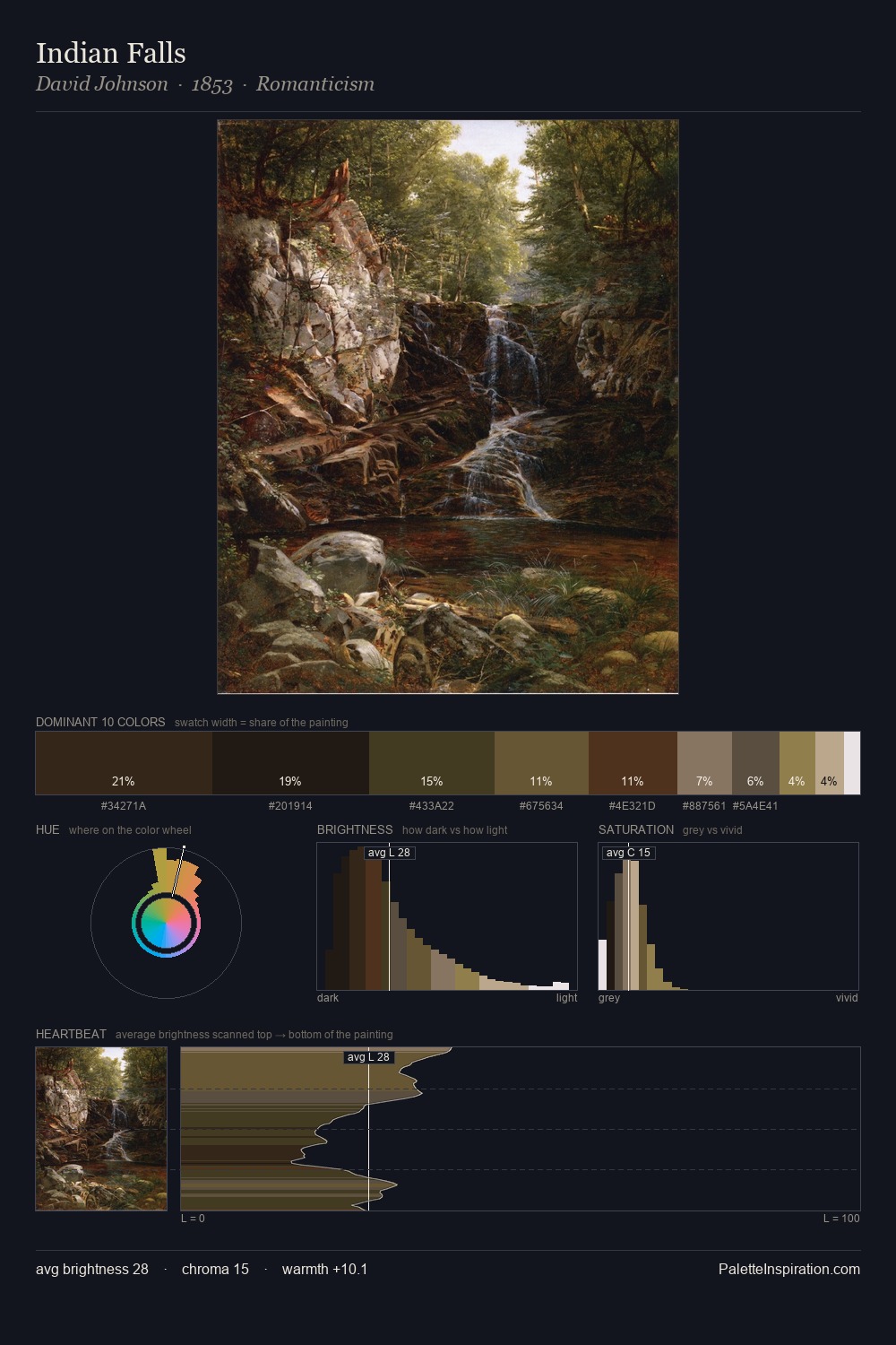
David Johnson Palette 9

Palette Analysis
Mid-key values give David Johnson its characteristic quietness - nothing blazes, nothing disappears. David Johnson builds on cool foundations: the palette favours the blue-cyan-green arc. Chroma is kept low across all colours, producing the soft, enveloping quality that characterises tonal painting. #F1F0EE claims 47.8% of the surface, functioning as the work's tonal foundation. The highest-chroma note - #D0C097 - appears at just 2.7%, deployed as a precision accent against the quieter ground. From deepest dark to palest light, the palette traverses 77 units of the value scale - a span that creates natural depth. The mid-to-high key, cool bias, and moderate chroma point to outdoor observation - sky and diffused daylight as the dominant light source. In the context of David Johnson's full range of palettes, group 9 represents one movement in an ongoing chromatic dialogue.
Example use cases
- exhibition design
- foundation branding
- estate management
- art education
- museums & galleries
I Love This!
Copy, export, or download for your project