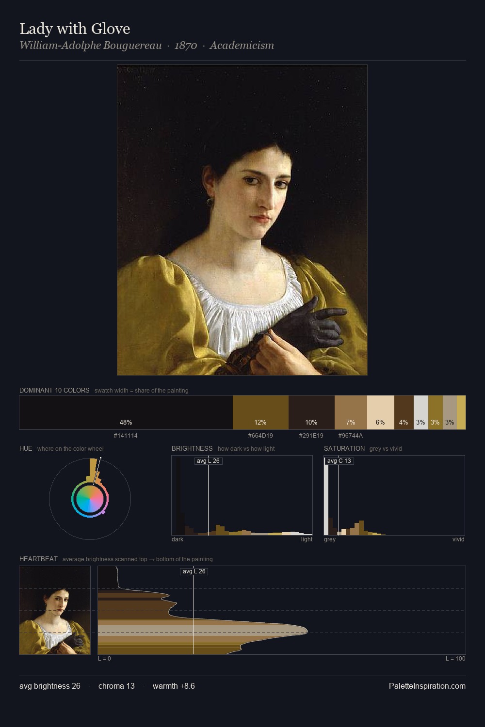
David Johnson Palette 5

Palette Analysis
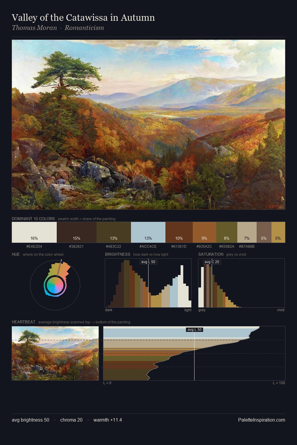
David Johnson works in the upper reaches of the value scale, creating an atmosphere of brightness and expansiveness. Temperature is cool-dominant, with blue and green families claiming the largest areas. All colours lean toward grey, building depth through value rather than colour punch. #E3E0BF claims 26.2% of the surface, functioning as the work's tonal foundation. The highest-chroma note - #8E5A28 - appears at just 6.0%, deployed as a precision accent against the quieter ground. 73 units of value range underpin the palette's structural clarity: the eye always knows where light falls. High luminosity and cool temperature suggest the plein-air condition: unfiltered daylight and open sky. In the context of David Johnson's full range of palettes, group 5 represents one movement in an ongoing chromatic dialogue.
Example use cases
- publishing
- corporate identity
- consumer apps
- hospitality
- design agencies
I Love This!
Copy, export, or download for your project