Daniel Ridgway Knight Palette 2

Palette Analysis
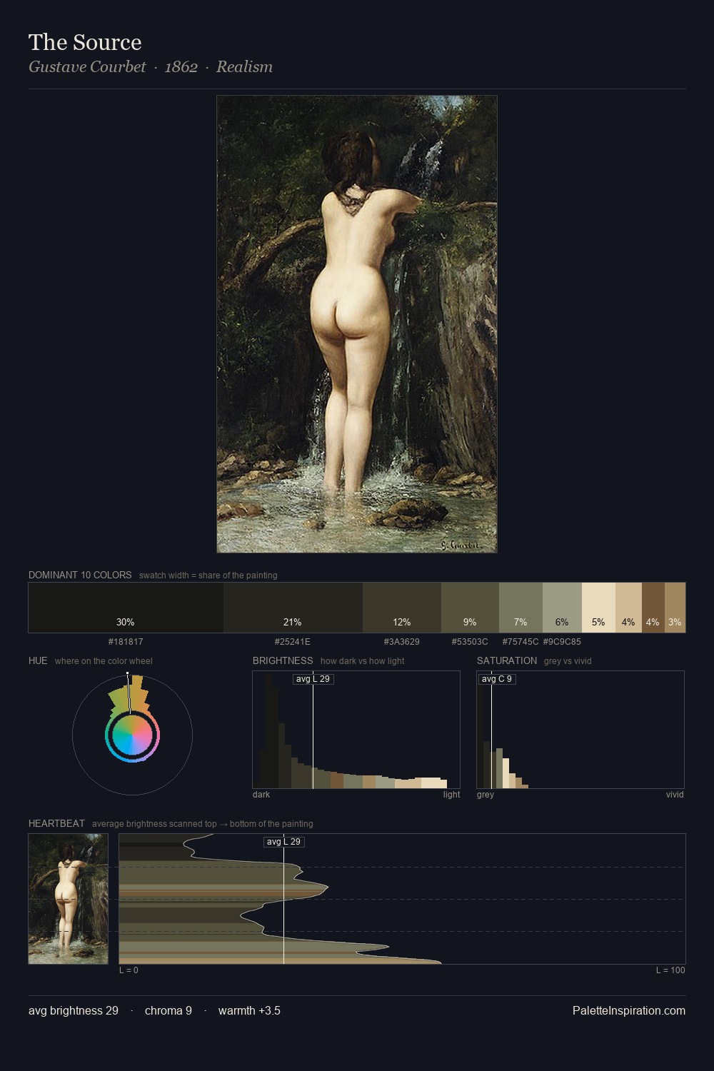
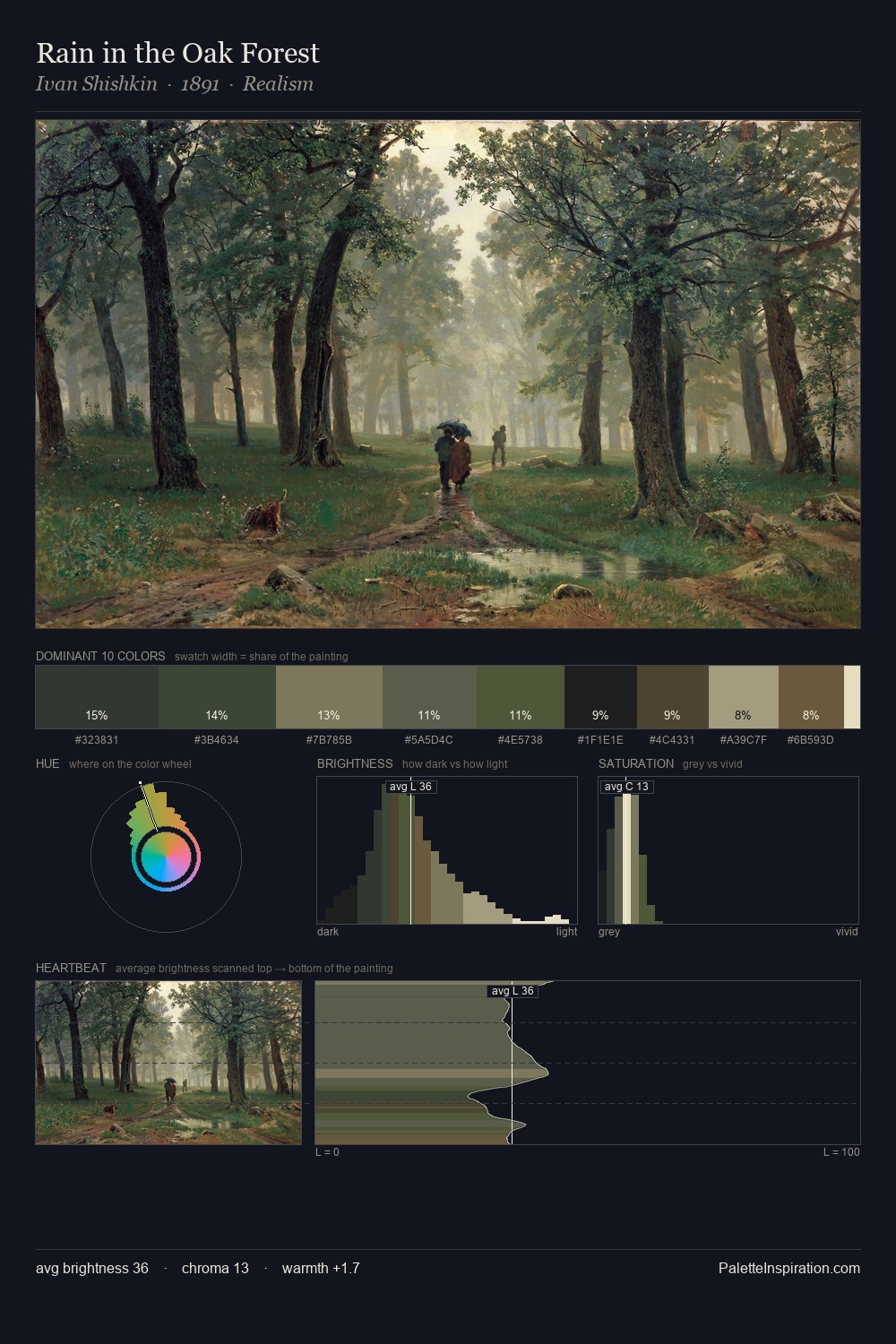
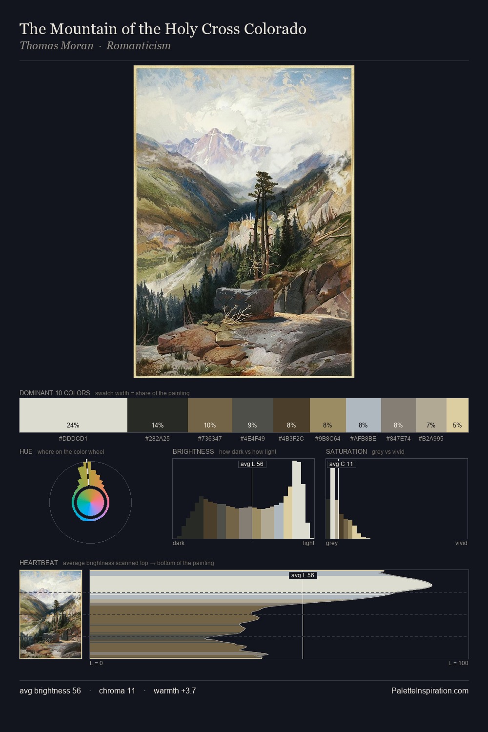
Daniel Ridgway Knight occupies the comfortable middle of the value scale, avoiding both extremes to hold the eye in a sustained middle grey. Blues and teal-greys govern the palette, lending it an aquatic or atmospheric quality. Muted throughout, the palette achieves its effects through value and temperature rather than chromatic force. Only 7.5% is devoted to #E5DEB4, yet that small allocation delivers the palette's entire chromatic tension. From deepest dark to palest light, the palette traverses 64 units of the value scale - a span that creates natural depth. High luminosity and cool temperature suggest the plein-air condition: unfiltered daylight and open sky. This is palette 2 of Daniel Ridgway Knight's sequence - a single chapter in a chromatic story told across many works.
Example use cases
- exhibition design
- foundation branding
- estate management
- art education
- museums & galleries
I Love This!
Copy, export, or download for your project