Cornelis Saftleven Master Palette
Penumbral Caramel
Penumbral Partial shadow - the transitional zone between light and full dark, soft-edged.
Caramel Warm mid-brown - the color of cooked sugar, smooth and amber-toned.

Palette Analysis
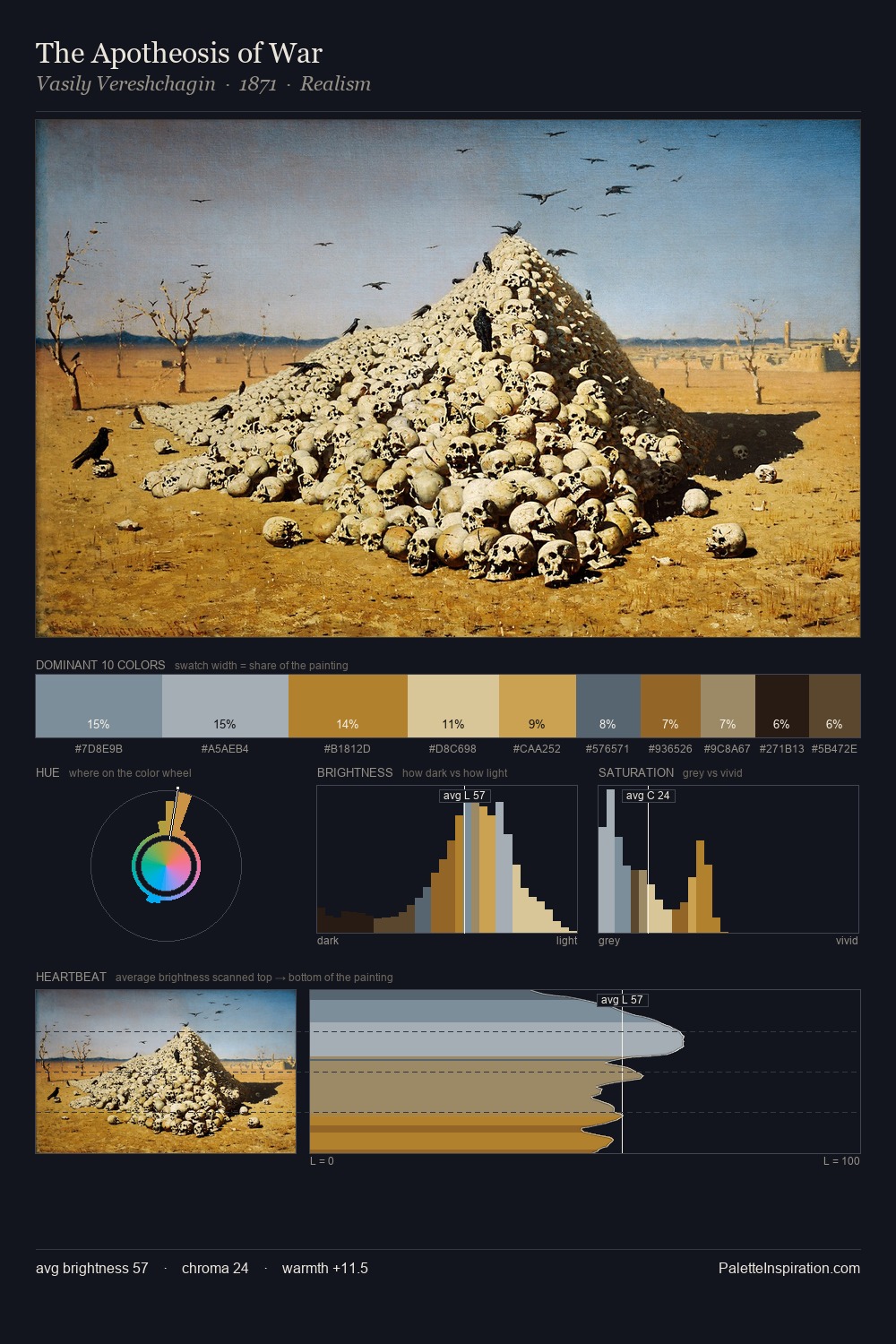
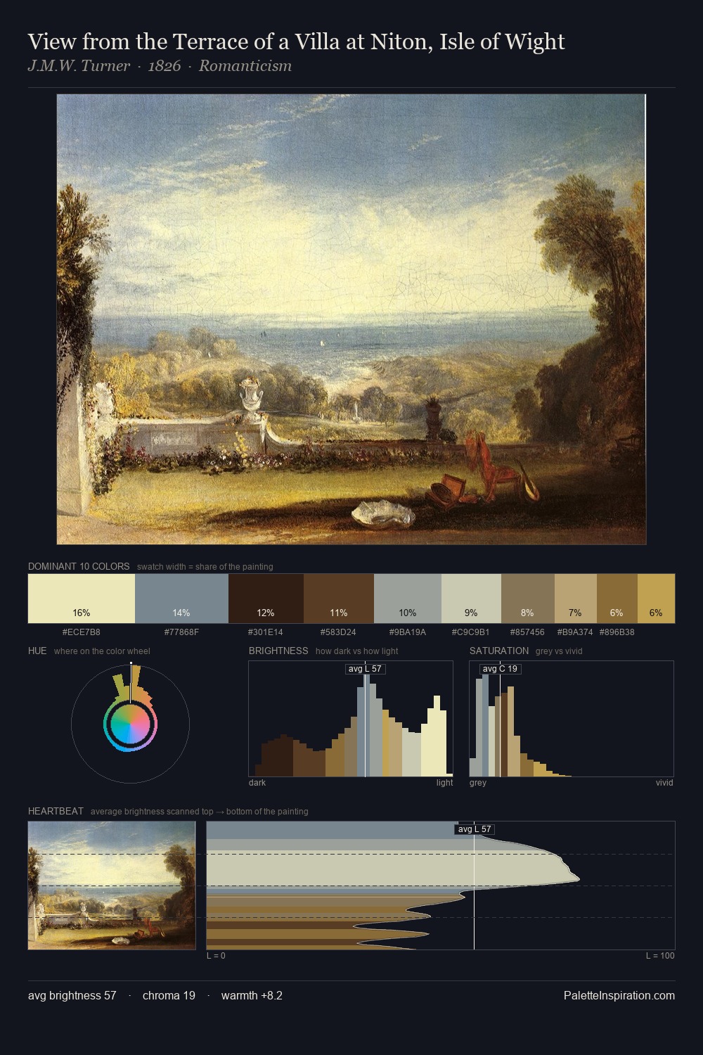
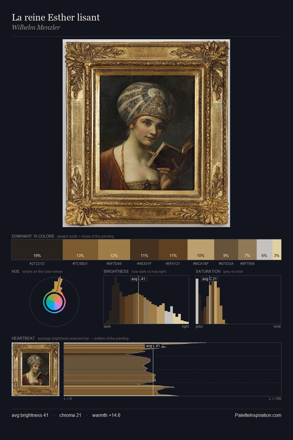
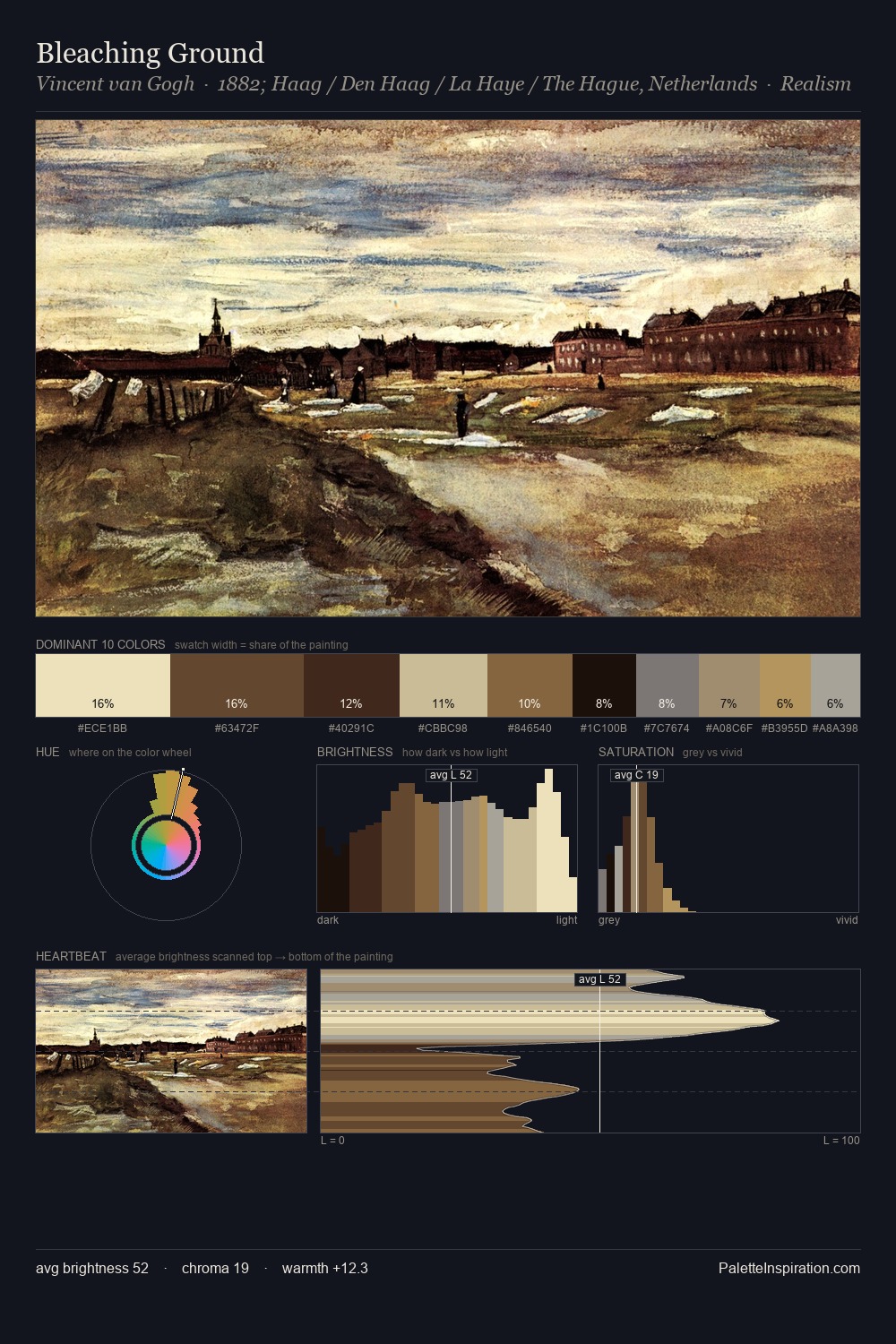
Mid-key values give Cornelis Saftleven its characteristic quietness - nothing blazes, nothing disappears. Temperature reads distinctly warm: the reds and earth tones from Cornelis Saftleven carry the compositional weight. Chroma hovers near zero; colour declares itself through subtle shifts in hue rather than outright saturation. At 10.0%, #C39D57 carries the palette's sharpest chromatic charge: an accent that earns its place precisely because it is withheld. From deepest dark to palest light, the palette traverses 65 units of the value scale - a span that creates natural depth. These proportions encode Cornelis Saftleven's instinctive sense of how much of each quality the eye can hold.
Example use cases
- theater design
- jewelry brands
- tobacco-adjacent retail
- event branding
- film & entertainment
I Love This!
Use This Palette
Copy, export, or download for your project
Copy, export, or download for your project
Copy:
Download:
Share: