Colors that go with

Violet-blue

#324AB2

Or pick a different color

Open on color wheel →

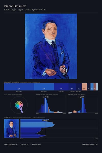
Violet-blue (#324AB2) is a mid-tone cool shade that appears across 6 master palettes in our corpus, most prominently in the work of Hans Holbein the Younger, Aleksander Kuprin, and Henri Matisse and the Northern Renaissance tradition. Master painters paired it most often with Floral white (#FFFAF0), Dark purple (#301934), and Khaki (#C3B091). The combination forms a steady, atmospheric chord, built on a split-complementary spread, leans on warm companions to lift a cool source color, with the pair colors held at a similar value to the source.
Artworks Featuring This Color

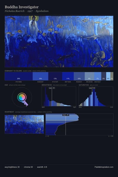
Buddha Investigator palette card
Buddha Investigator
Nicholas Roerich · 1927
Thought palette card
Thought
Nicholas Roerich · 1946
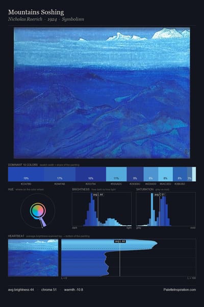
Mountains Soshing palette card
Mountains Soshing
Nicholas Roerich · 1924
View of Saint Tropez palette card
View of Saint Tropez
Henri Matisse · 1904
Blue Gentians palette card
Blue Gentians
John Singer Sargent · 1905
The Lake of Tiberias palette card
The Lake of Tiberias
John Singer Sargent · 1905

Master palettes

Palettes Featuring Violet-blue

6 palettes where Violet-blue appears prominently — one per artist.

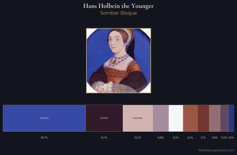
Hans Holbein the Younger Palette 7 - Somber Bisque

Hans Holbein the Younger

35.7% Violet-blue

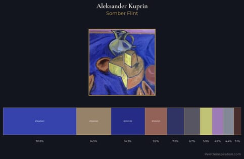
Aleksander Kuprin Palette 4 - Somber Flint

Aleksander Kuprin

30.8% Violet-blue

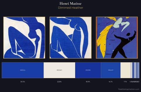
Henri Matisse Palette 8 - Dimmed Heather

Henri Matisse

30.5% Violet-blue

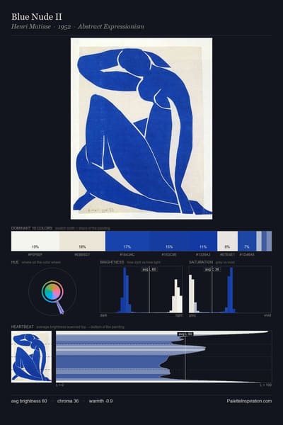
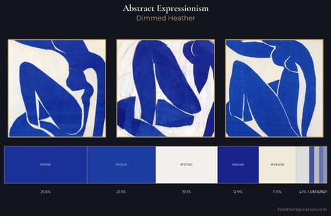
Abstract Expressionism Palette 3 - Dimmed Heather

Abstract Expressionism

21.3% Violet-blue

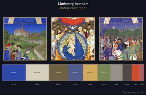
Limbourg brothers Palette 6 - Muted Parchment

Limbourg brothers

16.7% Violet-blue

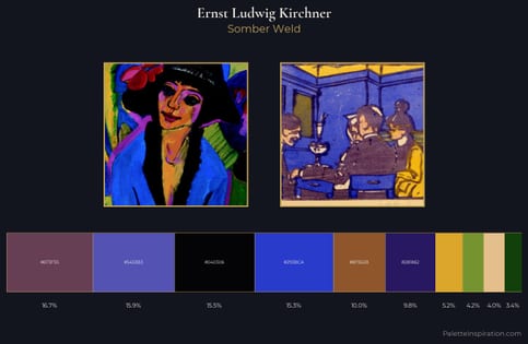
Ernst Ludwig Kirchner Palette 18 - Somber Weld

Ernst Ludwig Kirchner

15.9% Violet-blue

Choose another color