Colors that go with

Persian blue

#1C39BB

Try a similar color

Or pick a different color

Open on color wheel →

Persian blue (#1C39BB) is a mid-tone cool shade that appears across 5 master palettes in our corpus, most prominently in the work of Olga Rozanova, and Ernst Ludwig Kirchner and the Suprematism tradition. Master painters paired it most often with Red (#FE2712), Cultured Pearl (#F5F5F5), and Goldenrod (#DAA520). The combination forms a steady, atmospheric chord, built on a complementary hue split, leans on warm companions to lift a cool source color, with a moderate step up in value that keeps the source recessed.
Artworks Featuring This Color

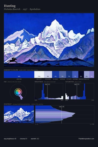
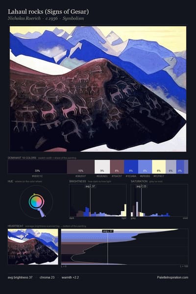
Lahaul rocks (Signs of Gesar) palette card
Lahaul rocks (Signs of Gesar)
Nicholas Roerich · 1936
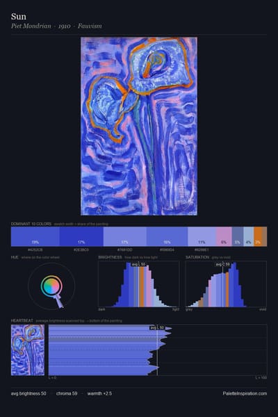
Sun palette card
Sun
Piet Mondrian · 1910
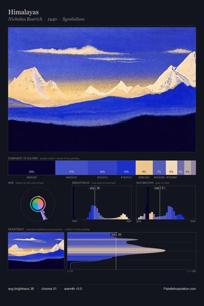
Himalayas palette card
Himalayas
Nicholas Roerich · 1940
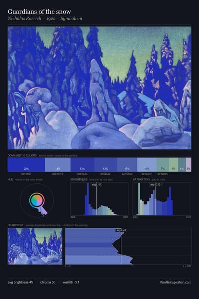
Guardians of the snow palette card
Guardians of the snow
Nicholas Roerich · 1922
Future (study) palette card
Future (study)
Giacomo Balla · 1918
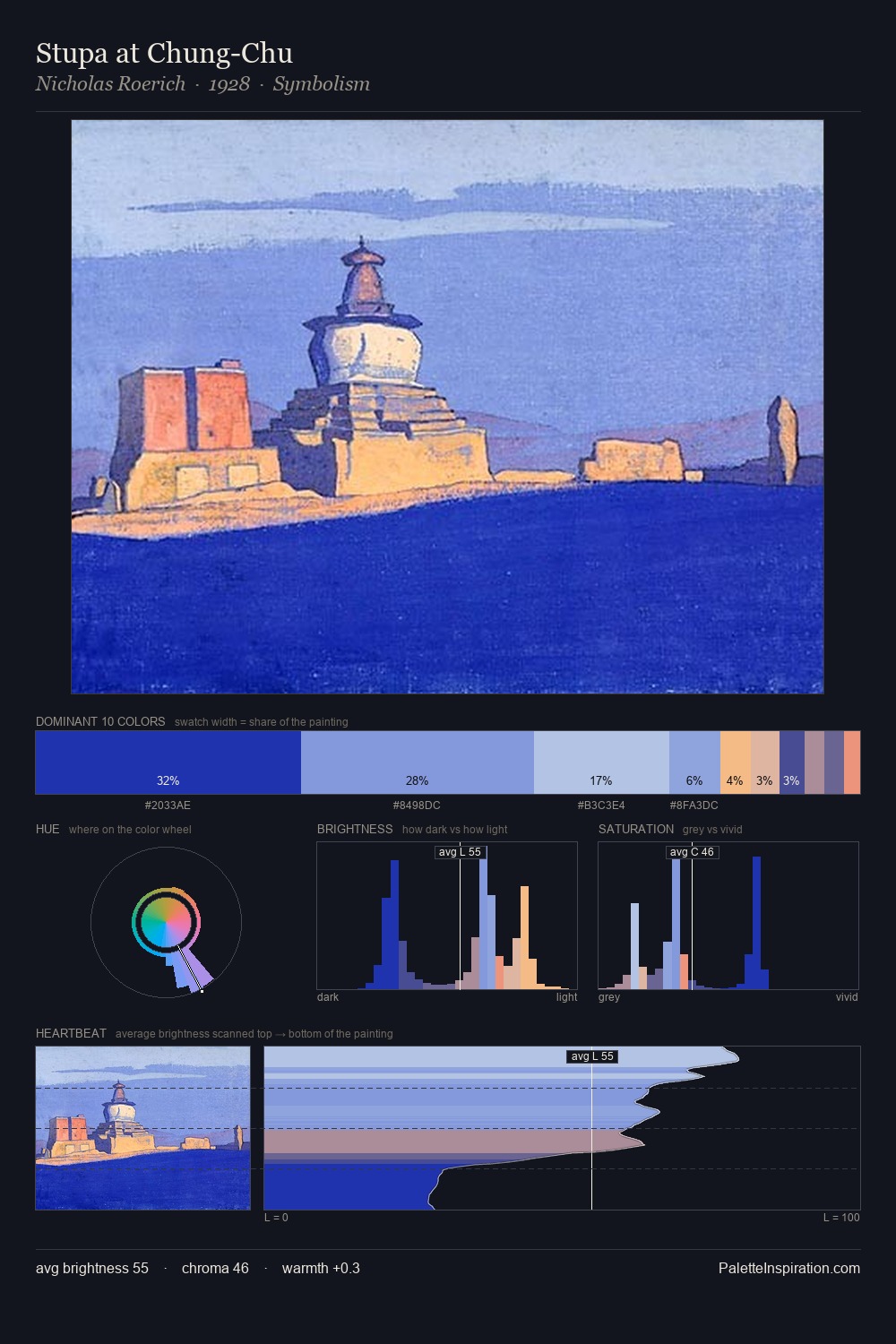
Stupa at Chung-Chu palette card
Stupa at Chung-Chu
Nicholas Roerich · 1928

Master palettes

Palettes Featuring Persian blue

5 palettes where Persian blue appears prominently — one per artist.

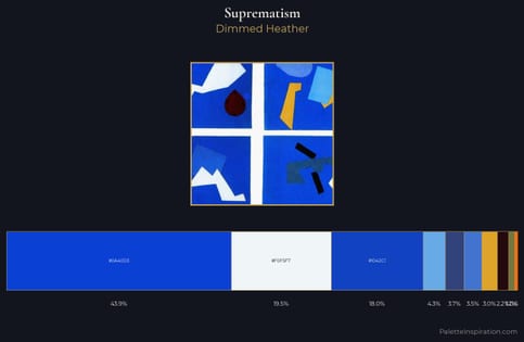
Suprematism Palette 8 - Dimmed Heather

Suprematism

43.9% Persian blue

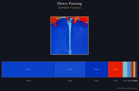
flower painting Palette 38 - Somber Fulvous

flower painting

39.6% Persian blue

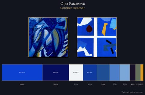
Olga Rozanova Palette 7 - Somber Heather

Olga Rozanova

28.6% Persian blue

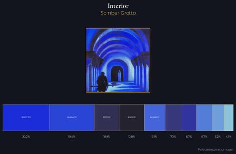
interior Palette 26 - Somber Grotto

interior

19.4% Persian blue

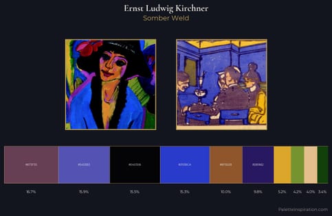
Ernst Ludwig Kirchner Palette 18 - Somber Weld

Ernst Ludwig Kirchner

15.3% Persian blue

Choose another color