Color one

Orange

#FF7538

Color two

Prairie gold

#E1CA7A

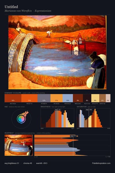
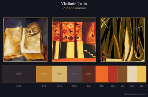
Orange (#FF7538) and Prairie gold (#E1CA7A) appear together across 2 master palettes in our corpus, most prominently in the work of Vladimir Tatlin and the Constructivism tradition. Painters typically deployed orange at an average of 4% of the canvas, with prairie gold at 5%. Third colors most often completing the combination include Raisin black (#242124), Chili red (#E23D28), and Xumo (#413639).
Artworks Featuring Orange & Prairie gold

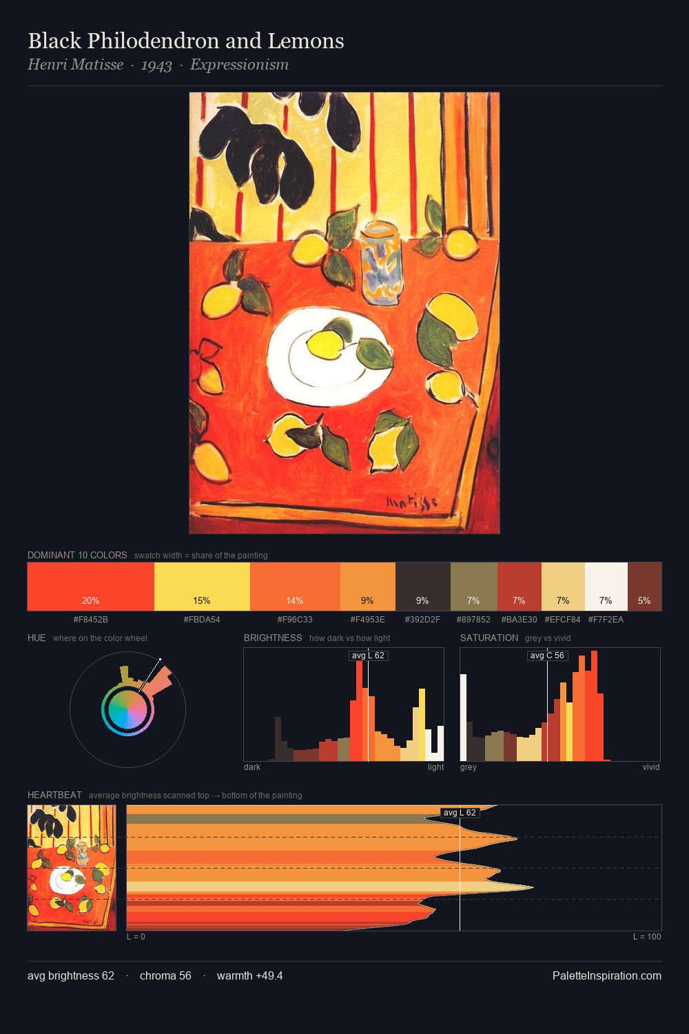
Black Philodendron and Lemons palette card
Black Philodendron and Lemons
Henri Matisse · 1943
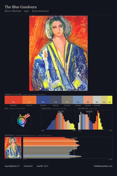
The Blue Gandoura palette card
The Blue Gandoura
Henri Matisse · 1951
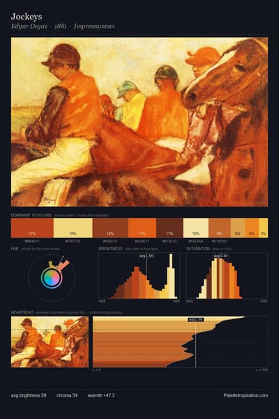
Jockeys palette card
Jockeys
Edgar Degas · 1881
Reclining nude palette card
Reclining nude
Amedeo Modigliani · 1917
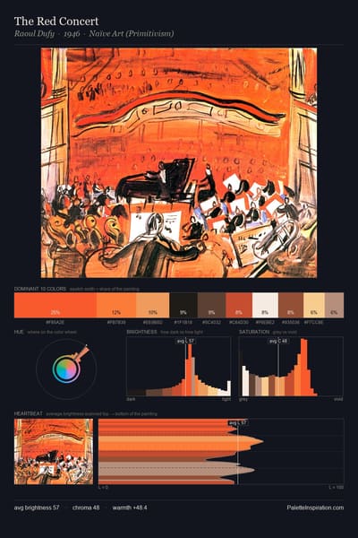
The Red Concert palette card
The Red Concert
Raoul Dufy · 1946
Music palette card
Music
Andre Derain · 1904

Master palettes

Palettes Featuring Orange & Prairie gold

1 master palette where Orange and Prairie gold appear together most prominently.

Vladimir Tatlin Palette 3 - Muted Caramel

Vladimir Tatlin

8.5% Orange · 10.4% Prairie gold

Choose another color