Color one

Light cornflower blue

#93CCEA

Color two

Prairie gold

#E1CA7A

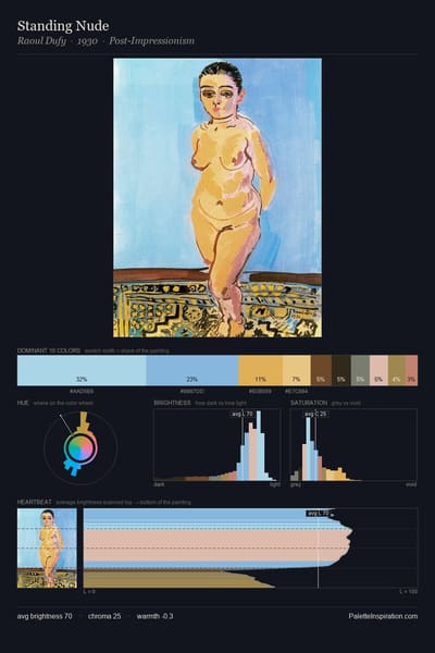
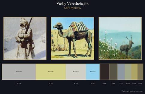
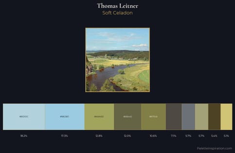
Light cornflower blue (#93CCEA) and Prairie gold (#E1CA7A) appear together across 3 master palettes in our corpus, most prominently in the work of Thomas Leitner, and Vasily Vereshchagin and the Academic Art tradition. Painters typically deployed light cornflower blue at an average of 15% of the canvas, with prairie gold at 10%. Third colors most often completing the combination include Light blue (#ADD8E6), Moss green (#8A9A5B), and Gold Fusion (#85754E).
Artworks Featuring Light cornflower blue & Prairie gold

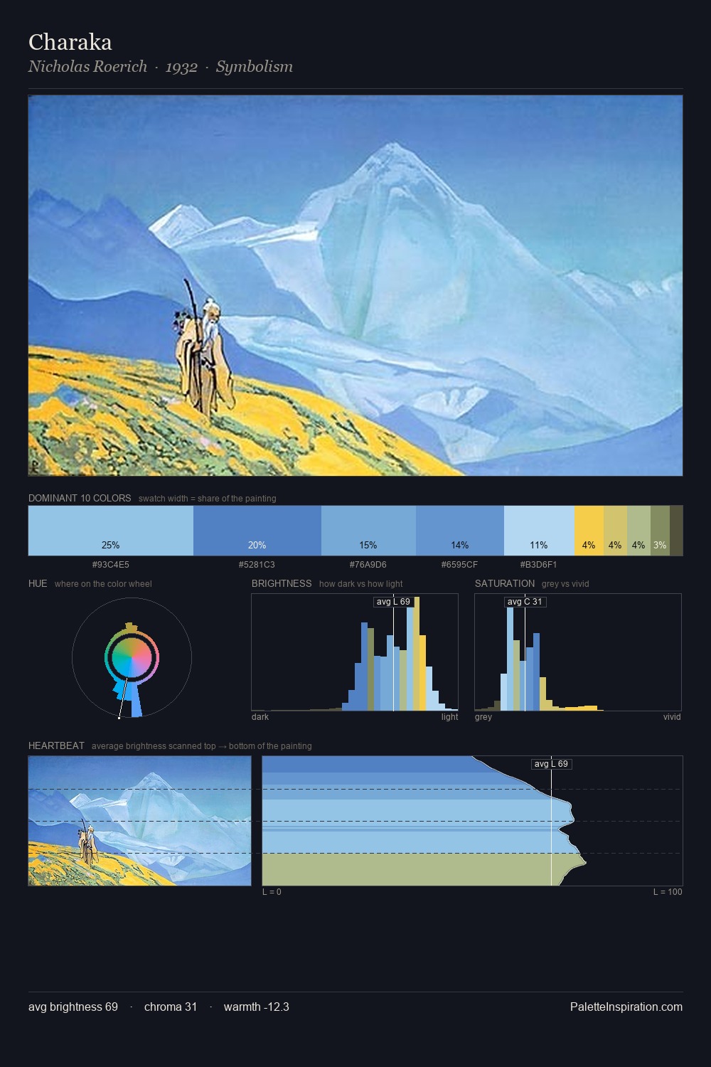
Charaka palette card
Charaka
Nicholas Roerich · 1932
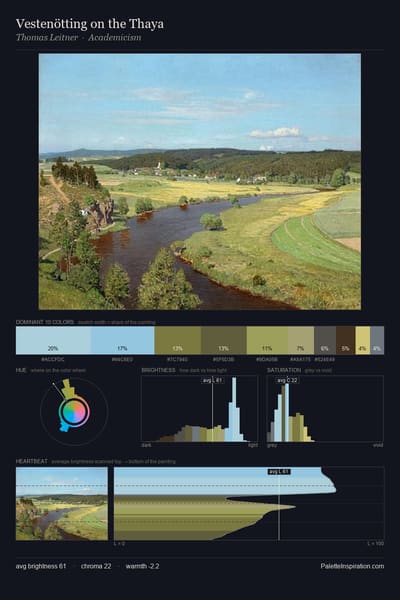
Vestenötting on the Thaya palette card
Vestenötting on the Thaya
Thomas Leitner
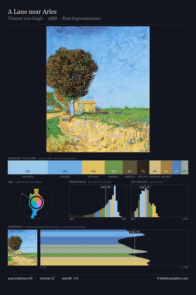
A Lane near Arles palette card
A Lane near Arles
Vincent van Gogh · 1888
The fall in Silvaplana palette card
The fall in Silvaplana
Ferdinand Hodler · 1907
Open Window at Collioure palette card
Open Window at Collioure
Henri Matisse
Wide Lands of the Navajo palette card
Wide Lands of the Navajo
Maynard Dixon · 1945

Master palettes

Palettes Featuring Light cornflower blue & Prairie gold

3 master palettes where Light cornflower blue and Prairie gold appear together most prominently.

Vasily Vereshchagin Palette 1 - Soft Mellow

Vasily Vereshchagin

9.7% Light cornflower blue · 21.1% Prairie gold

Thomas Leitner Palette 1 - Soft Celadon

Thomas Leitner

17.3% Light cornflower blue · 5.1% Prairie gold

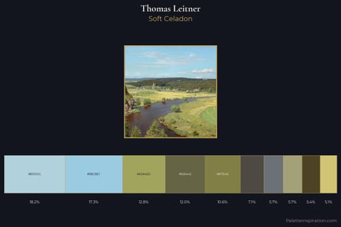
Thomas Leitner Master Palette - Soft Celadon

Thomas Leitner

17.3% Light cornflower blue · 5.1% Prairie gold

Choose another color