Colors that go with

Japanese carmine

#9D2933

Or pick a different color

Open on color wheel →

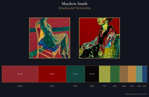
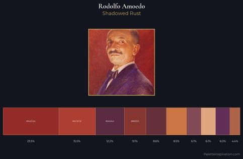
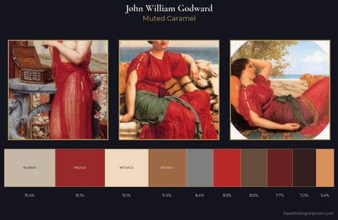
Japanese carmine (#9D2933) is a deep warm shade that appears across 3 master palettes in our corpus, most prominently in the work of Matthew Smith, Rodolfo Amoedo, and John William Godward and the Post-Impressionism tradition. Master painters paired it most often with Khaki (#C3B091), MSU green (#18453B), and Artichoke green (#4B6F44). The combination forms an earthy, lived-in chord, built on a split-complementary spread, spans a mixed temperature range, with the pair colors held at a similar value to the source.
Artworks Featuring This Color

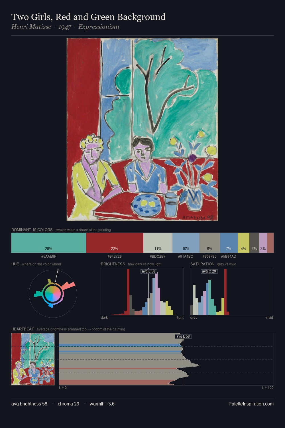
Two Girls, Red and Green Background palette card
Two Girls, Red and Green Background
Henri Matisse · 1947
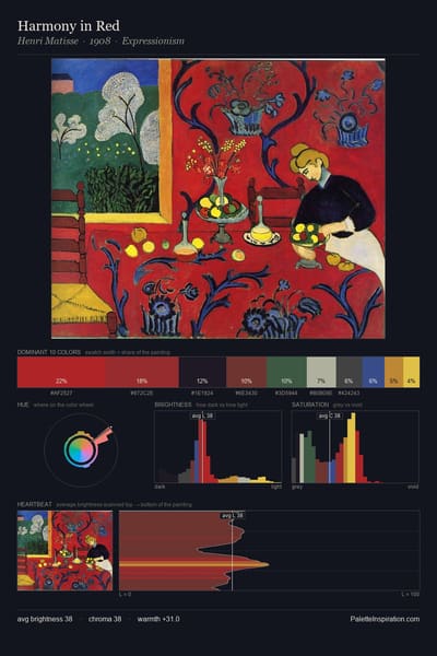
Harmony in Red palette card
Harmony in Red
Henri Matisse · 1908
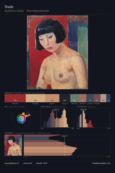
Nude palette card
Nude
Fujishima Takeji
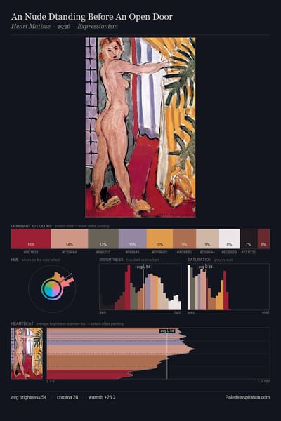
An Nude Dtanding Before An Open Door palette card
An Nude Dtanding Before An Open Door
Henri Matisse · 1936
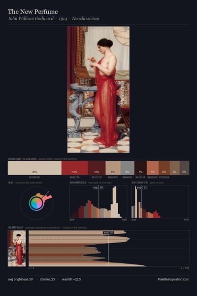
The New Perfume palette card
The New Perfume
John William Godward · 1914
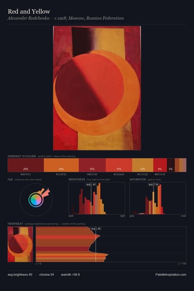
Red and Yellow palette card
Red and Yellow
Alexander Rodchenko · 1918

Master palettes

Palettes Featuring Japanese carmine

3 palettes where Japanese carmine appears prominently — one per artist.

Matthew Smith Palette 6 - Shadowed Terracotta

Matthew Smith

25.0% Japanese carmine

Rodolfo Amoedo Palette 5 - Shadowed Rust

Rodolfo Amoedo

23.5% Japanese carmine

John William Godward Palette 11 - Muted Caramel

John William Godward

15.1% Japanese carmine

Choose another color