Colors that go with

Glaucous

#6082B6

Or pick a different color

Open on color wheel →

Glaucous (#6082B6) is a mid-tone cool shade that appears across 15 master palettes in our corpus, most prominently in the work of Sassoferrato, Arman Manookian, and Peder Severin Kroyer and the Impressionism tradition. Master painters paired it most often with Khaki (#C3B091), Bone (#E3DAC9), and Pink lavender (#D8B2D1). The combination forms a steady, atmospheric chord, built on a complementary hue split, leans on warm companions to lift a cool source color, with a moderate step up in value that keeps the source recessed.
Artworks Featuring This Color

Water Lilies palette card
Water Lilies
Claude Monet · 1920
Frost palette card
Frost
Claude Monet · 1875
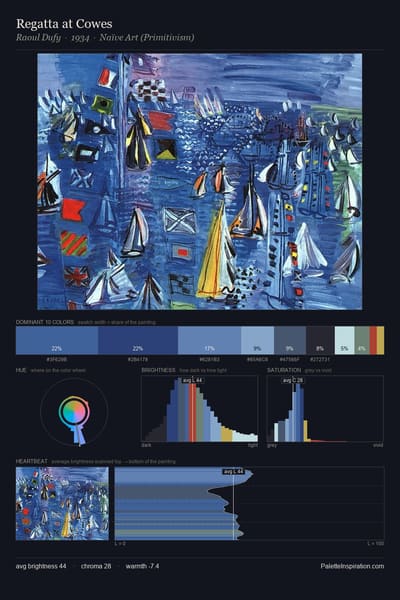
Regatta at Cowes palette card
Regatta at Cowes
Raoul Dufy · 1934
Anxiety palette card
Anxiety
Nicholas Roerich · 1938
July Afternoon palette card
July Afternoon
Guy Rose
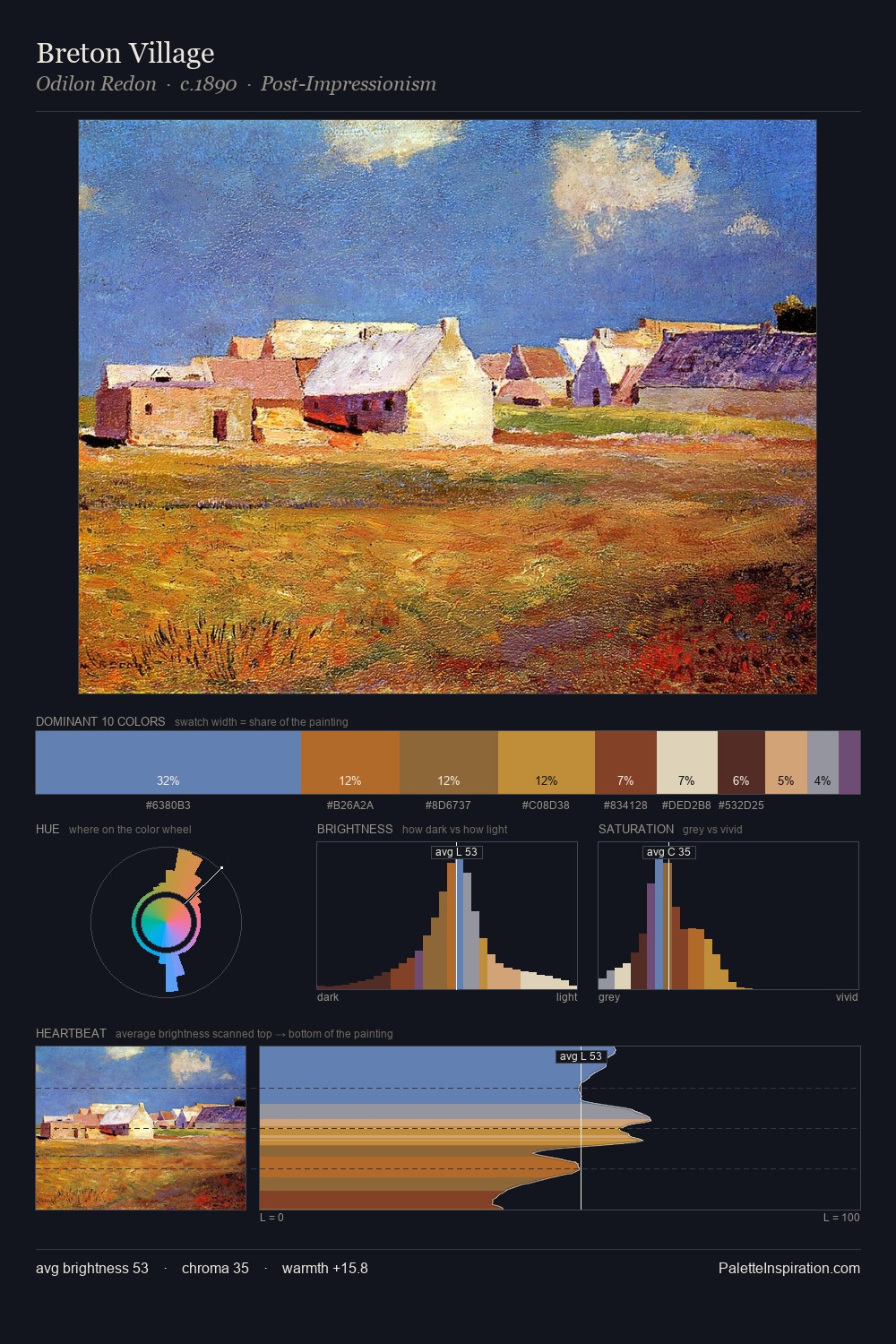
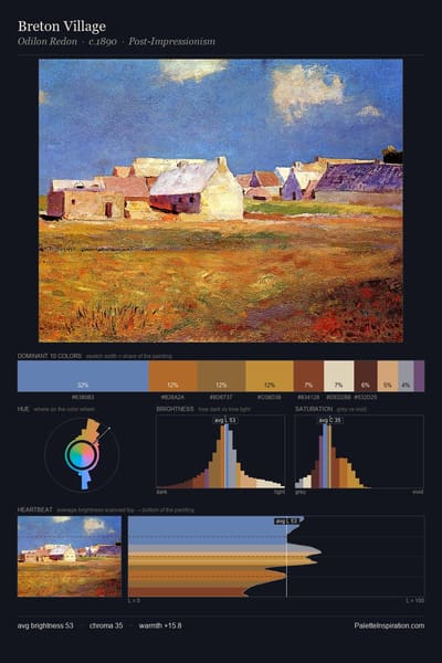
Breton Village palette card
Breton Village
Odilon Redon · 1890

Master palettes

Palettes Featuring Glaucous

6 palettes where Glaucous appears prominently — one per artist.

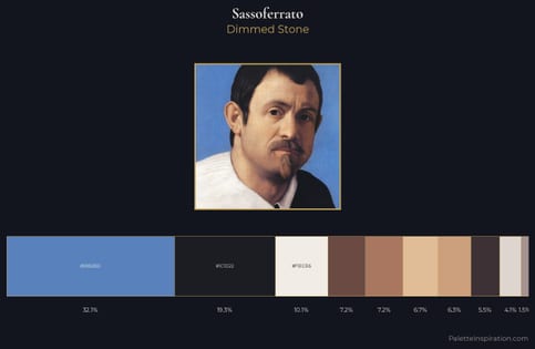
Sassoferrato Palette 1 - Dimmed Stone

Sassoferrato

32.1% Glaucous

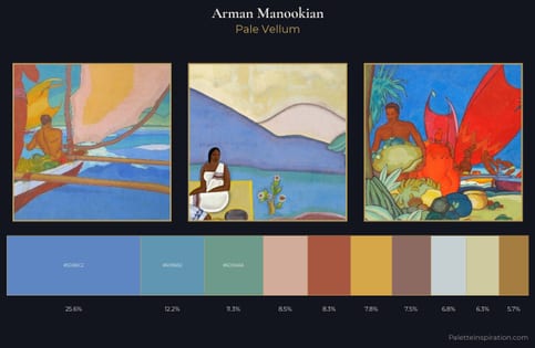
Arman Manookian Palette 1 - Pale Vellum

Arman Manookian

25.6% Glaucous

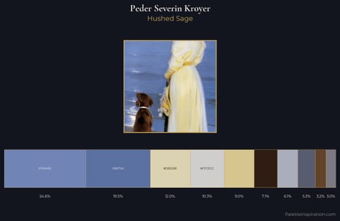
Peder Severin Kroyer Palette 5 - Hushed Sage

Peder Severin Kroyer

24.6% Glaucous

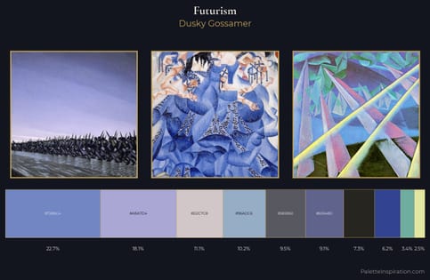
Futurism Palette 6 - Dusky Gossamer

Futurism

22.7% Glaucous

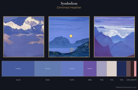
Symbolism Palette 29 - Dimmed Heather

Symbolism

19.5% Glaucous

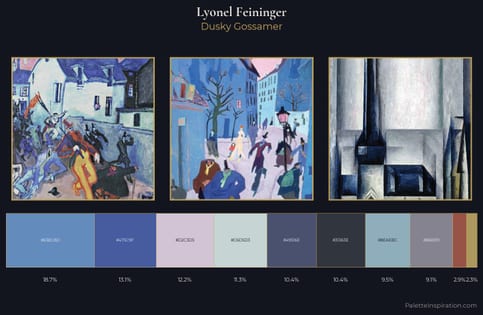
Lyonel Feininger Palette 4 - Dusky Gossamer

Lyonel Feininger

18.7% Glaucous

Choose another color