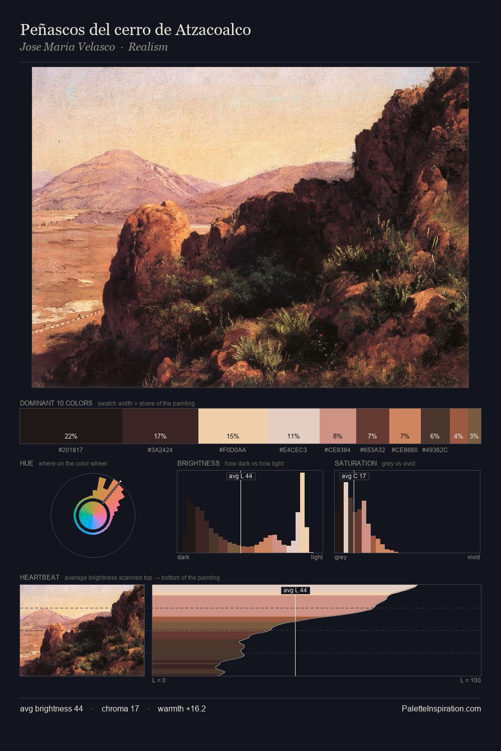
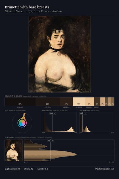
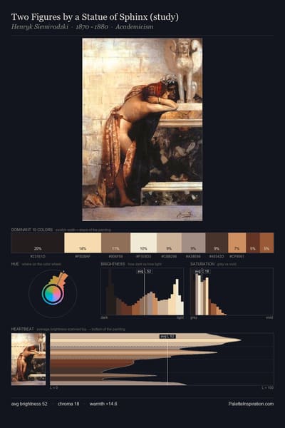
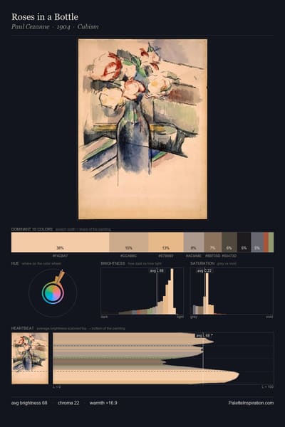
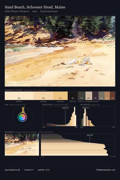
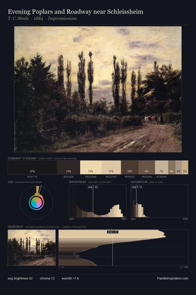
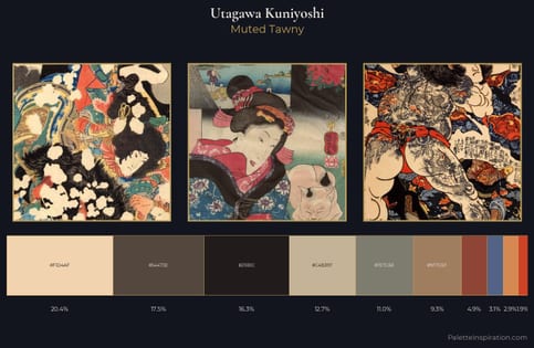
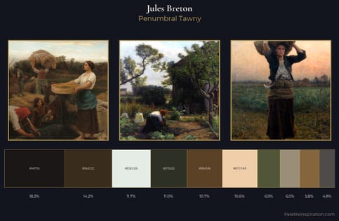
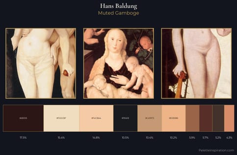
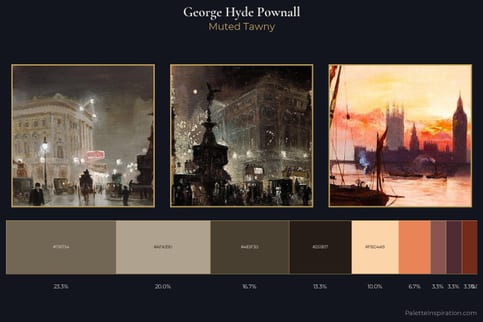
Eerie black (#1B1B1B) and Light orange (#FED8B1) appear together across 6 master palettes in our corpus, most prominently in the work of Utagawa Kuniyoshi, Jules Breton, and Hans Baldung and the Realism tradition. Painters typically deployed eerie black at an average of 16% of the canvas, with light orange at 10%. Third colors most often completing the combination include Dark lava (#483C32), Khaki (#C3B091), and Bistre (#3D2B1F).