Colors that go with

Cinnabar

#E34234

Or pick a different color

Open on color wheel →

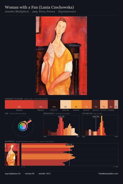
Cinnabar (#E34234) is a mid-tone warm shade that appears across 13 master palettes in our corpus, most prominently in the work of Piet Mondrian, Amedeo Modigliani, and Paul Klee and the Expressionism tradition. Master painters paired it most often with Jonquil (#F4CA16), Light cornflower blue (#93CCEA), and Old lace (#FDF5E6). The combination forms a sun-bleached, daylight chord, reads as a unified warm palette, with a moderate step up in value that keeps the source recessed.
Artworks Featuring This Color

Forest trail palette card
Forest trail
Jan Sluyters · 1910
Moss roses palette card
Moss roses
Pierre-Auguste Renoir · 1890
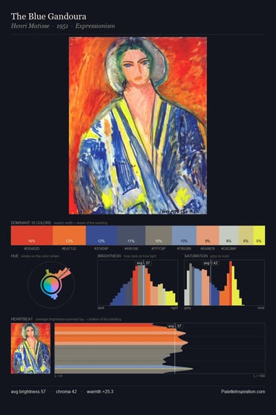
The Blue Gandoura palette card
The Blue Gandoura
Henri Matisse · 1951
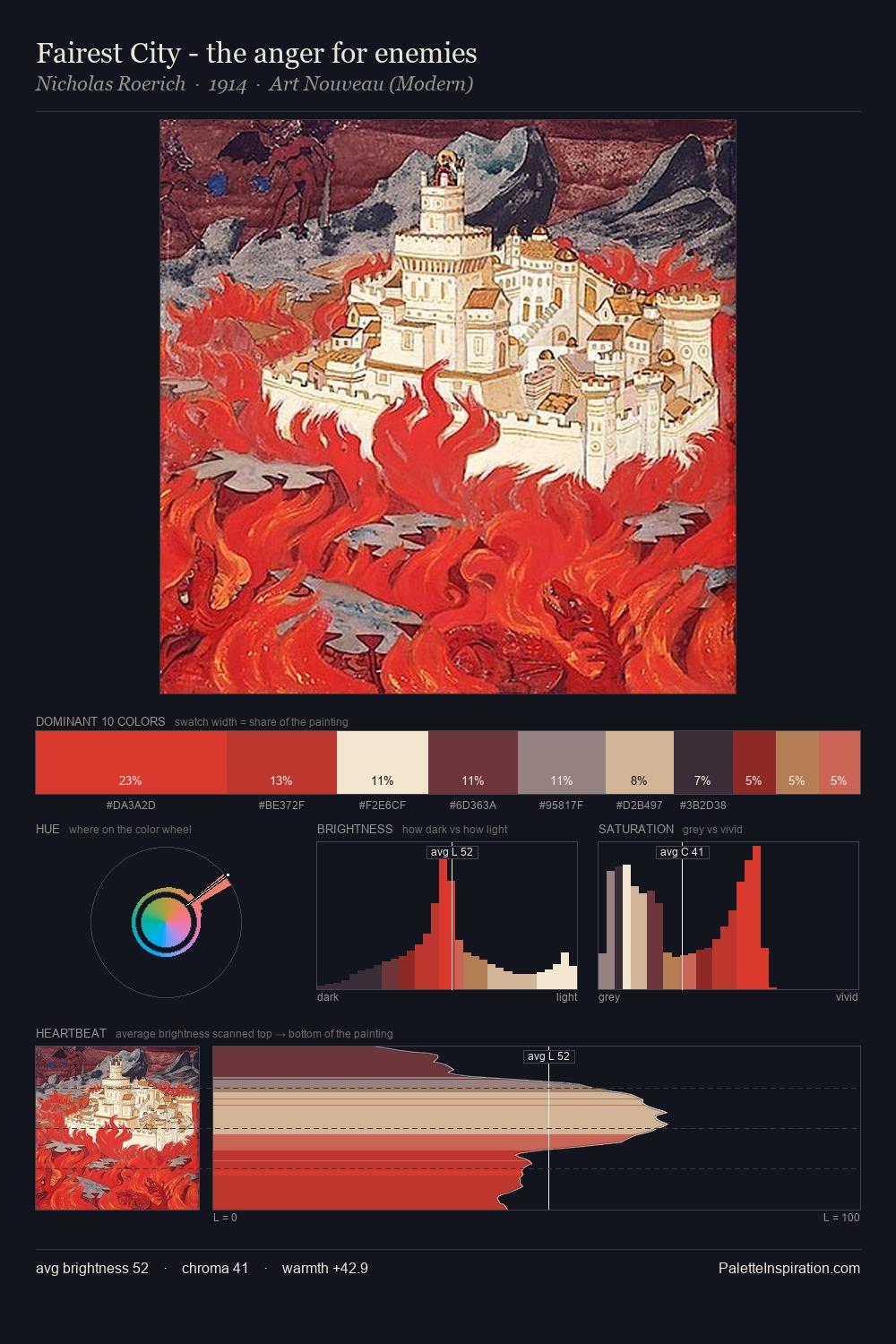
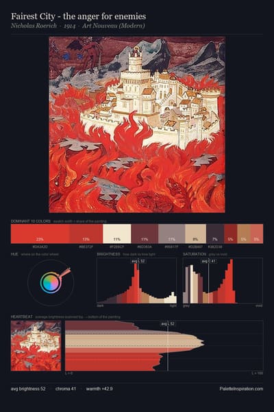
Fairest City - the anger for enemies palette card
Fairest City - the anger for enemies
Nicholas Roerich · 1914
Studio Interior, Model for the Scenery of La Lepreuse palette card
Studio Interior, Model for the Scenery of La Lepreuse
Edouard Vuillard · 1919
Poppies and Daisies in a Blue Vase palette card
Poppies and Daisies in a Blue Vase
Odilon Redon

Master palettes

Palettes Featuring Cinnabar

6 palettes where Cinnabar appears prominently — one per artist.

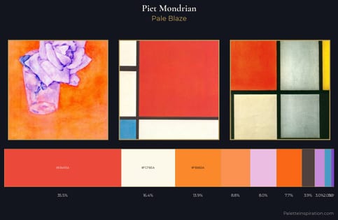
Piet Mondrian Palette 1 - Pale Blaze

Piet Mondrian

35.4% Cinnabar

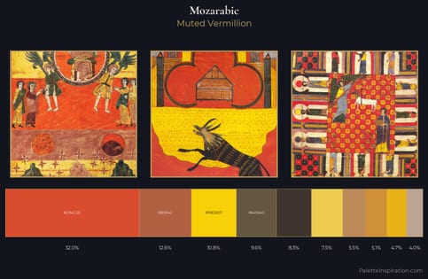
Mozarabic Palette 3 - Muted Vermillion

Mozarabic

32.0% Cinnabar

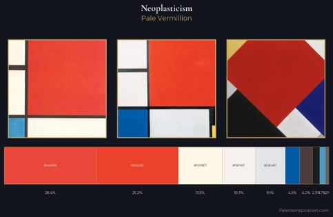
Neoplasticism Palette 6 - Pale Vermillion

Neoplasticism

28.4% Cinnabar

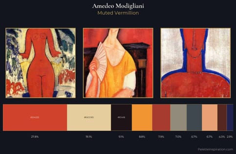
Amedeo Modigliani Palette 12 - Muted Vermillion

Amedeo Modigliani

27.8% Cinnabar

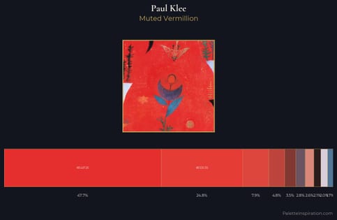
Paul Klee Palette 12 - Muted Vermillion

Paul Klee

24.8% Cinnabar

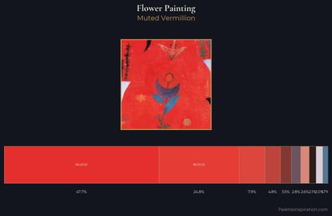
flower painting Palette 26 - Muted Vermillion

flower painting

24.8% Cinnabar

Choose another color