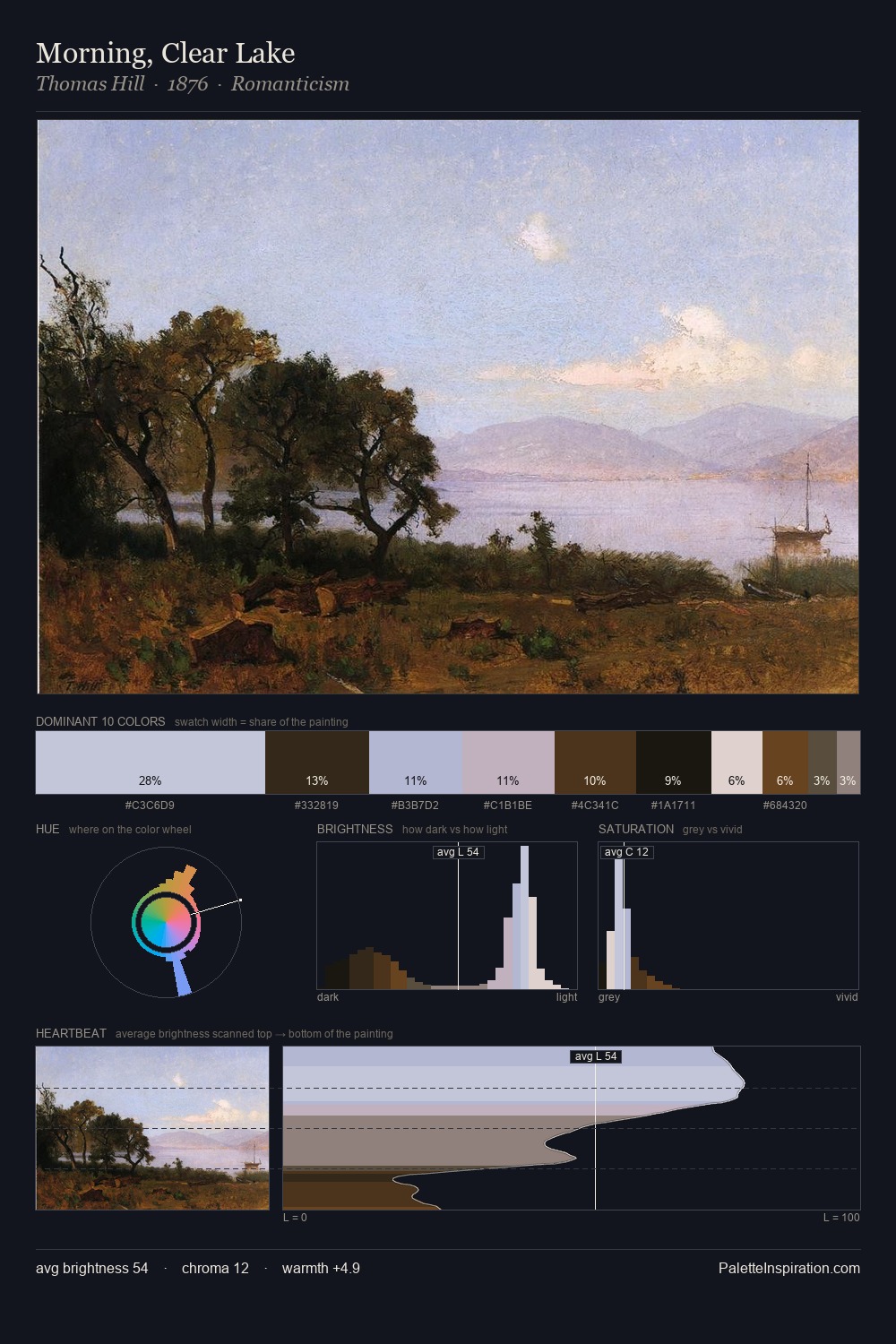
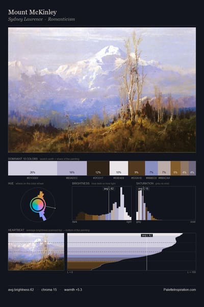
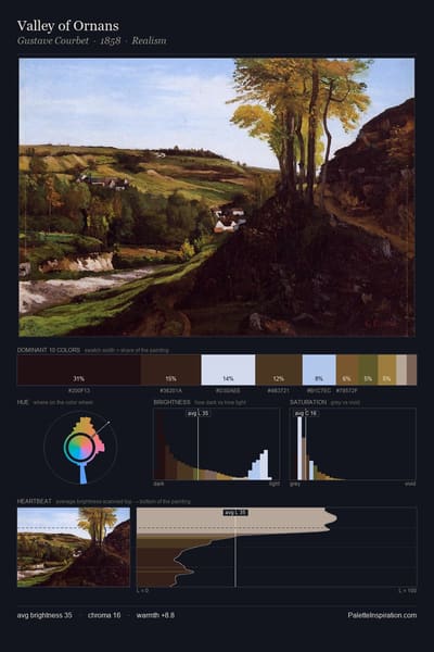
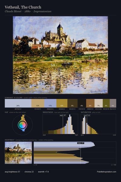
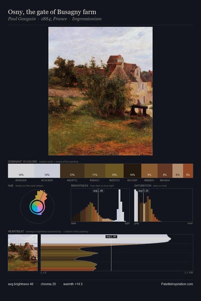
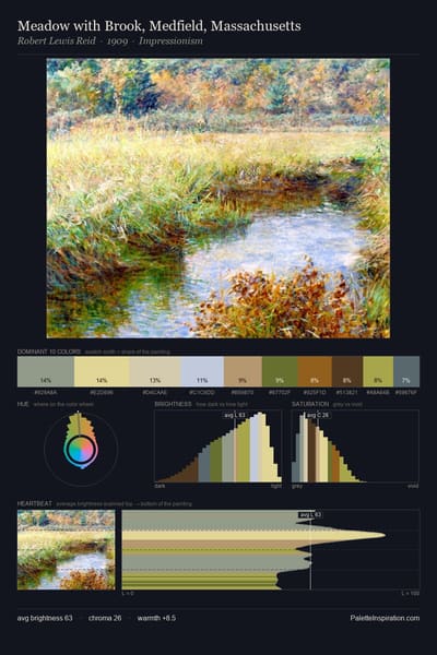
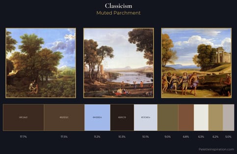
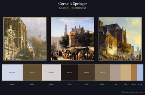
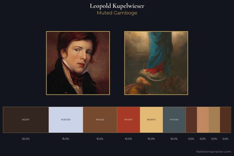
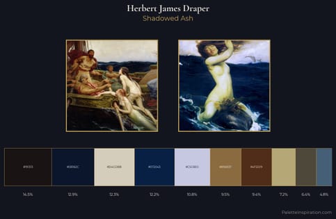
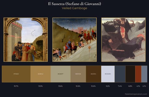
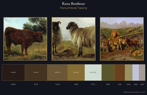
Café noir (#4B3621) and Light periwinkle (#C5CBE1) appear together across 6 master palettes in our corpus, most prominently in the work of Cornelis Springer, Leopold Kupelwieser, and Herbert James Draper and the Romanticism tradition. Painters typically deployed café noir at an average of 14% of the canvas, with light periwinkle at 9%. Third colors most often completing the combination include Eerie black (#1B1B1B), Raw umber (#826644), and Shadow (#8A795D).