Color one

Blue sapphire

#126180

Color two

Dark spring green

#177245

Blue sapphire (#126180) and Dark spring green (#177245) appear together across 2 master palettes in our corpus, most prominently in the work of Otto Freundlich and the Abstract Art tradition. Painters typically deployed blue sapphire at an average of 6% of the canvas, with dark spring green at 5%. Third colors most often completing the combination include Canary (#FFFF99), Old gold (#CFB53B), and Black olive (#3B3C36).
Artworks Featuring Blue sapphire & Dark spring green

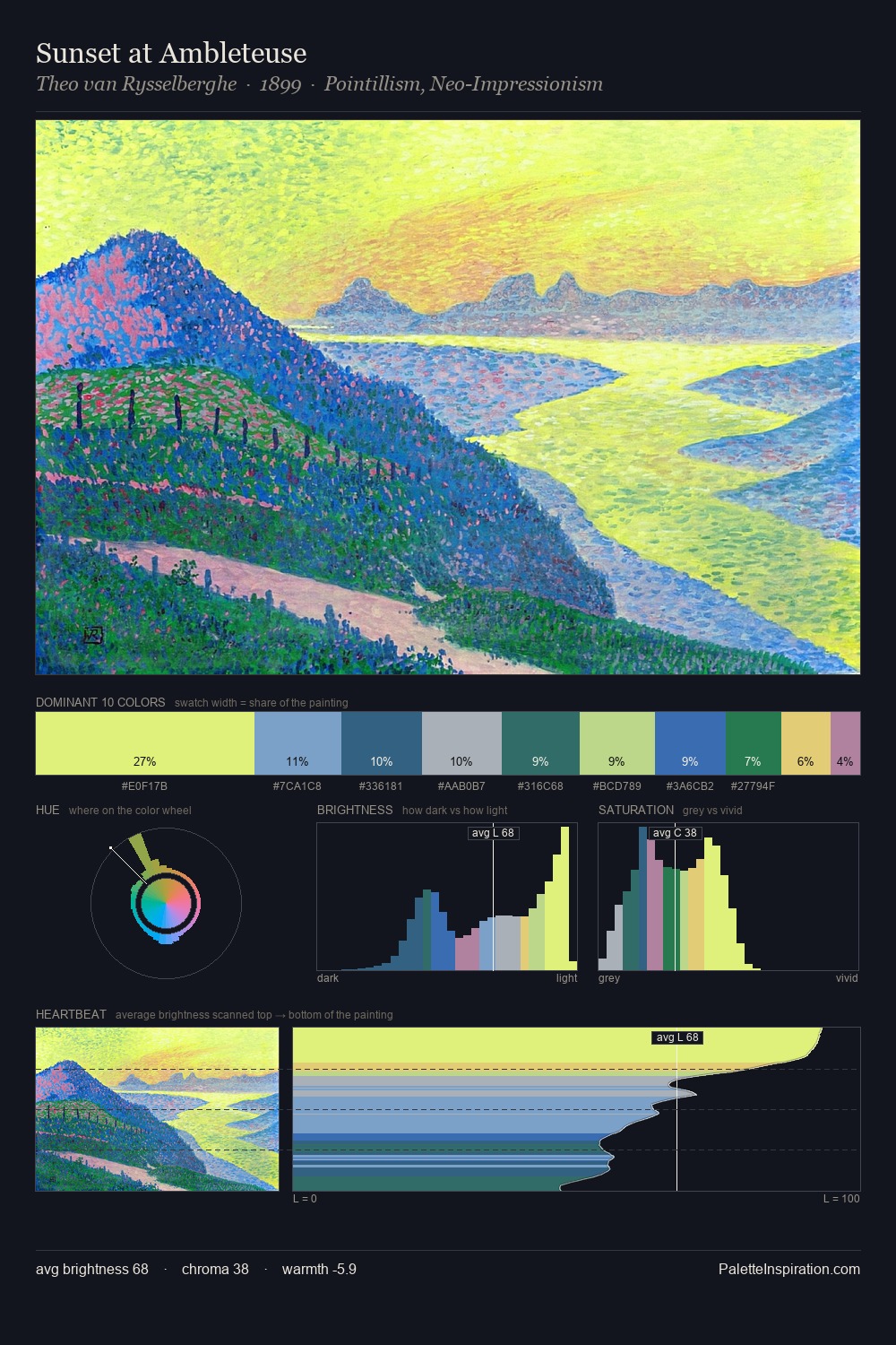
Sunset at Ambleteuse palette card
Sunset at Ambleteuse
Theo van Rysselberghe · 1899
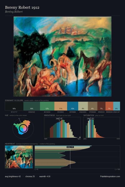
Bereny Robert 1912 palette card
Bereny Robert 1912
Berény Róbert
Carnaval palette card
Carnaval
Laura Knight · 1920
Karelian landscape palette card
Karelian landscape
Nicholas Roerich · 1917
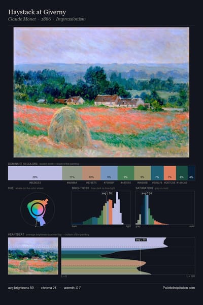
Haystack at Giverny palette card
Haystack at Giverny
Claude Monet · 1886
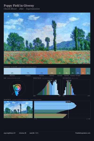
Poppy Field in Giverny palette card
Poppy Field in Giverny
Claude Monet · 1890

Master palettes

Palettes Featuring Blue sapphire & Dark spring green

1 master palette where Blue sapphire and Dark spring green appear together most prominently.

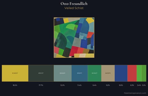
Otto Freundlich Palette 4 - Veiled Schist

Otto Freundlich

11.4% Blue sapphire · 9.4% Dark spring green

Choose another color