Color one

B'dazzled blue

#2E5894

Color two

Light purple

#D8BFD8

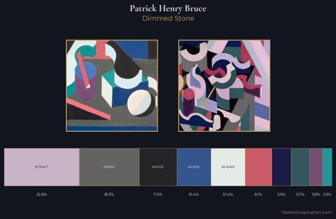
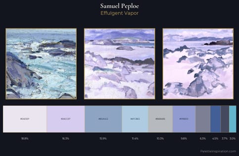
B'dazzled blue (#2E5894) and Light purple (#D8BFD8) appear together across 3 master palettes in our corpus, most prominently in the work of Patrick Henry Bruce, and Samuel Peploe and the Cubism tradition. Painters typically deployed b'dazzled blue at an average of 5% of the canvas, with light purple at 13%. Third colors most often completing the combination include Blue bell (#A2A2D0), Cerulean frost (#6D9BC3), and Wild blue yonder (#A2ADD0).
Artworks Featuring B'dazzled blue & Light purple

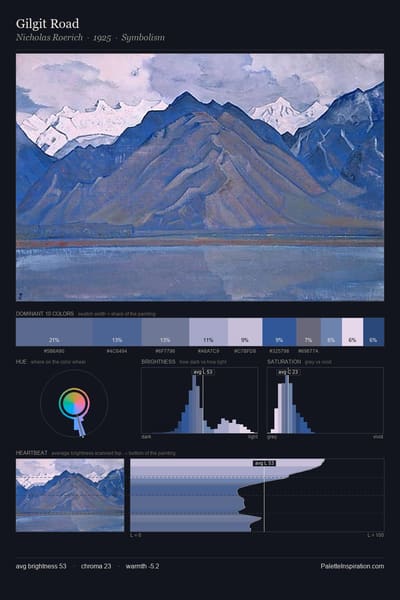
Gilgit Road palette card
Gilgit Road
Nicholas Roerich · 1925
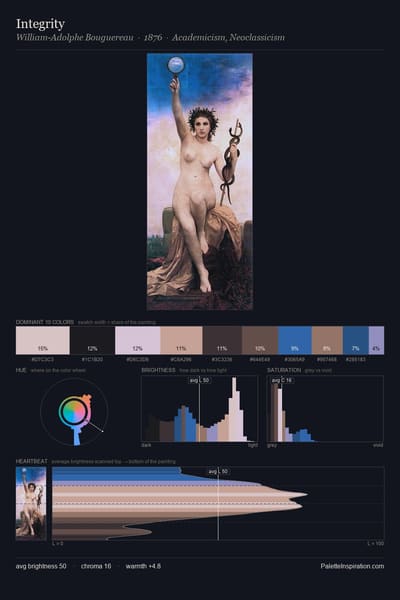
Integrity palette card
Integrity
William-Adolphe Bouguereau · 1876
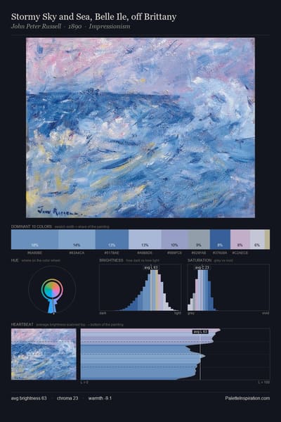
Stormy Sky and Sea, Belle Ile, off Brittany palette card
Stormy Sky and Sea, Belle Ile, off Brittany
John Peter Russell · 1890
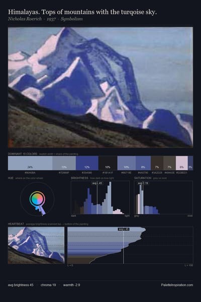
Himalayas. Tops of mountains with the turqoise sky. palette card
Himalayas. Tops of mountains with the turqoise sky.
Nicholas Roerich · 1937
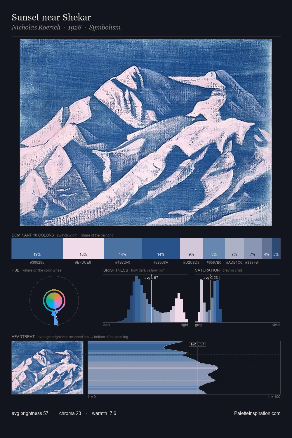
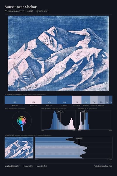
Sunset near Shekar palette card
Sunset near Shekar
Nicholas Roerich · 1928
Svyatogor palette card
Svyatogor
Nicholas Roerich · 1942

Master palettes

Palettes Featuring B'dazzled blue & Light purple

2 master palettes where B'dazzled blue and Light purple appear together most prominently.

Patrick Henry Bruce Palette 3 - Dimmed Stone

Patrick Henry Bruce

10.4% B'dazzled blue · 22.8% Light purple

Samuel Peploe Palette 1 - Effulgent Vapor

Samuel Peploe

4.5% B'dazzled blue · 16.3% Light purple

Choose another color