Clarence Gagnon Palette 3

Palette Analysis
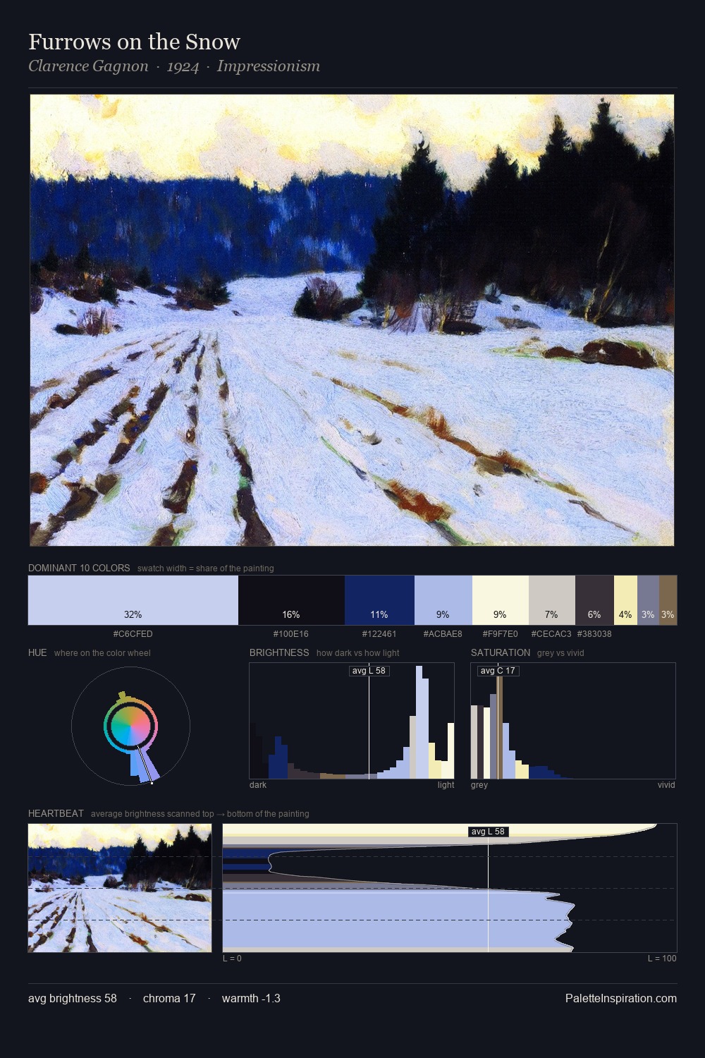
Clarence Gagnon distributes its values across the middle register, creating harmony without high contrast. Cool tones set the register here - the blues and greens easily outweigh any warm accents. The absence of saturated colour is itself an expressive choice: this is a palette of restraint and atmosphere. #C3CDED claims 36.0% of the surface, functioning as the work's tonal foundation. The saturated accent, #F4EAAB, registers at 1.8% - sparse enough to feel like a deliberate surprise. 80 units of value range underpin the palette's structural clarity: the eye always knows where light falls. The mid-to-high key, cool bias, and moderate chroma point to outdoor observation - sky and diffused daylight as the dominant light source. In the context of Clarence Gagnon's full range of palettes, group 3 represents one movement in an ongoing chromatic dialogue.
Example use cases
- publishing
- corporate identity
- consumer apps
- hospitality
- design agencies
I Love This!
Copy, export, or download for your project