Cima da Conegliano Palette 4

Palette Analysis
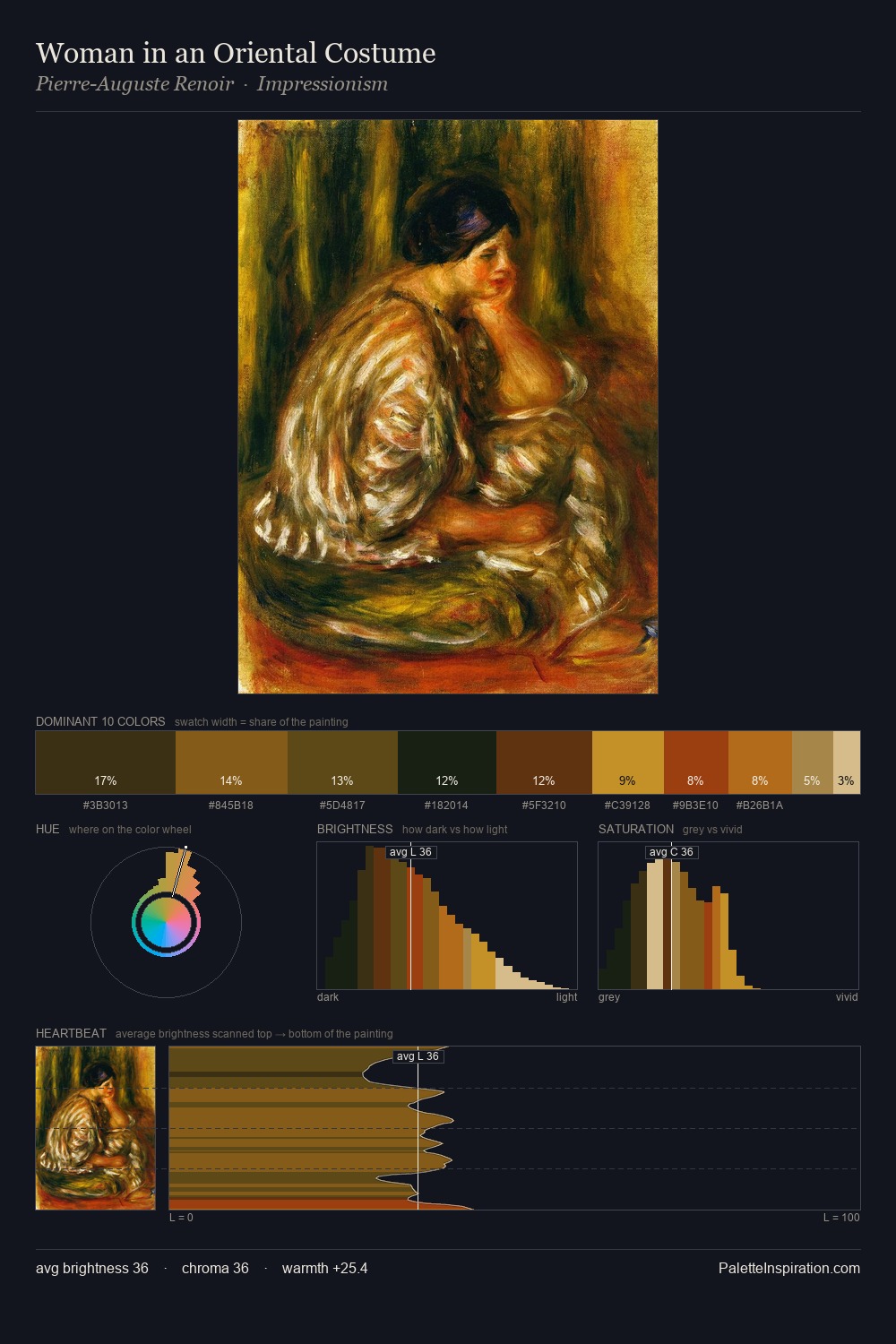
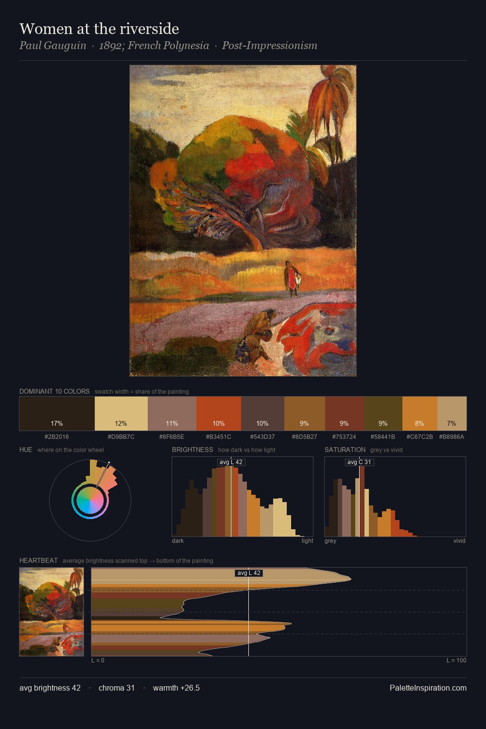
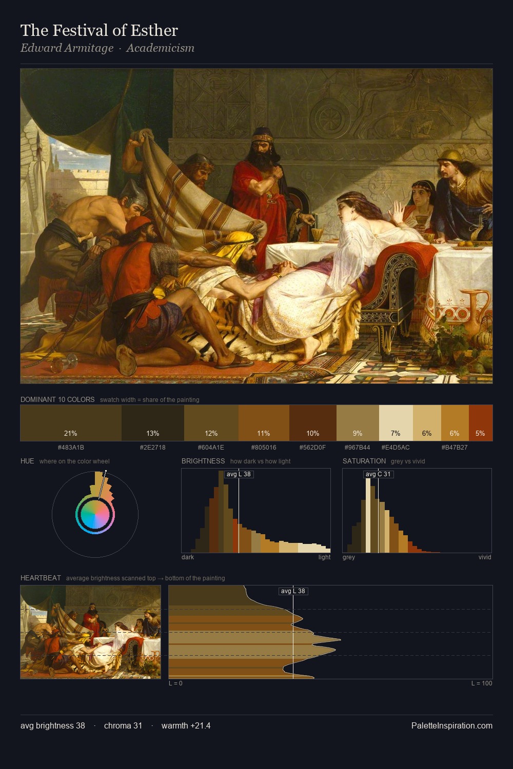
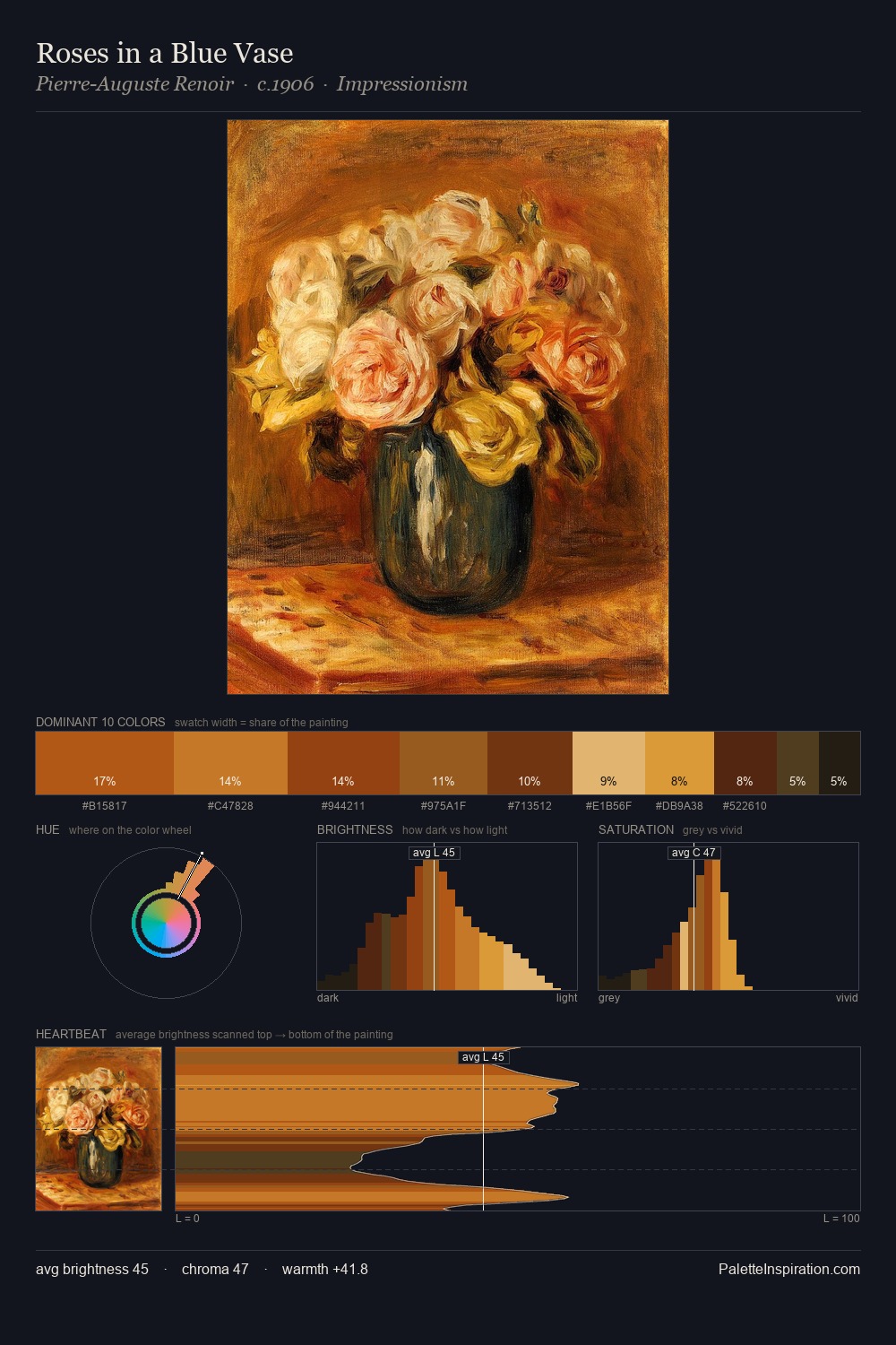
Cima da Conegliano distributes its values across the middle register, creating harmony without high contrast. Cima da Conegliano keeps warm and cool in parity, a balance that lends the work a perceptual shimmer. Mid-saturation across the board: the palette has colour character without chromatic excess. Only 8.9% is devoted to #97320B, yet that small allocation delivers the palette's entire chromatic tension. 57 units of value range underpin the palette's structural clarity: the eye always knows where light falls. The palette reads as an Impressionist one - light-biased, chromatically direct, and built on temperature contrast rather than value opposition. Cima da Conegliano's palette 4 carries its own internal logic while remaining in conversation with the artist's broader colour intelligence.
Example use cases
- premium streaming
- cocktail bars
- fashion campaigns
- book covers
- music labels
I Love This!
Copy, export, or download for your project