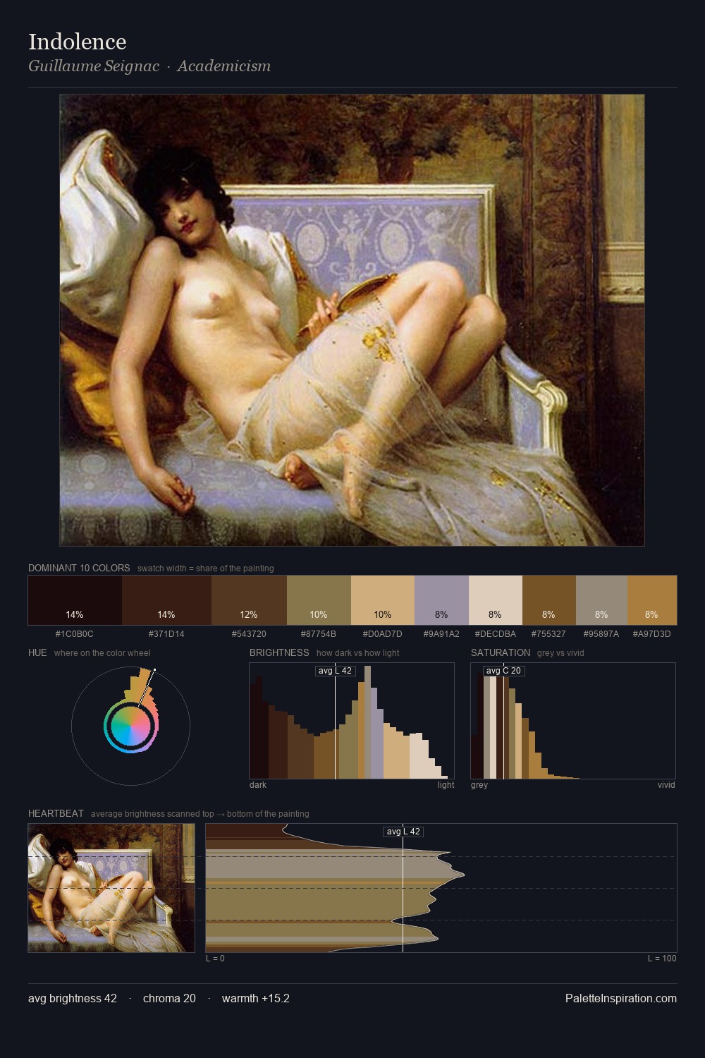
Charles Stuart Palette 1
Muted Apricot
Muted Deliberately desaturated - chroma pulled toward gray, the restraint of tonal painting.
Apricot Soft warm orange - peach-adjacent, the color of ripe stone fruit.

Palette Analysis
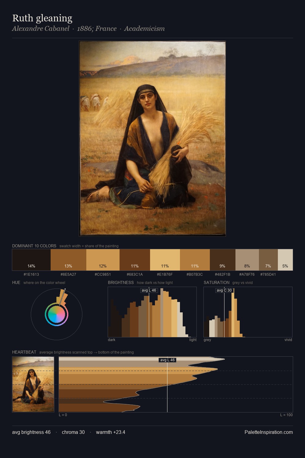
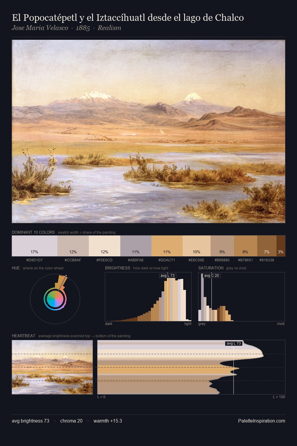
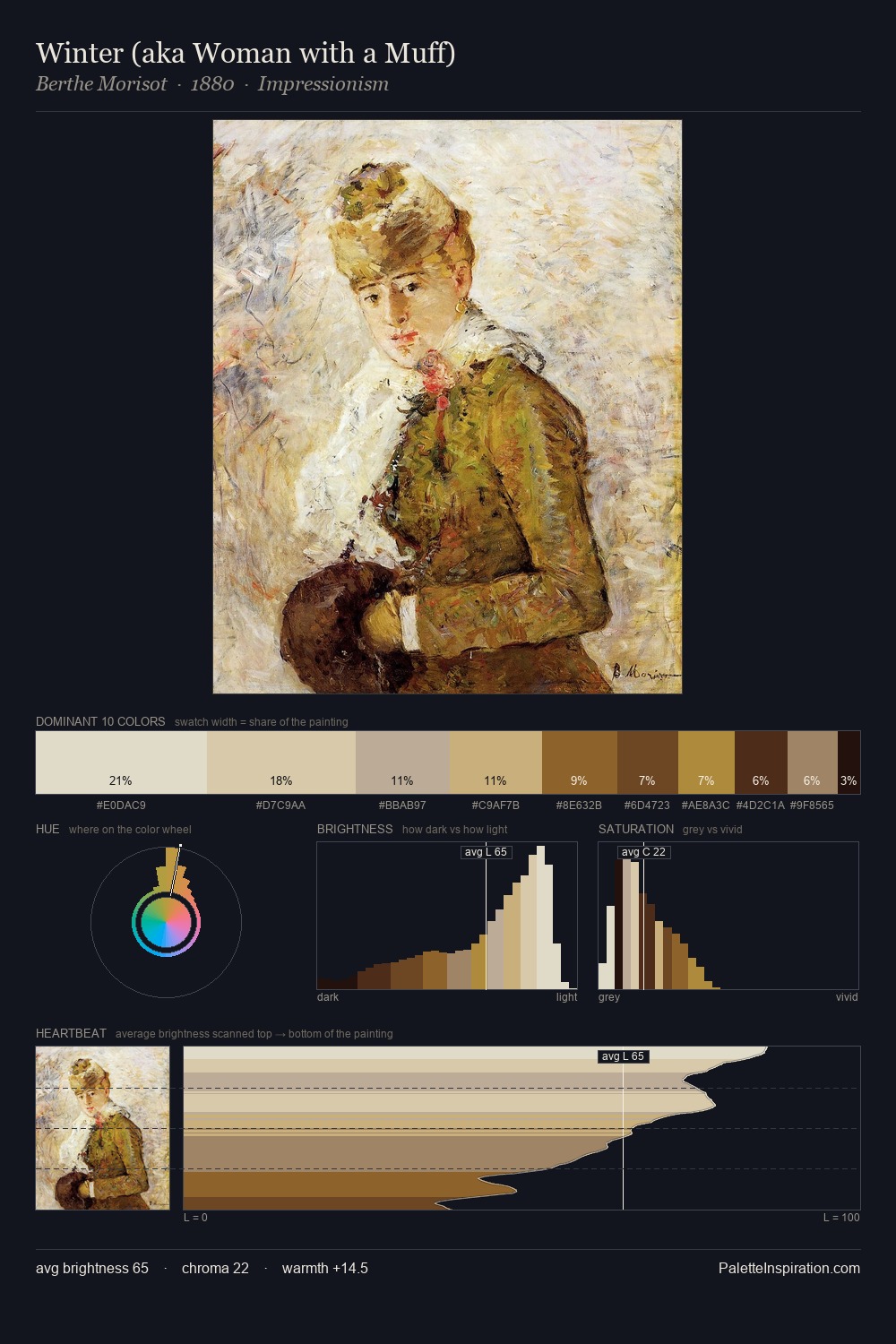
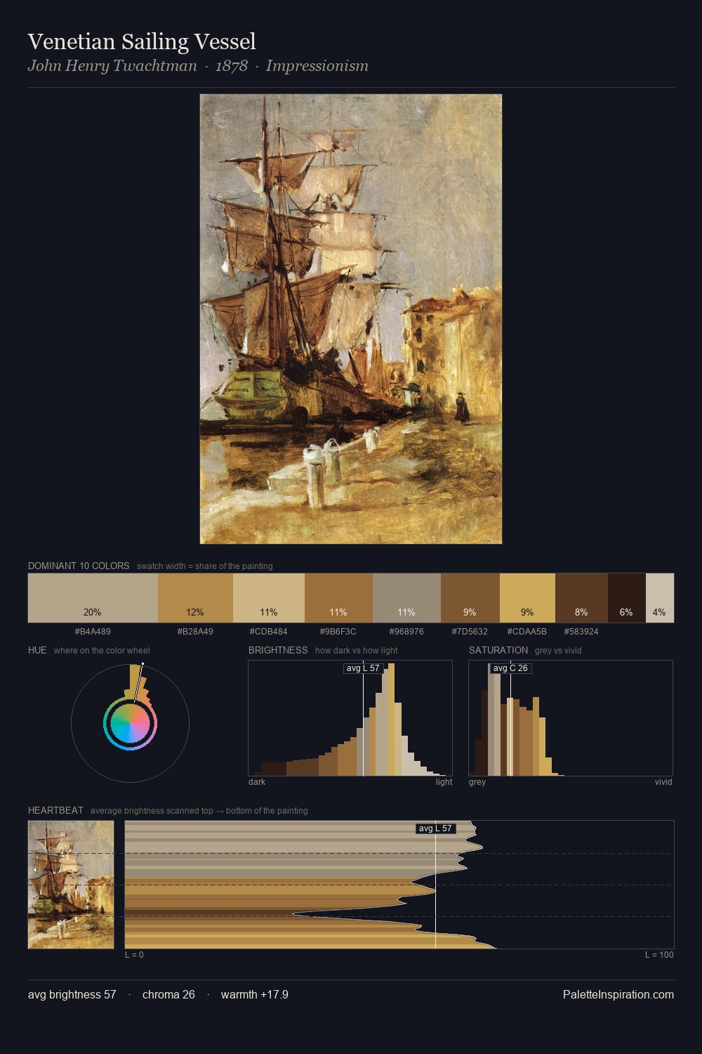
Mid-key values give Charles Stuart its characteristic quietness - nothing blazes, nothing disappears. Warmth dominates - the palette of Charles Stuart leans heavily on the yellow-orange-red arc of the colour wheel. Chroma is moderate: colours carry enough saturation to be read as colour, but the palette stops well short of garish intensity. The highest-chroma note - #462B16 - appears at just 10.5%, deployed as a precision accent against the quieter ground. The value range spans 57 units across the palette, providing the full gamut from deep shadow to near-white and ensuring clear tonal hierarchy. Palette 1 sits within the larger chromatic argument that Charles Stuart's complete body of work advances.
Example use cases
- ceramics & pottery
- boutique hospitality
- menswear
- heritage food brands
- craft & artisan brands
I Love This!
Use This Palette
Copy, export, or download for your project
Copy, export, or download for your project
Copy:
Download:
Share: