Carle Vernet Palette 6

Palette Analysis
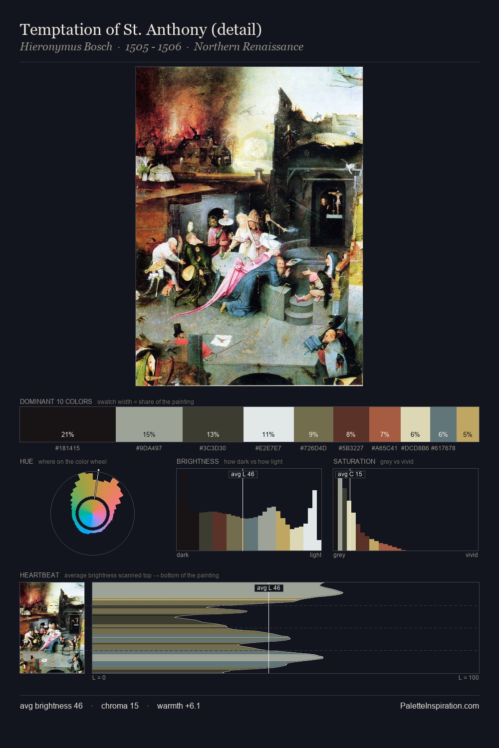
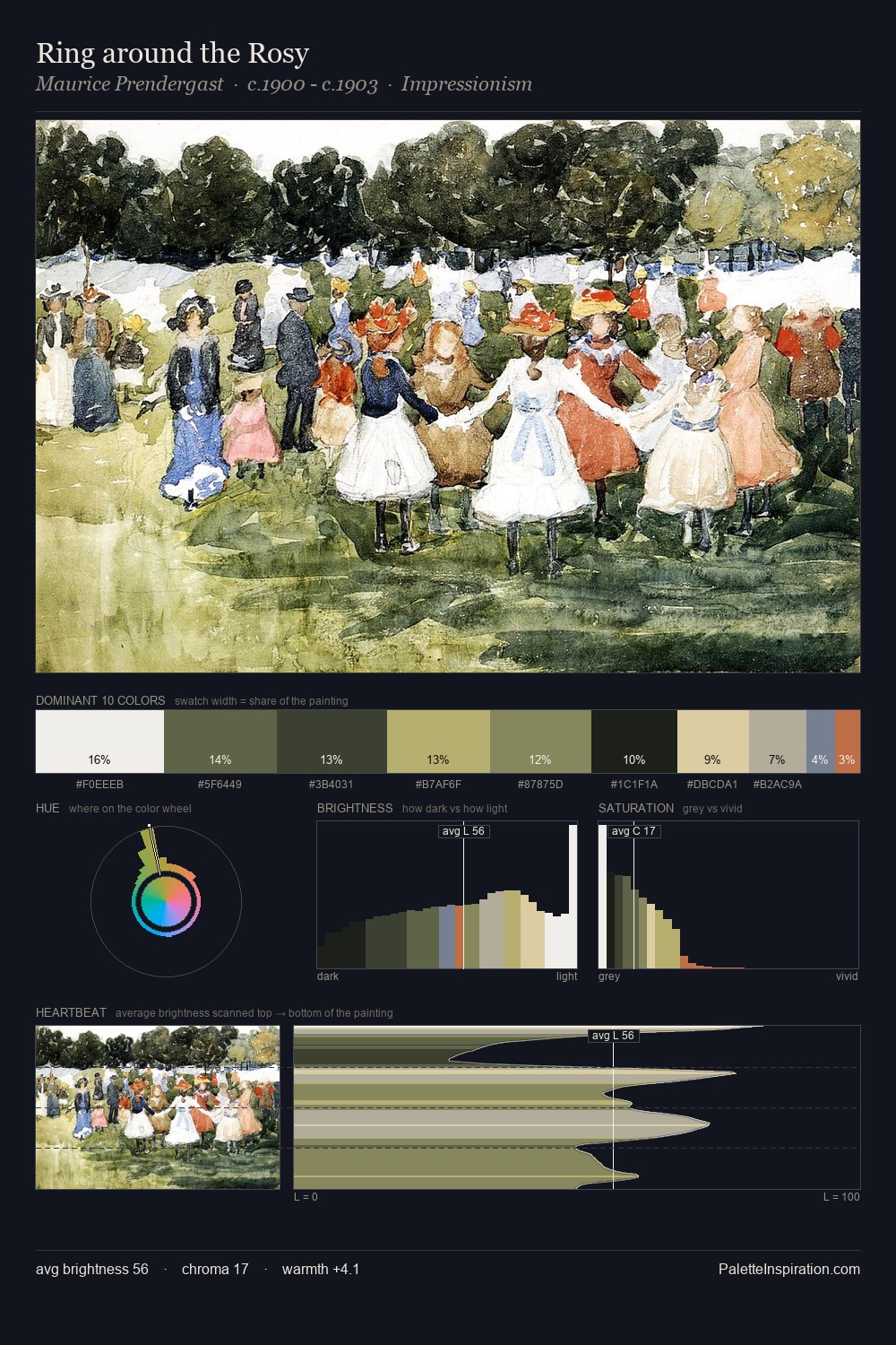
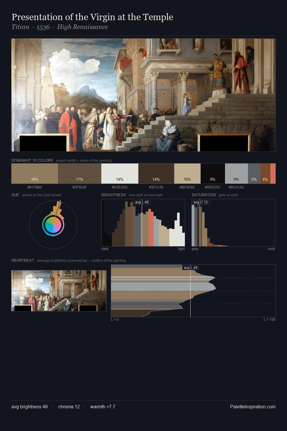
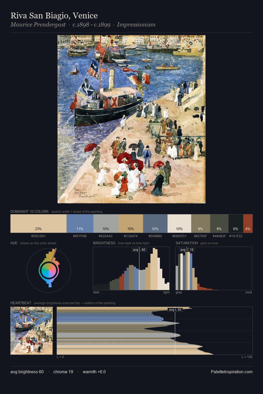
Carle Vernet is high in key: pale, luminous, and filled with optical air. Cool tones set the register here - the blues and greens easily outweigh any warm accents. Saturation is deliberately withheld - the beauty here lies in the near-monochromatic gradations rather than colour difference. At 30.8%, #CDE2F0 functions less as a colour accent and more as a complete atmospheric environment. #C26148 functions as the palette's exclamation mark: highest chroma, lowest percentage (0.5%). The value range spans 74 units across the palette, providing the full gamut from deep shadow to near-white and ensuring clear tonal hierarchy. The palette has the character of outdoor light: cool, mid-bright, with colour rendered faithfully rather than expressively. This is palette 6 of Carle Vernet's sequence - a single chapter in a chromatic story told across many works.
Example use cases
- publishing
- corporate identity
- consumer apps
- hospitality
- design agencies
I Love This!
Copy, export, or download for your project