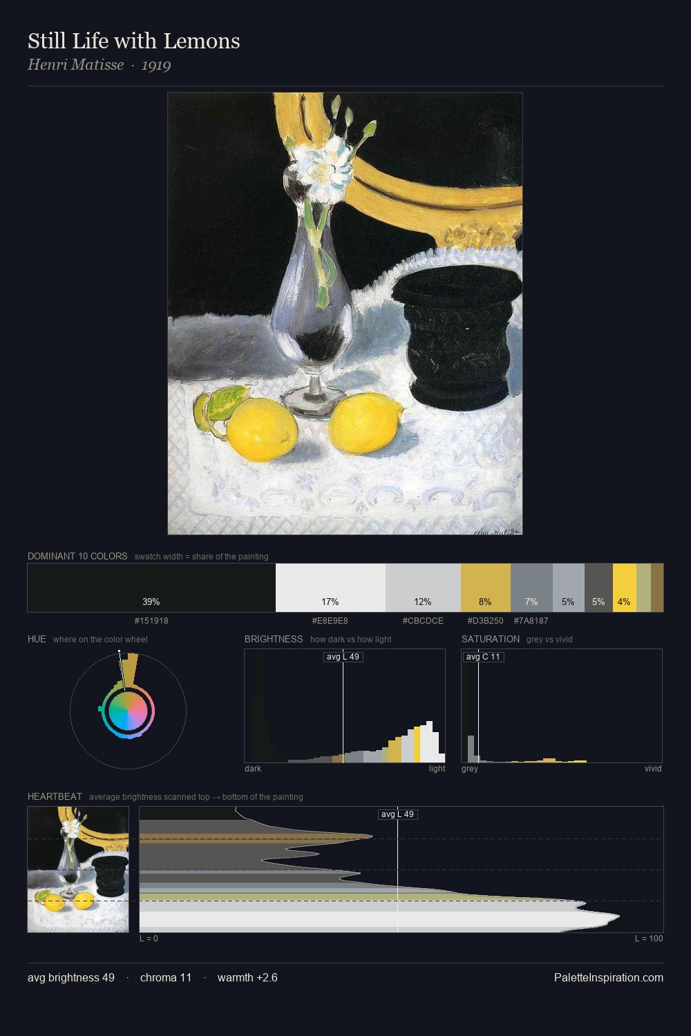
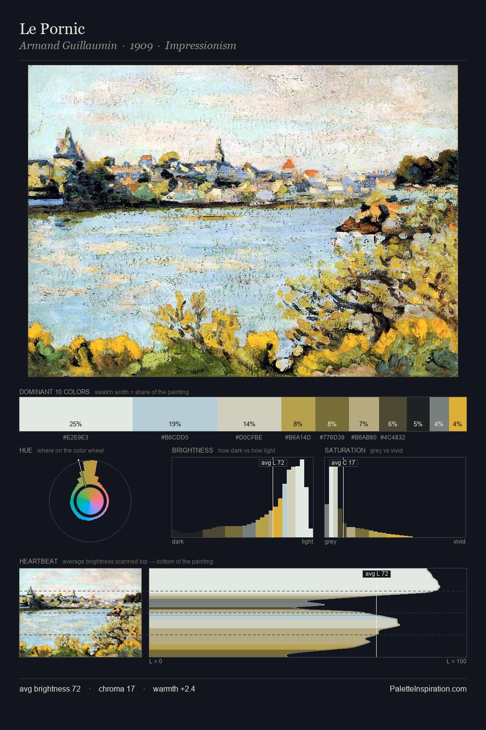
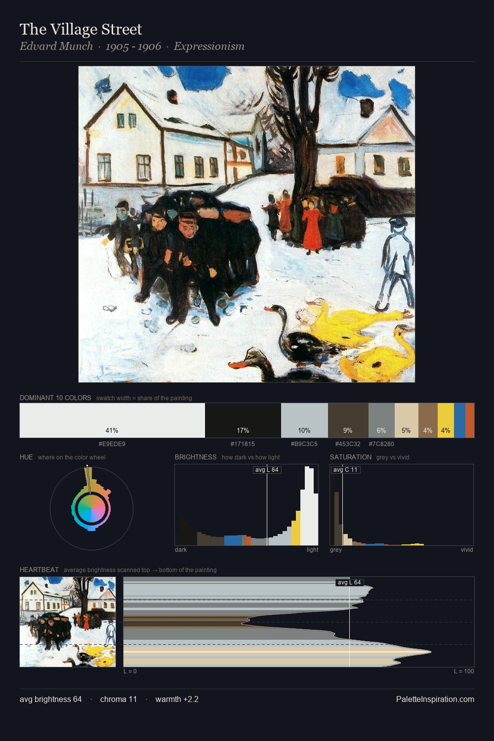
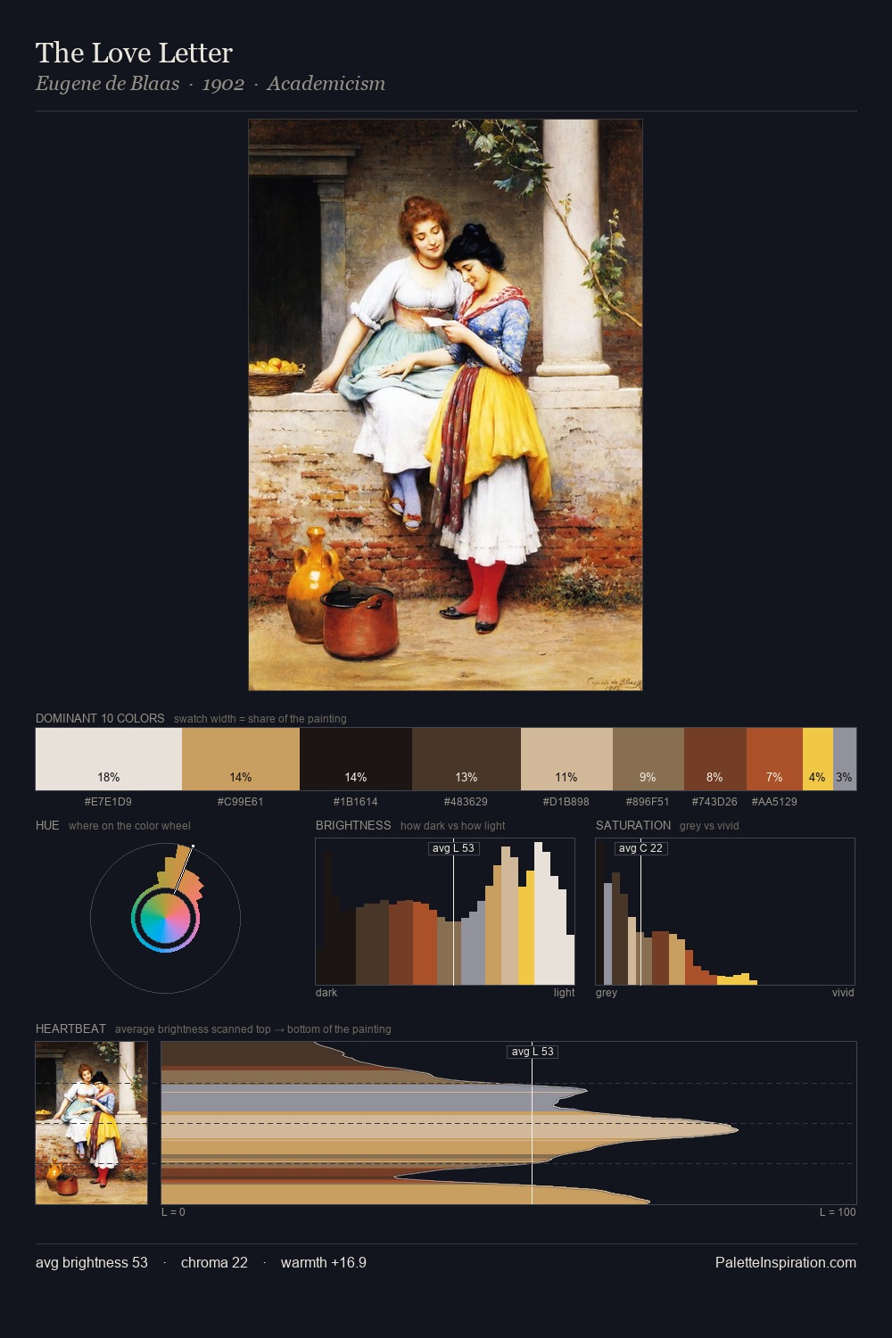
Carle Vernet Palette 2

Palette Analysis
Light floods Carle Vernet; the palette keeps values pale and airy across its range. Temperature is cool-dominant, with blue and green families claiming the largest areas. Every colour is desaturated; the palette proceeds through near-neutrals and gently-coloured greys. Carle Vernet gives 26.8% of the composition to a single #CBDBE5 - a decisive chromatic anchor. The saturated accent, #EEBE10, registers at 1.1% - sparse enough to feel like a deliberate surprise. At 70 units of value range, the palette has the tonal breadth to sustain complex spatial readings. The mid-to-high key, cool bias, and moderate chroma point to outdoor observation - sky and diffused daylight as the dominant light source. Palette 2 sits within the larger chromatic argument that Carle Vernet's complete body of work advances.
Example use cases
- ceramics & pottery
- boutique hospitality
- menswear
- heritage food brands
- craft & artisan brands
I Love This!
Copy, export, or download for your project