Carl Spitzweg Palette 6

Palette Analysis
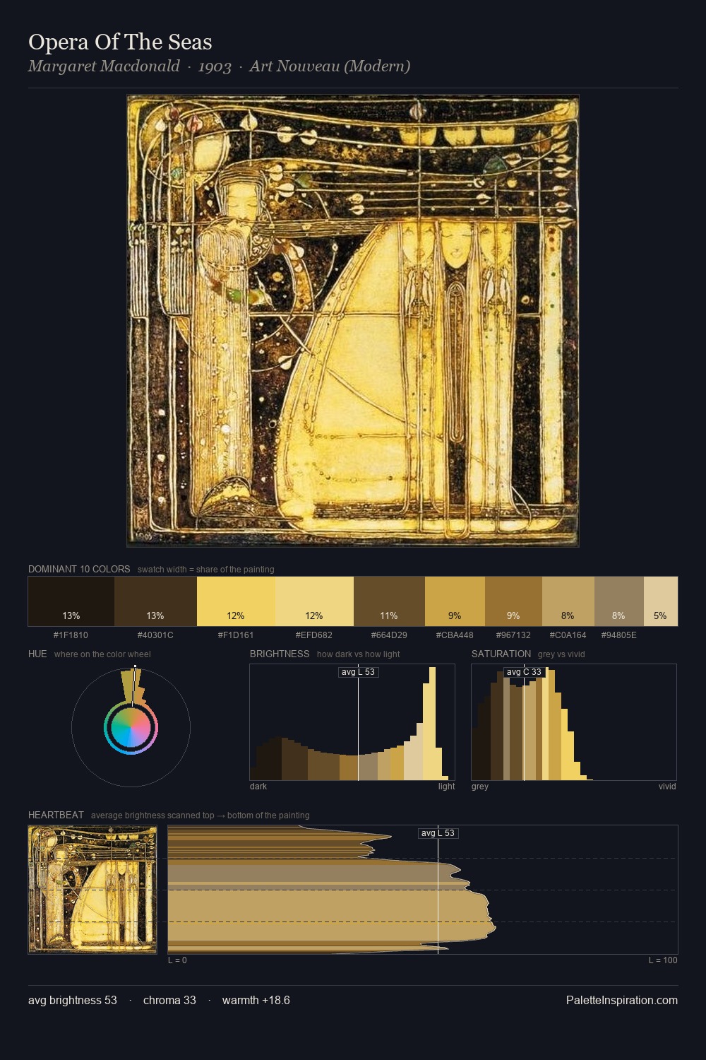
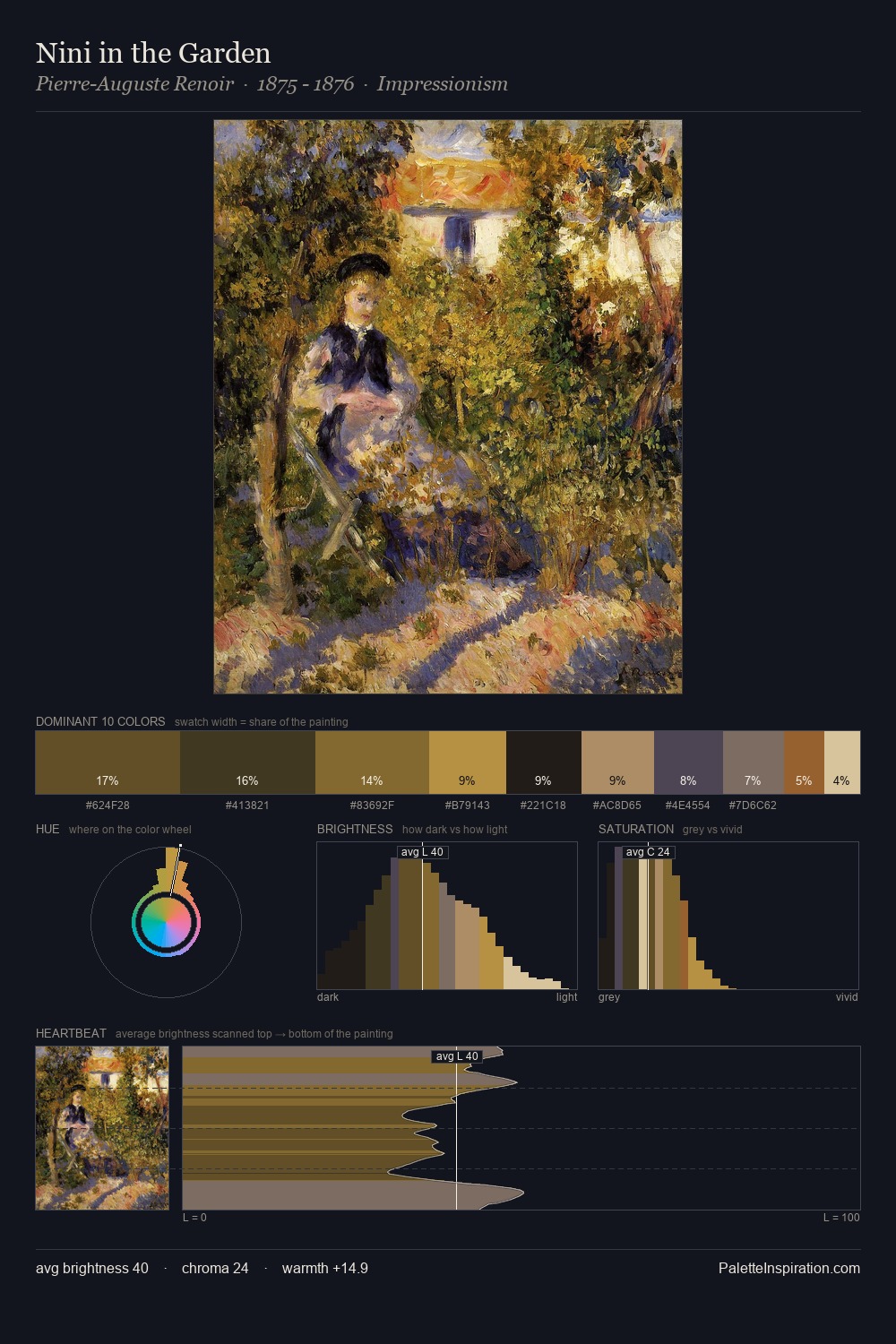
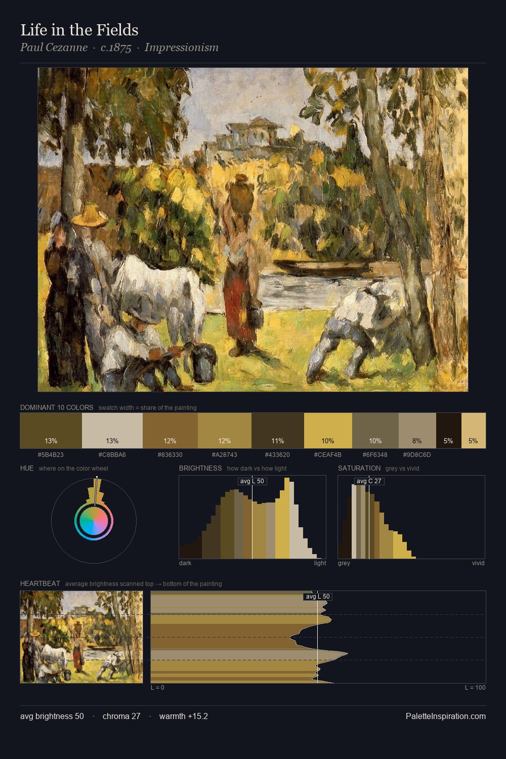
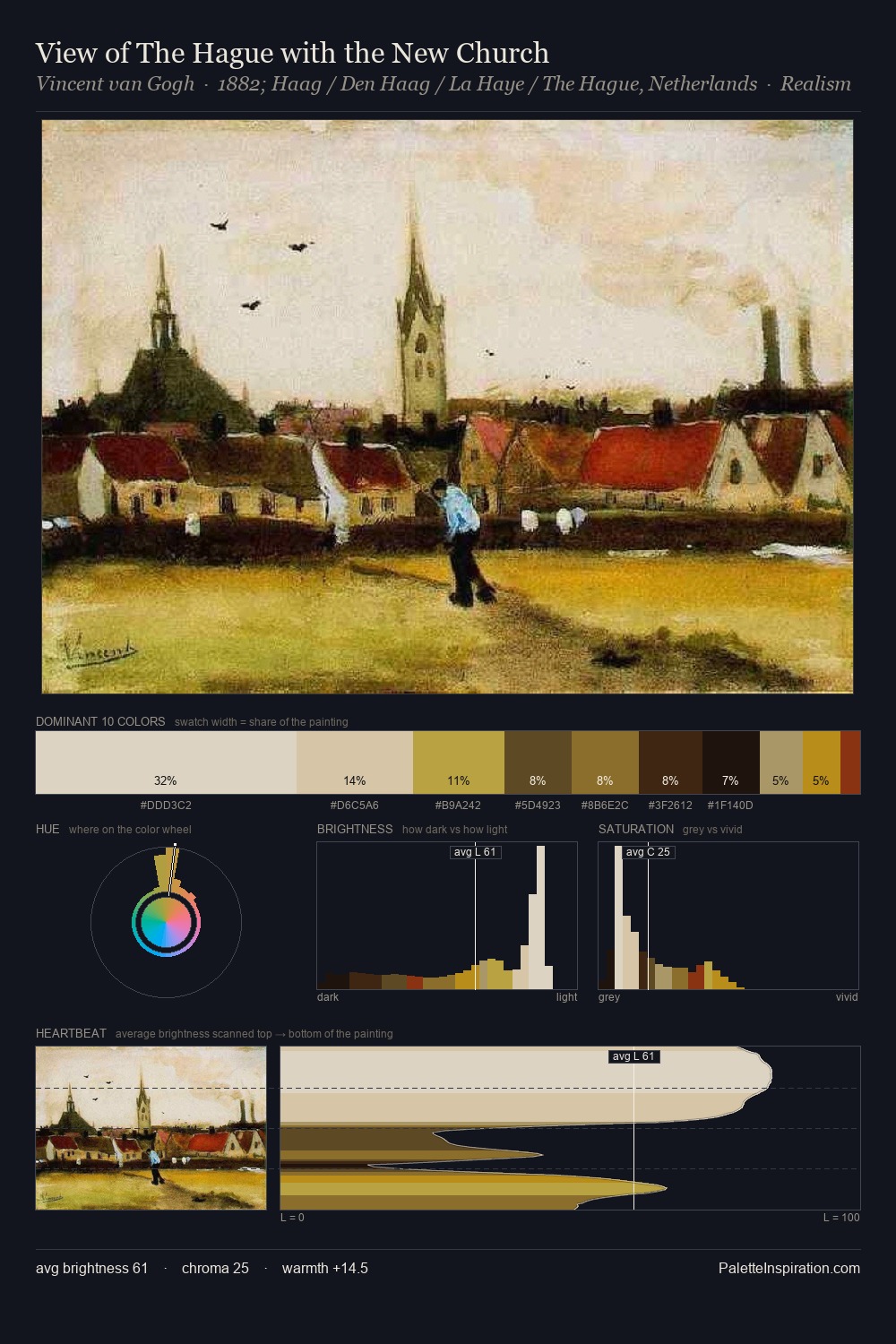
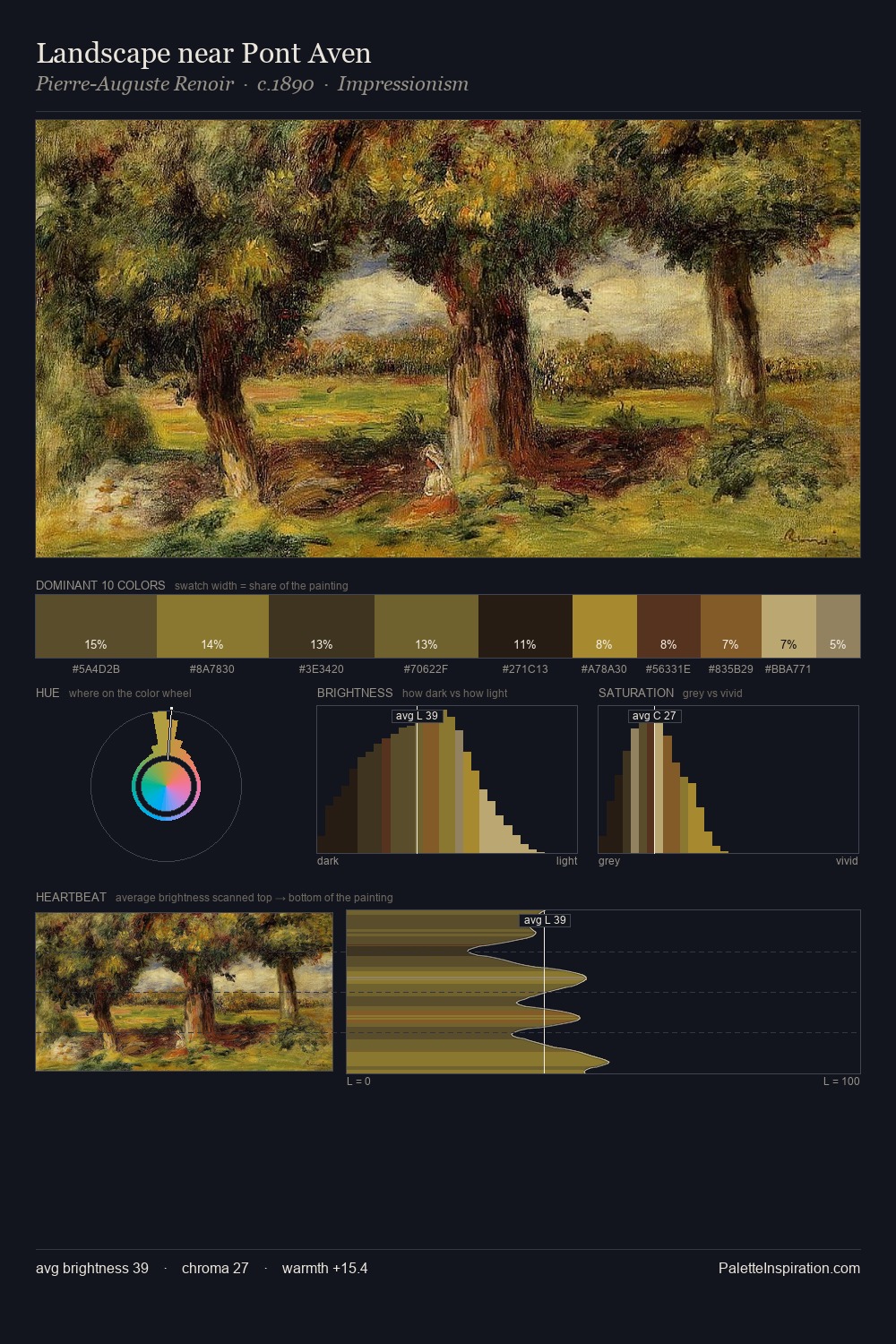
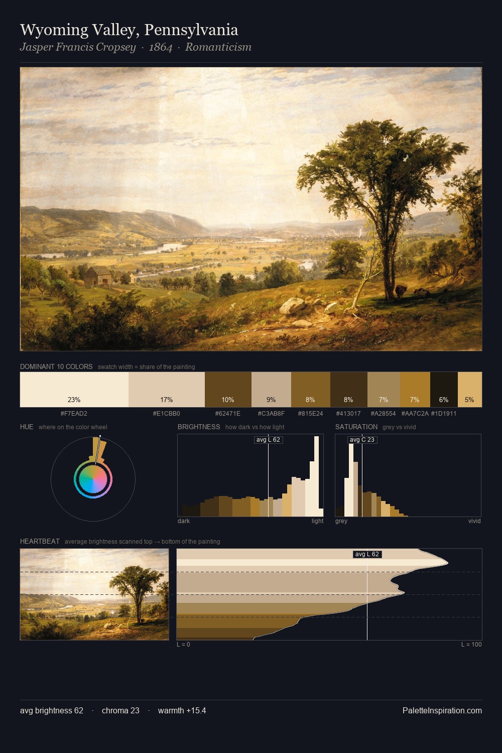
Carl Spitzweg occupies the comfortable middle of the value scale, avoiding both extremes to hold the eye in a sustained middle grey. Warm and cool tones are held in careful balance - neither family dominates, creating tension and resolution simultaneously. Saturation is measured and controlled, giving the palette presence without visual aggression. The most saturated colour, #BD932D, is reserved to 7.9% of the surface, where it acts as a focal punctuation. The value range spans 61 units across the palette, providing the full gamut from deep shadow to near-white and ensuring clear tonal hierarchy. Together these qualities point to the open-air Impressionist method: recording light rather than local colour. Palette 6 sits within the larger chromatic argument that Carl Spitzweg's complete body of work advances.
Example use cases
- theater design
- jewelry brands
- tobacco-adjacent retail
- event branding
- film & entertainment
I Love This!
Copy, export, or download for your project