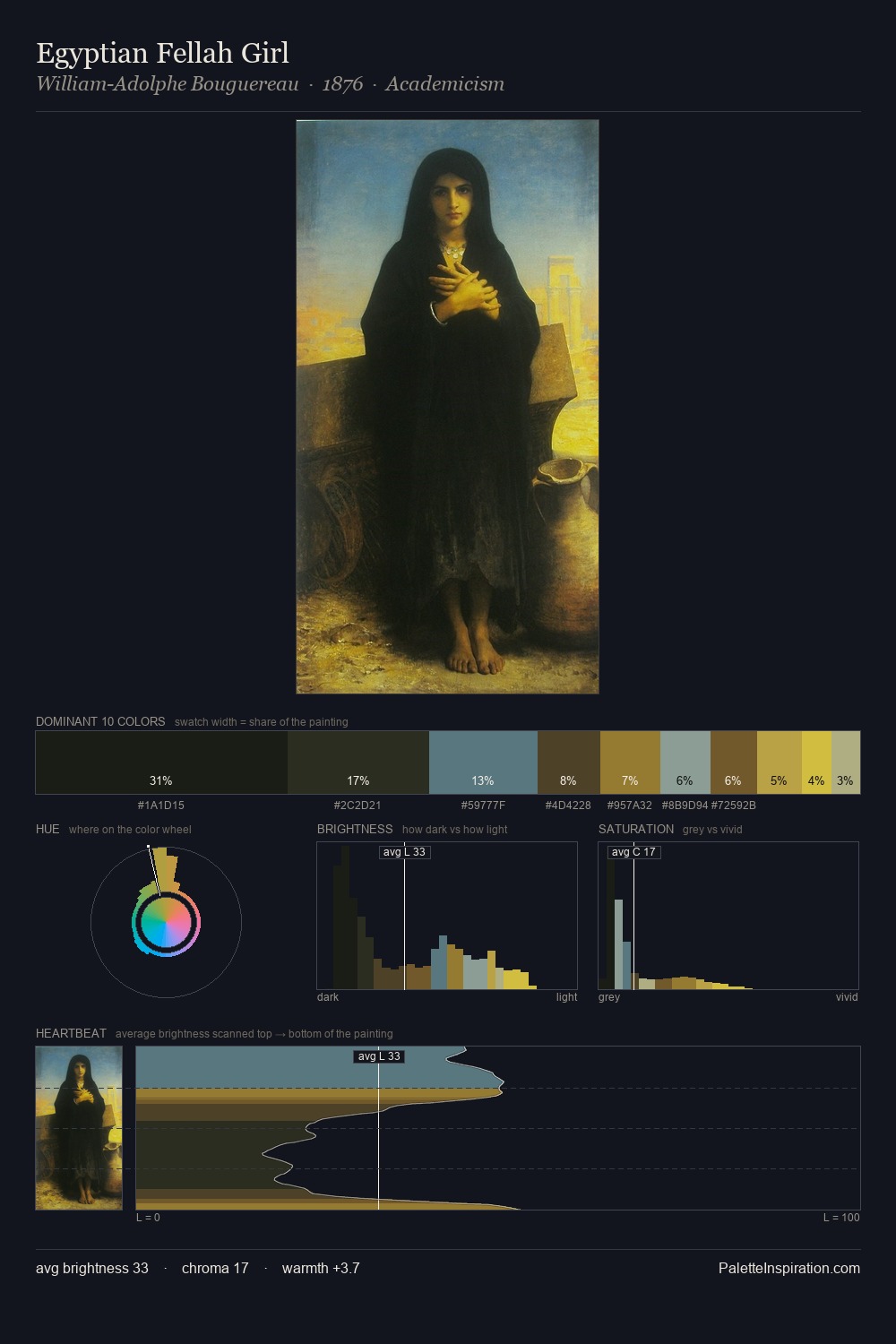
Carl Spitzweg Palette 10

Palette Analysis
Carl Spitzweg dwells firmly in the shadows, with no more than a whisper of light. Temperature reads distinctly warm: the reds and earth tones from Carl Spitzweg carry the compositional weight. Chroma is kept low across all colours, producing the soft, enveloping quality that characterises tonal painting. Only 1.4% is devoted to #CEBA3C, yet that small allocation delivers the palette's entire chromatic tension. From deepest dark to palest light, the palette traverses 58 units of the value scale - a span that creates natural depth. Together these qualities place Carl Spitzweg firmly in the tonal tradition - concerned with mood and atmosphere rather than chromatic display. Carl Spitzweg's palette 10 carries its own internal logic while remaining in conversation with the artist's broader colour intelligence.
Example use cases
- premium streaming
- cocktail bars
- fashion campaigns
- book covers
- music labels
I Love This!
Copy, export, or download for your project