Carl Schweninger the Elder Palette 4

Palette Analysis
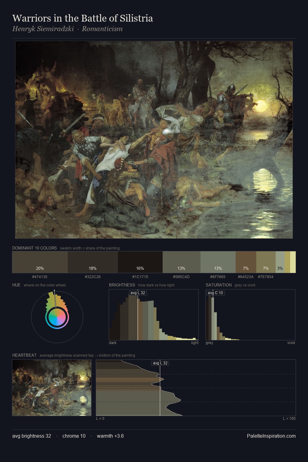
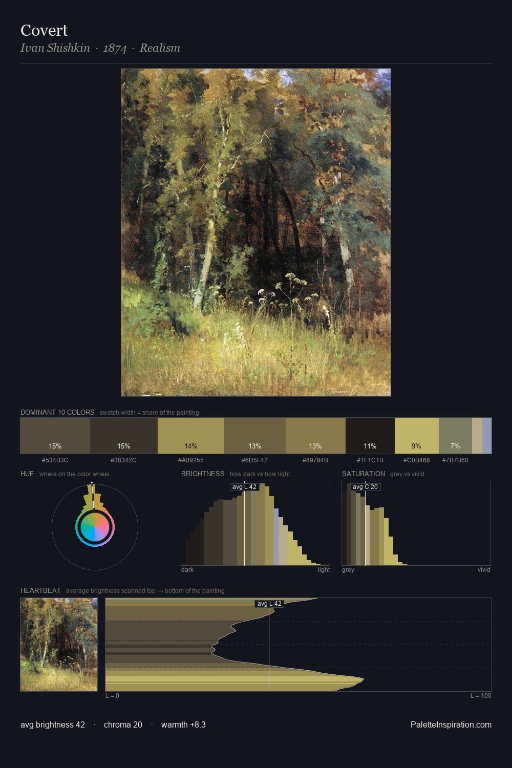
Carl Schweninger the Elder distributes its values across the middle register, creating harmony without high contrast. Cool hues prevail: blues, greens, and greys anchor the palette's emotional temperature. Saturation is deliberately withheld - the beauty here lies in the near-monochromatic gradations rather than colour difference. The most saturated colour, #7A7141, is reserved to 5.8% of the surface, where it acts as a focal punctuation. 42 units of value spread create a palette that is varied but unified - contrast in the service of harmony. The palette has the character of outdoor light: cool, mid-bright, with colour rendered faithfully rather than expressively. In the context of Carl Schweninger the Elder's full range of palettes, group 4 represents one movement in an ongoing chromatic dialogue.
Example use cases
- theater design
- jewelry brands
- tobacco-adjacent retail
- event branding
- film & entertainment
I Love This!
Copy, export, or download for your project