Carl Schweninger the Elder Palette 1

Palette Analysis
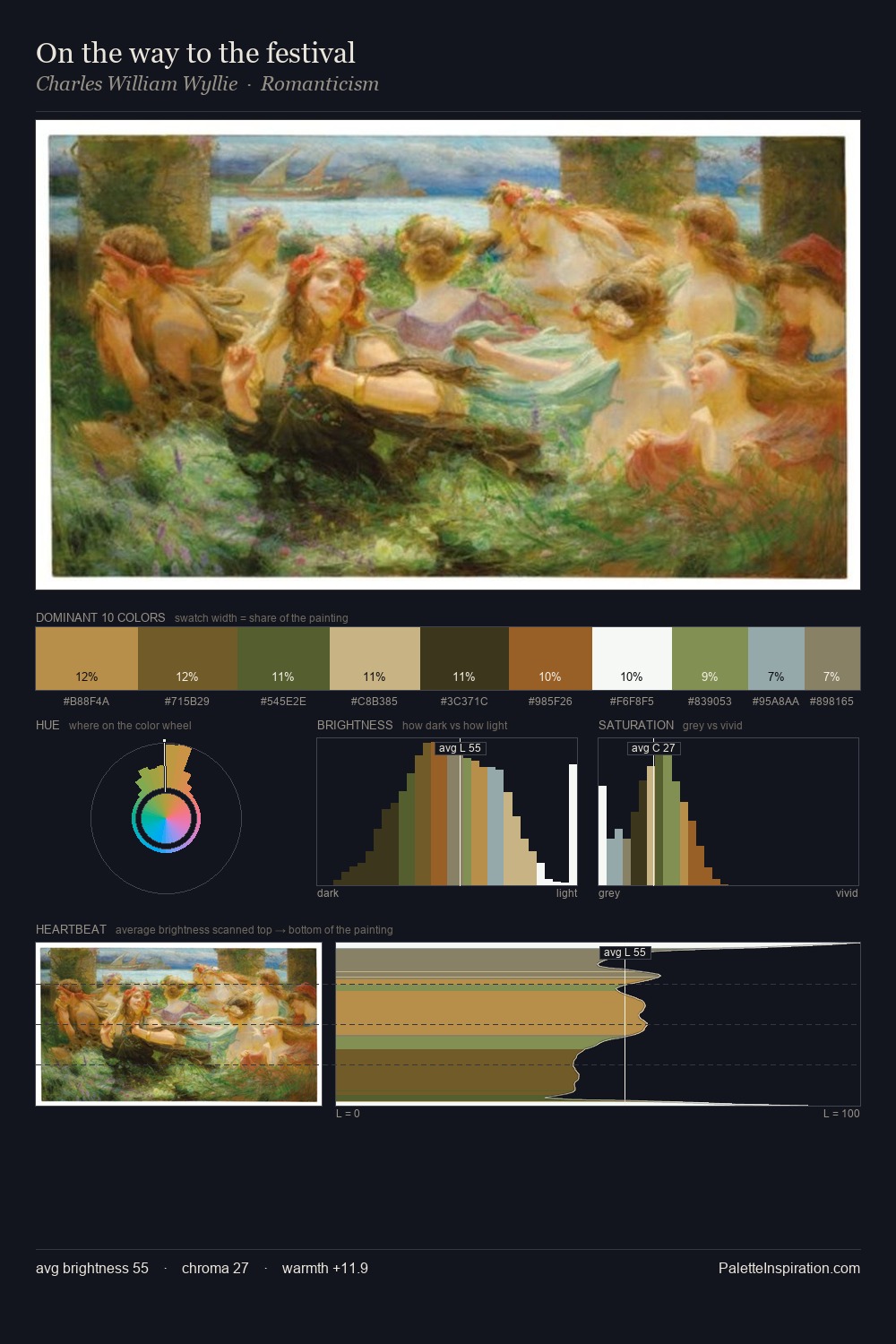
The high-key values of Carl Schweninger the Elder give it an effulgent, almost bleached quality. Carl Schweninger the Elder orchestrates warmth above all else - reds, ambers, and siennas take the lead. The absence of saturated colour is itself an expressive choice: this is a palette of restraint and atmosphere. The dominant colour, #FFFEFE, takes 38.0% of the total area, establishing the overall mood before any other hue is introduced. The most saturated colour, #9C6B34, is reserved to 8.1% of the surface, where it acts as a focal punctuation. 66 units of value range underpin the palette's structural clarity: the eye always knows where light falls. This is palette 1 of Carl Schweninger the Elder's sequence - a single chapter in a chromatic story told across many works.
Example use cases
- publishing
- corporate identity
- consumer apps
- hospitality
- design agencies
I Love This!
Copy, export, or download for your project