Carl Hasenpflug Palette 2

Palette Analysis
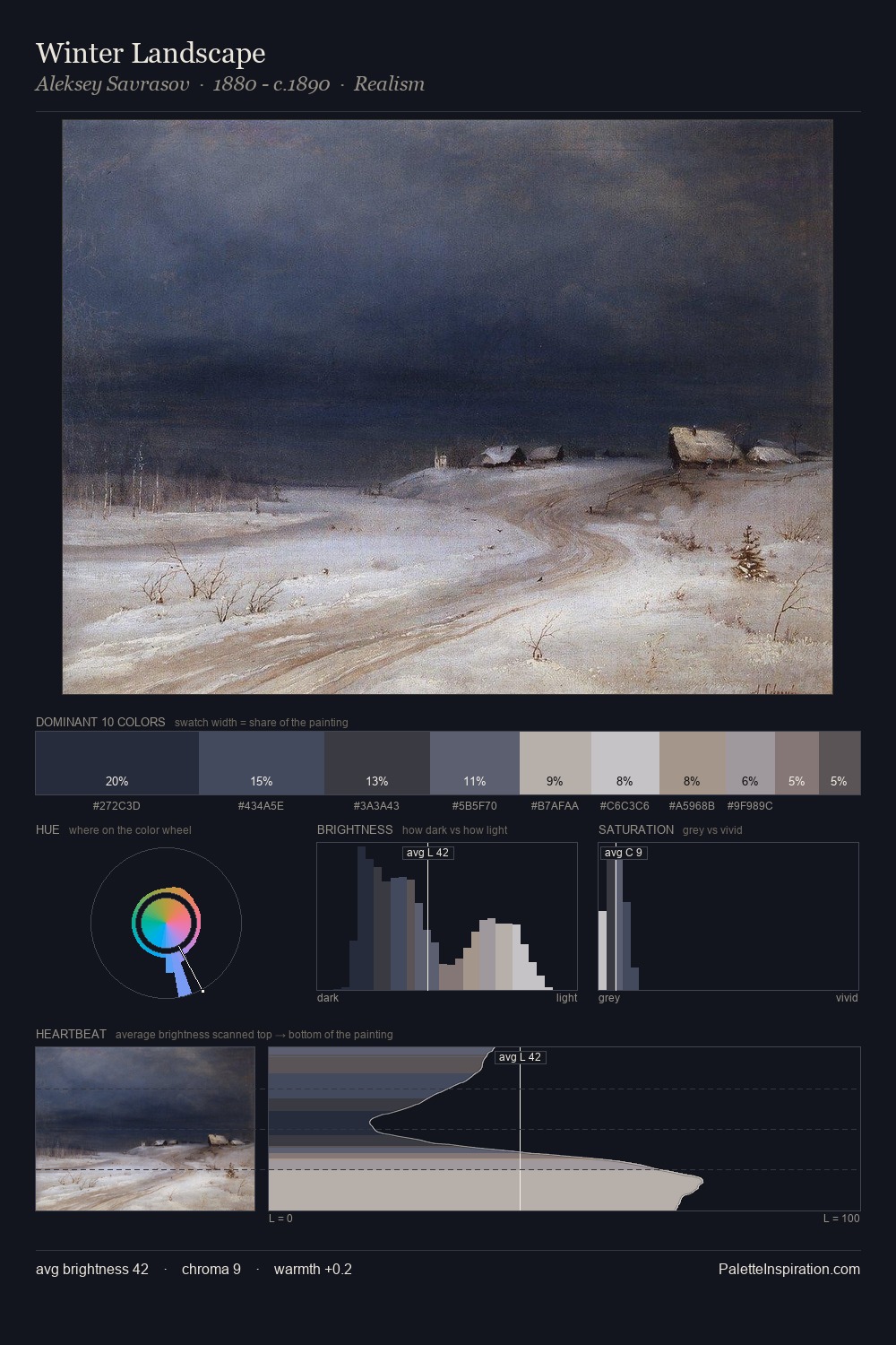
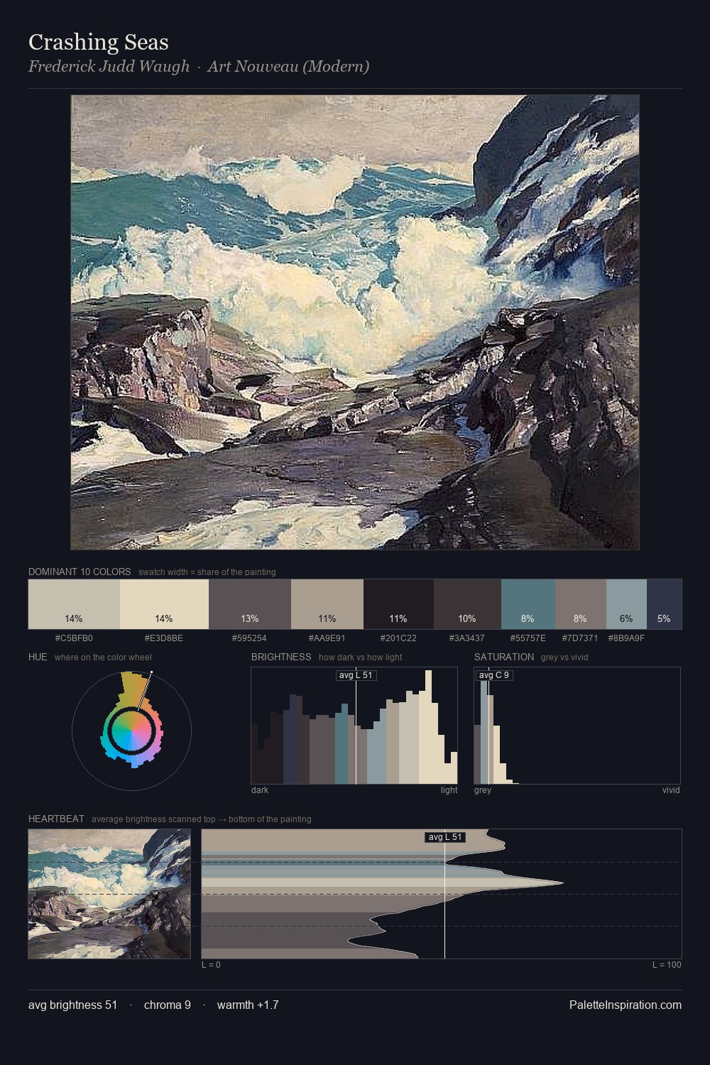
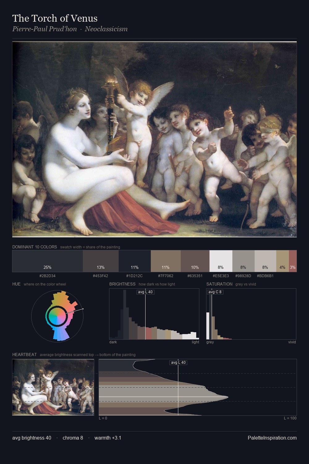
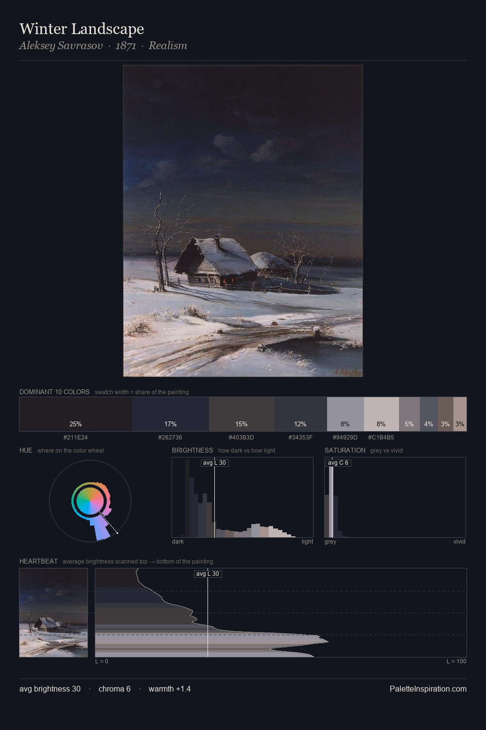
The value structure of Carl Hasenpflug is mid-key: quiet, controlled, and cohesive. Carl Hasenpflug builds on cool foundations: the palette favours the blue-cyan-green arc. Chroma is kept low across all colours, producing the soft, enveloping quality that characterises tonal painting. #273043 is not a small accent - at 26.1% it qualifies as a major presence and gives the palette its chromatic identity. A value spread of 55 units gives the palette both depth and air - shadows are genuinely dark, lights genuinely light. The mid-to-high key, cool bias, and moderate chroma point to outdoor observation - sky and diffused daylight as the dominant light source. Palette 2 sits within the larger chromatic argument that Carl Hasenpflug's complete body of work advances.
Example use cases
- luxury automotive
- premium electronics
- private banking
- B2B platforms
- developer tools
I Love This!
Copy, export, or download for your project