Carl Fredrik Hill Palette 1

Palette Analysis
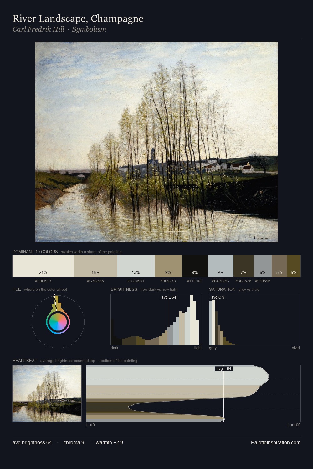
Values in Carl Fredrik Hill tilt decisively toward white, giving the palette its luminous character. A distinctly cool atmosphere runs through this palette: sky, water, and mist given colour form. Chroma hovers near zero; colour declares itself through subtle shifts in hue rather than outright saturation. The most saturated colour, #5A503C, is reserved to 6.4% of the surface, where it acts as a focal punctuation. A value spread of 74 units gives the palette both depth and air - shadows are genuinely dark, lights genuinely light. The palette has the character of outdoor light: cool, mid-bright, with colour rendered faithfully rather than expressively. Palette 1 sits within the larger chromatic argument that Carl Fredrik Hill's complete body of work advances.
Example use cases
- exhibition design
- foundation branding
- estate management
- art education
- museums & galleries
I Love This!
Copy, export, or download for your project