Carel Fabritius Palette 2

Palette Analysis
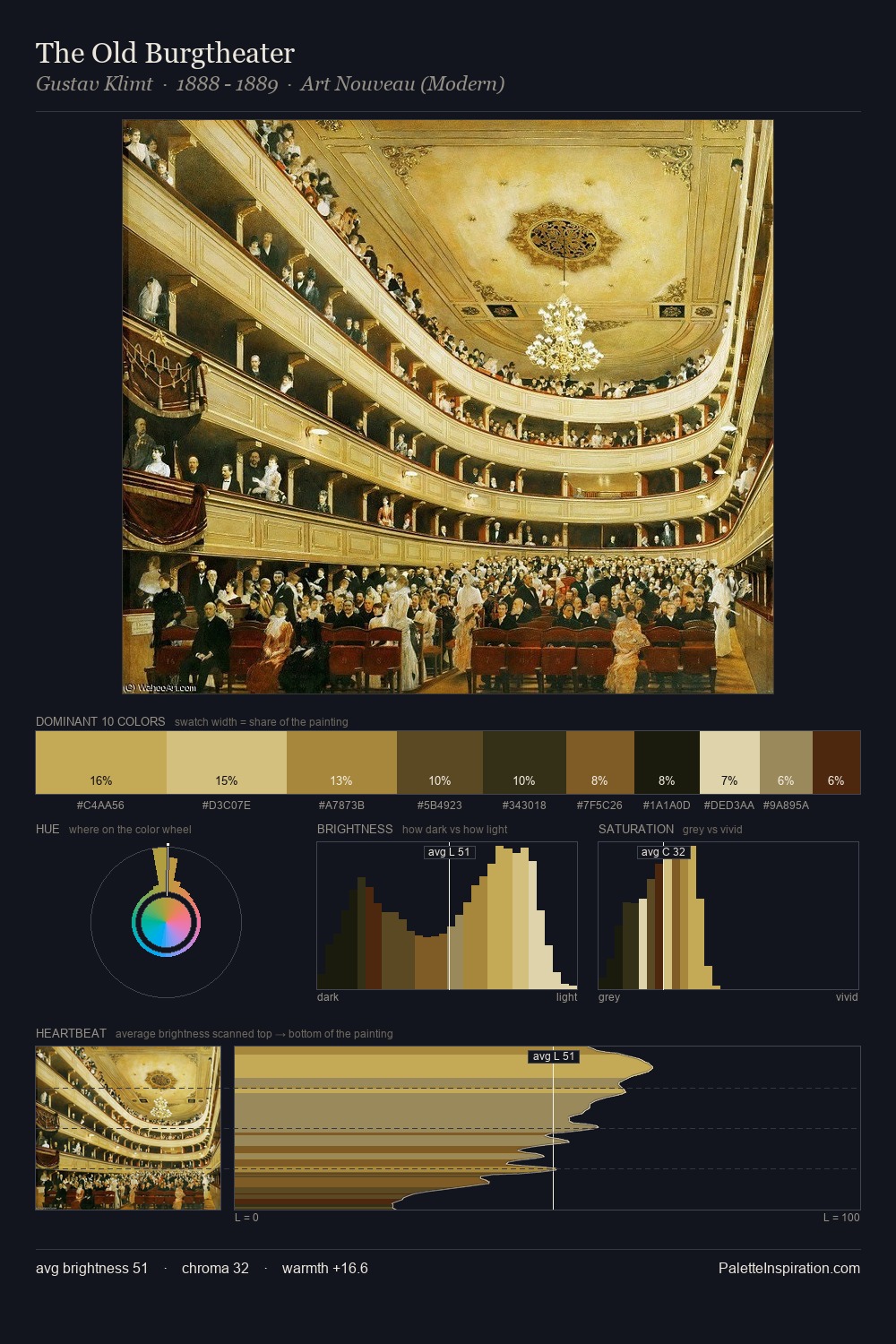
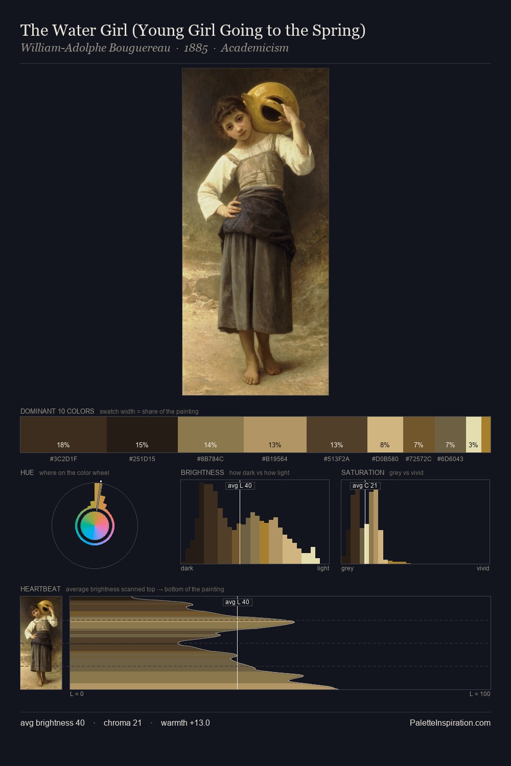
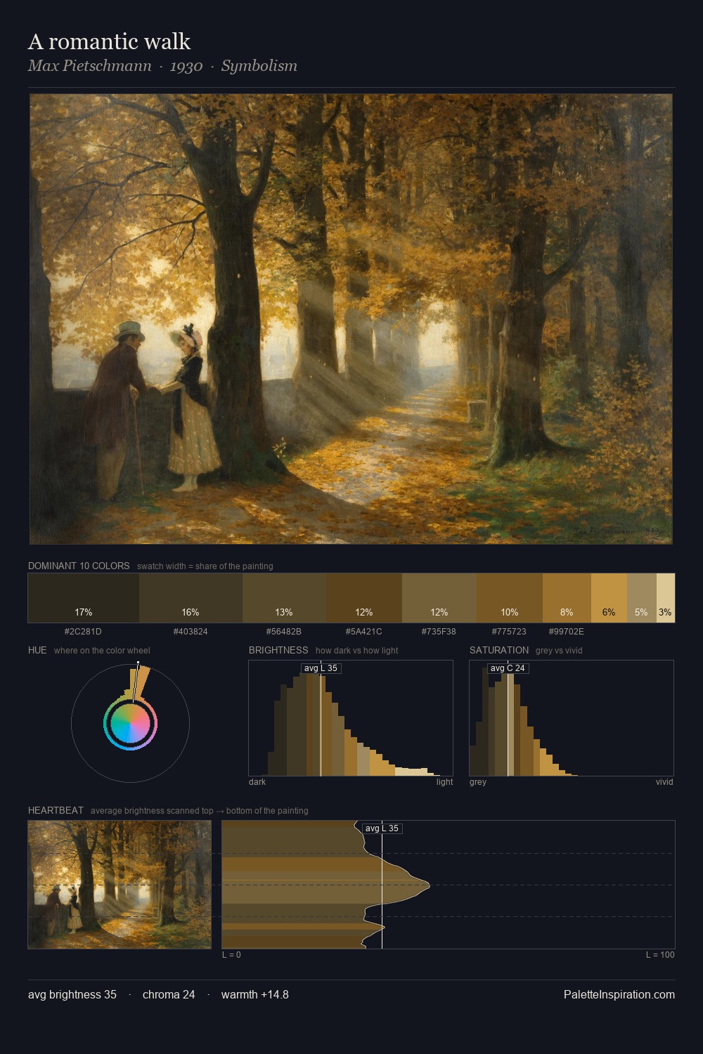
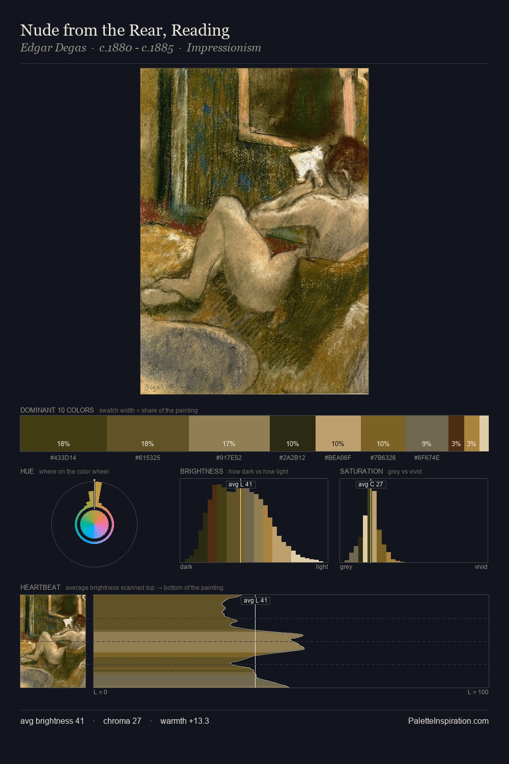
Carel Fabritius occupies the comfortable middle of the value scale, avoiding both extremes to hold the eye in a sustained middle grey. A distinctly cool atmosphere runs through this palette: sky, water, and mist given colour form. Saturation is deliberately withheld - the beauty here lies in the near-monochromatic gradations rather than colour difference. At 26.1%, #2B2416 functions less as a colour accent and more as a complete atmospheric environment. At 1.6%, #E7D9AD carries the palette's sharpest chromatic charge: an accent that earns its place precisely because it is withheld. 63 units of value range underpin the palette's structural clarity: the eye always knows where light falls. The palette has the character of outdoor light: cool, mid-bright, with colour rendered faithfully rather than expressively. Palette 2 sits within the larger chromatic argument that Carel Fabritius's complete body of work advances.
Example use cases
- theater design
- jewelry brands
- tobacco-adjacent retail
- event branding
- film & entertainment
I Love This!
Copy, export, or download for your project