Benvenuto Tisi Palette 6

Palette Analysis
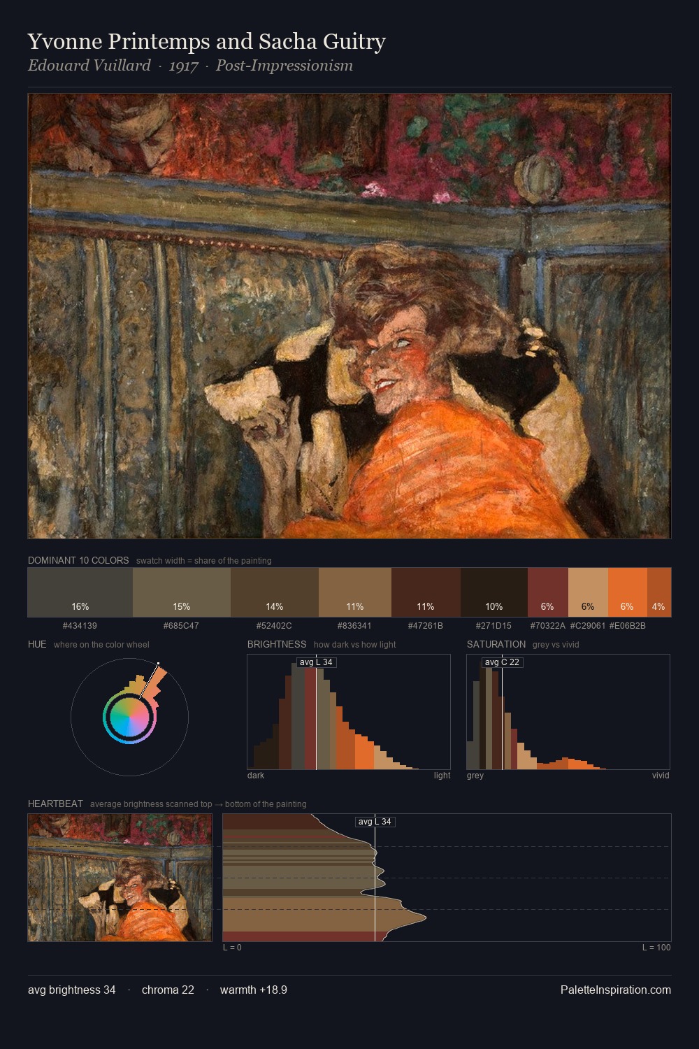
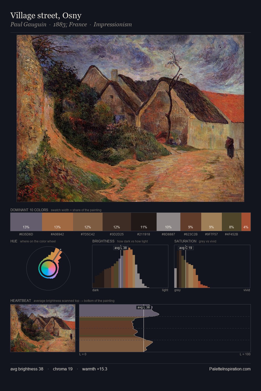
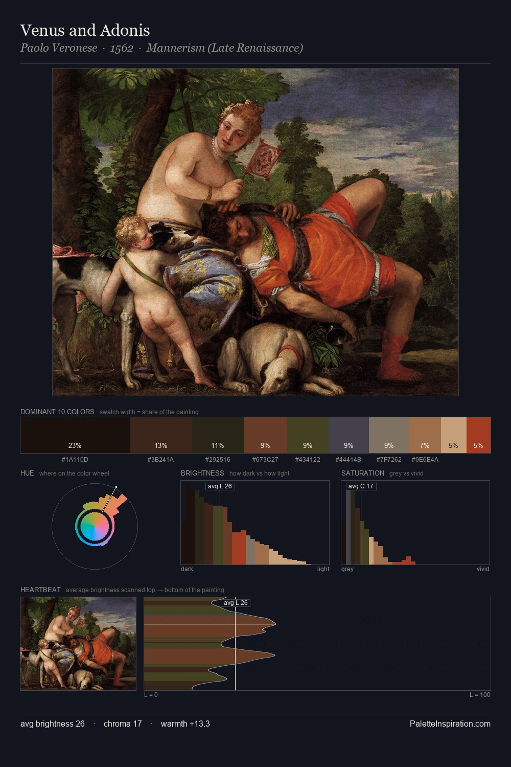
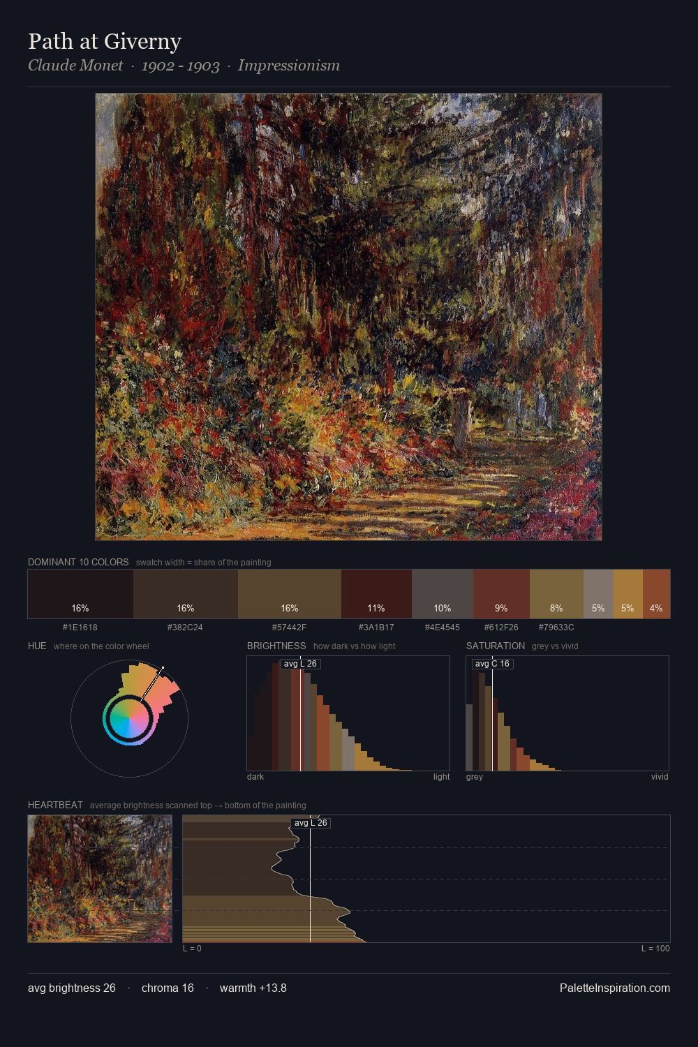
Benvenuto Tisi works almost entirely in the lower half of the value scale, privileging depth over brilliance. The dominant temperature is warm, with earth tones and fire-hues setting the emotional key. Saturation is deliberately withheld - the beauty here lies in the near-monochromatic gradations rather than colour difference. 33.0% of the palette belongs to #171412, a concentration that makes it the unmistakable visual centre. #A44935 delivers the chromatic peak at only 1.8% - a small shot of colour with outsized visual impact. 47 units of value spread create a palette that is varied but unified - contrast in the service of harmony. Together these qualities place Benvenuto Tisi firmly in the tonal tradition - concerned with mood and atmosphere rather than chromatic display. Benvenuto Tisi's palette 6 carries its own internal logic while remaining in conversation with the artist's broader colour intelligence.
Example use cases
- theater design
- jewelry brands
- tobacco-adjacent retail
- event branding
- film & entertainment
I Love This!
Copy, export, or download for your project