Rubens Color Scheme based on Roman Charity
Smoldering Laterite
Smoldering Suppressed heat in dark register - low-key with a warm undertone, ember-like.
Laterite Deep iron-red - the color of tropical laterite soil, oxidized and earthy.
Color Palette
✦ Edit in generatorColor Profile
light dark
0
100
15.1
vivid muted
0
100
19.3
warm cool
-30
0
+50
17.7
Distribution
avg L 15.1
darklight
avg C 19.3
grayvivid
Brightness Heartbeat
Average brightness scanned top → bottom of the painting.
avg L 15.1 L = 0 L = 100
Palette Analysis
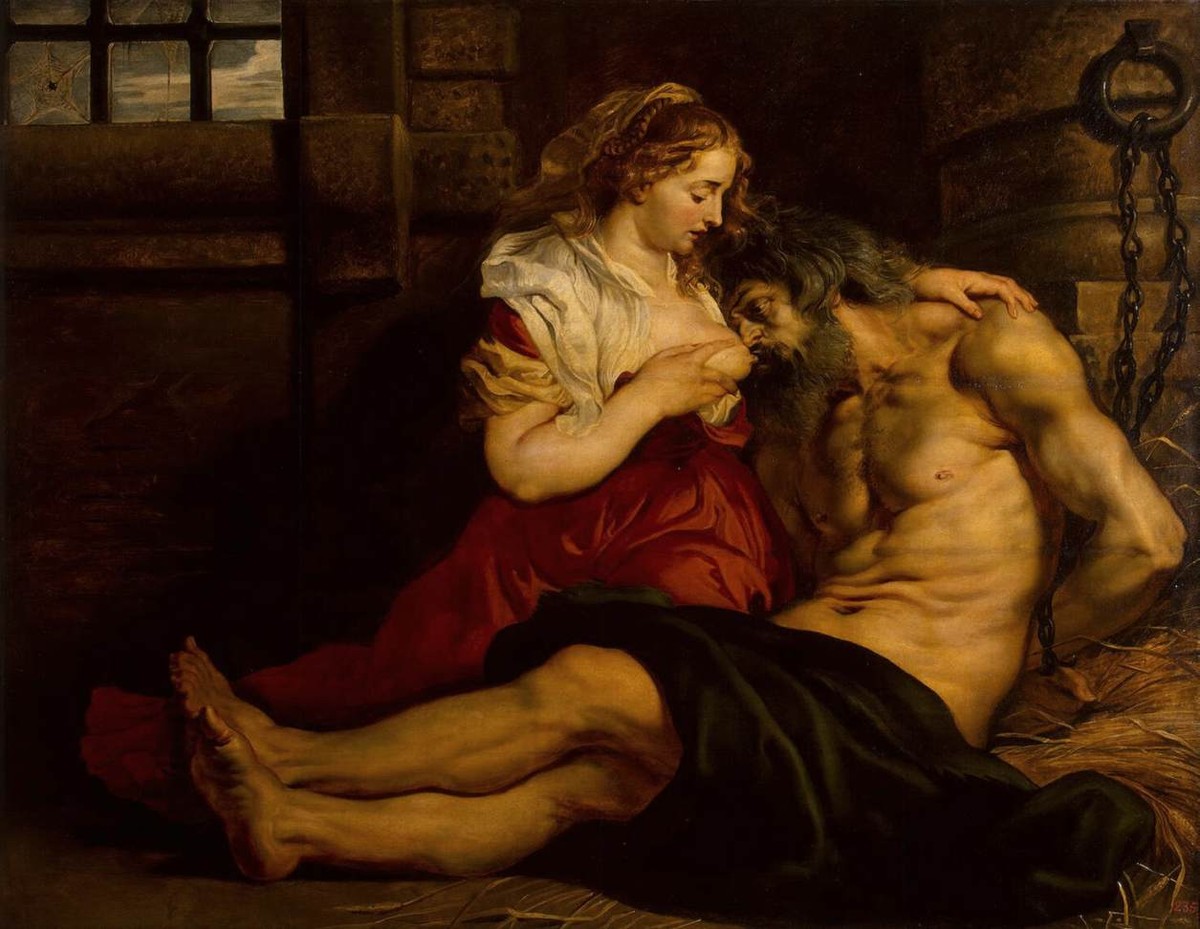
"Roman Charity" (1612) reads as a deep, vivid-saturation warm palette built around Amber and Red. One color carries 35% of the picture plane, anchoring the composition. A low-prevalence accent at #BD904F pulls the eye.
Example use cases
- theater design
- jewelry brands
- tobacco-adjacent retail
- event branding
- film & entertainment
Subject Tags
Build a palette inspired by Roman Charity
Open in generator with 10 colors pre-loaded
I Love This!
Use This Palette
Copy, export, or download for your project
Copy, export, or download for your project
Copy:
Download:
Share:
Artworks with a similar color profile
Nearest neighbours by brightness, saturation, warmth and hue across the full corpus.
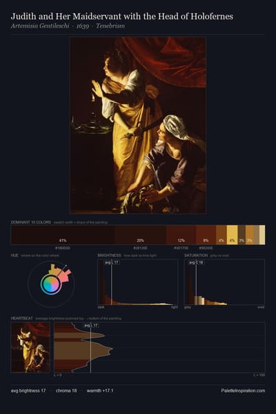
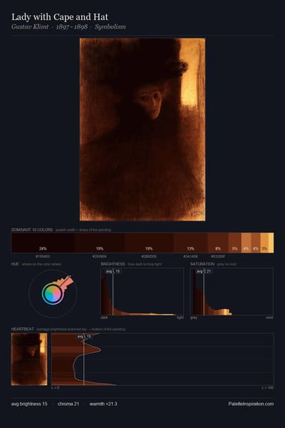
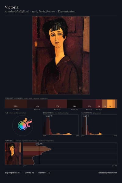
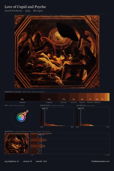
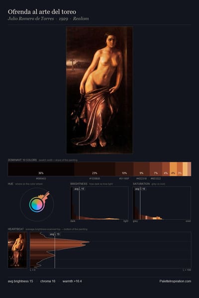
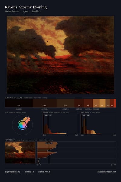
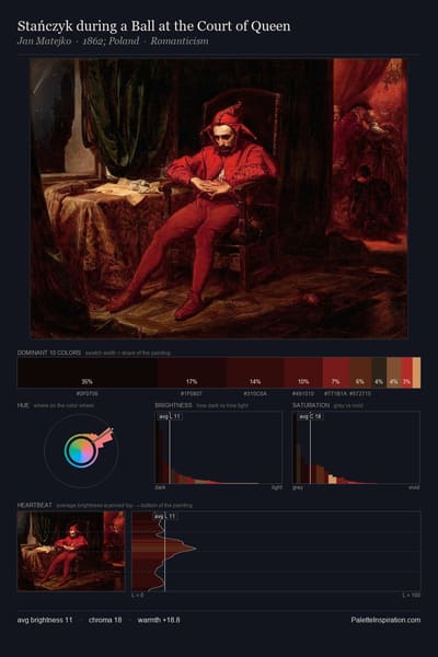
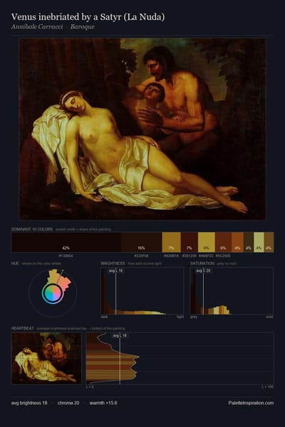
More by Peter Paul Rubens
More from Baroque