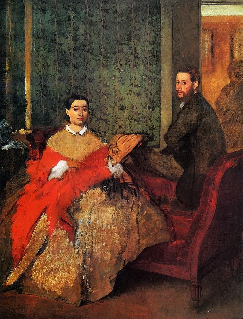
Degas Color Scheme based on Edmondo and Therese Morbilli
Dusky Stone
Dusky Twilight register - warm mid-darks, the palette of dusk and fading light.
Stone Neutral warm gray - the color of uncut limestone or granite, balanced and earthy.
Color Palette
✦ Edit in generatorColor Profile
light dark
0
100
29.4
vivid muted
0
100
22.7
warm cool
-30
0
+50
20.0
Distribution
avg L 29.4
darklight
avg C 22.7
grayvivid
Brightness Heartbeat
Average brightness scanned top → bottom of the painting.
avg L 29.4 L = 0 L = 100
Palette Analysis
"Edmondo and Therese Morbilli" (1865) reads as a deep, mid-saturation warm palette built around Amber and Cream. The body of the palette stays restrained while smaller hits of color do the work. A low-prevalence accent at #CC311A pulls the eye.
Example use cases
- music labels
- luxury hospitality
- editorial photography
- leather goods
- premium streaming
Subject Tags
Build a palette inspired by Edmondo and Therese Morbilli
Open in generator with 10 colors pre-loaded
I Love This!
Use This Palette
Copy, export, or download for your project
Copy, export, or download for your project
Copy:
Download:
Share:
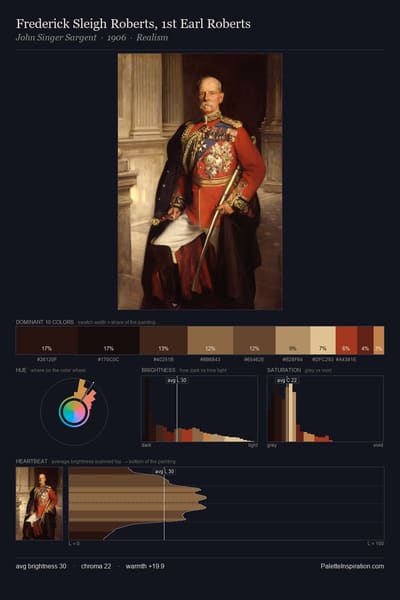
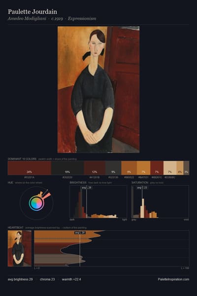
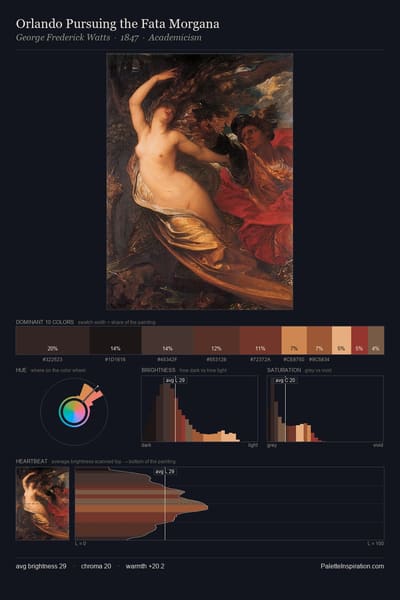
Artworks with a similar color profile
Nearest neighbours by brightness, saturation, warmth and hue across the full corpus.
More by Edgar Degas
More from Impressionism