Anthonie Jacobus van Wijngaerdt Palette 2

Palette Analysis
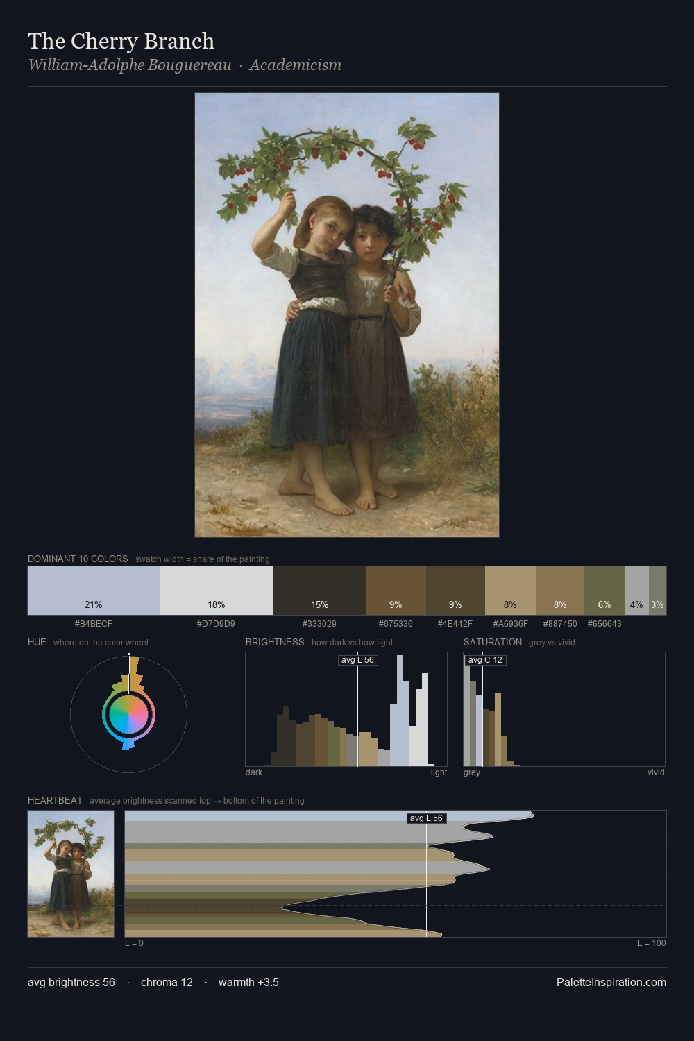
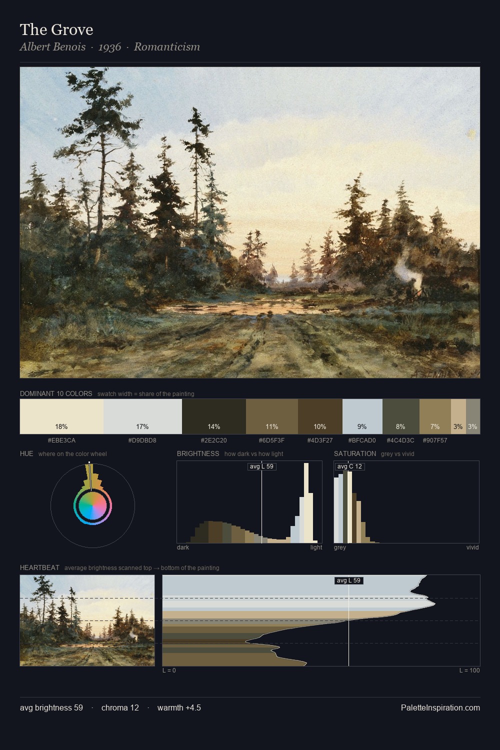
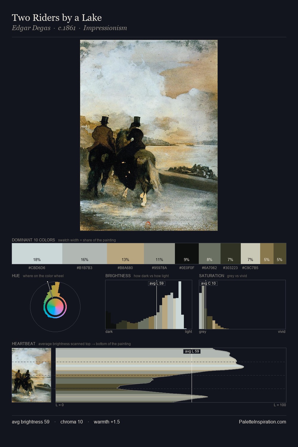
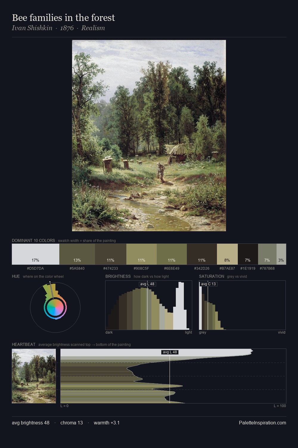
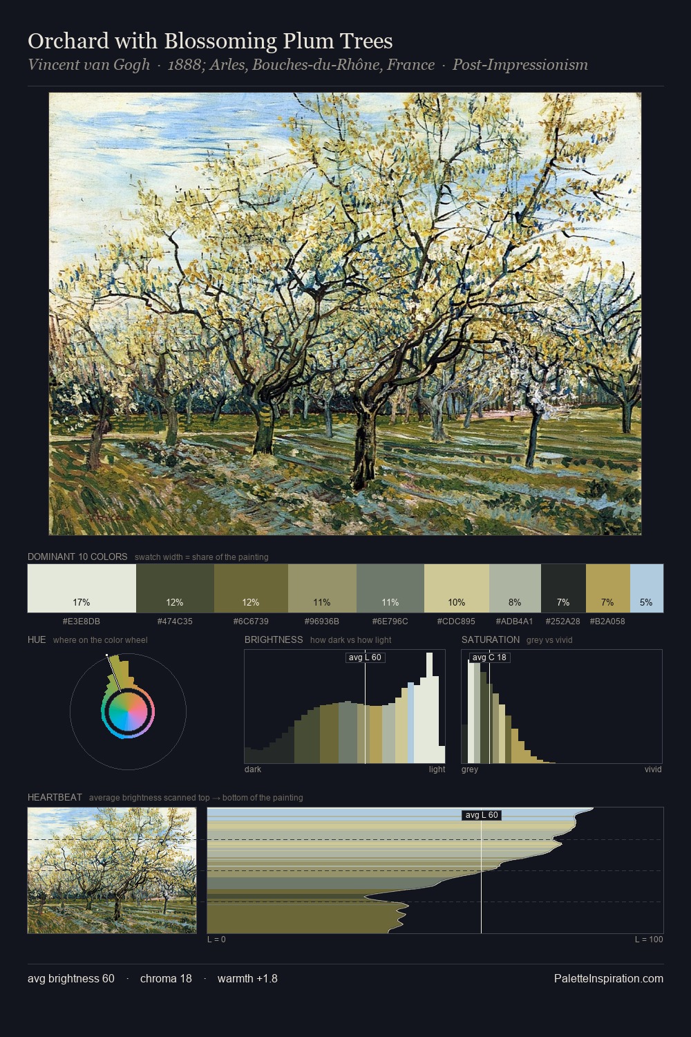
The high-key values of Anthonie Jacobus van Wijngaerdt give it an effulgent, almost bleached quality. Cool tones set the register here - the blues and greens easily outweigh any warm accents. The absence of saturated colour is itself an expressive choice: this is a palette of restraint and atmosphere. At 8.8%, #6A5D3C carries the palette's sharpest chromatic charge: an accent that earns its place precisely because it is withheld. A value spread of 62 units gives the palette both depth and air - shadows are genuinely dark, lights genuinely light. The palette has the character of outdoor light: cool, mid-bright, with colour rendered faithfully rather than expressively. Palette 2 sits within the larger chromatic argument that Anthonie Jacobus van Wijngaerdt's complete body of work advances.
Example use cases
- archival print
- university identity
- rare books
- cultural institutions
- nonprofit identity
I Love This!
Copy, export, or download for your project
Related Palettes

Thorsten Waenerberg Master Palette
Soft Vellum

Thorsten Waenerberg Palette 1
Soft Vellum

Anthonie Jacobus van Wijngaerdt Palette 1
Soft Sage

Anthonie Jacobus van Wijngaerdt Palette 3
Veiled Fawn

Anthonie Jacobus van Wijngaerdt Palette 4
Veiled Vellum

Anthonie Jacobus van Wijngaerdt Palette 5
Veiled Tawny