Anita Malfatti Palette 2
Muted Gamboge
Muted Deliberately desaturated - chroma pulled toward gray, the restraint of tonal painting.
Gamboge Deep golden yellow - a traditional warm pigment, rich amber-gold.

Palette Analysis
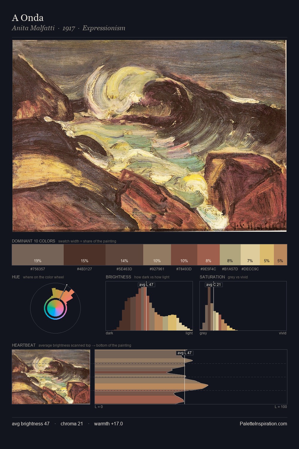
Anita Malfatti occupies the comfortable middle of the value scale, avoiding both extremes to hold the eye in a sustained middle grey. Yellow, ochre, sienna: warm hues that Anita Malfatti deploys as the palette's primary energy. All colours lean toward grey, building depth through value rather than colour punch. #DBB35A delivers the chromatic peak at only 3.6% - a small shot of colour with outsized visual impact. The value range of 45 units sits in the comfortable middle: enough depth, enough light, neither extreme. Palette 2 sits within the larger chromatic argument that Anita Malfatti's complete body of work advances.
Example use cases
- ceramics & pottery
- boutique hospitality
- menswear
- heritage food brands
- craft & artisan brands
I Love This!
Use This Palette
Copy, export, or download for your project
Copy, export, or download for your project
Copy:
Download:
Share: