Andrei Ryabushkin Palette 7

Palette Analysis
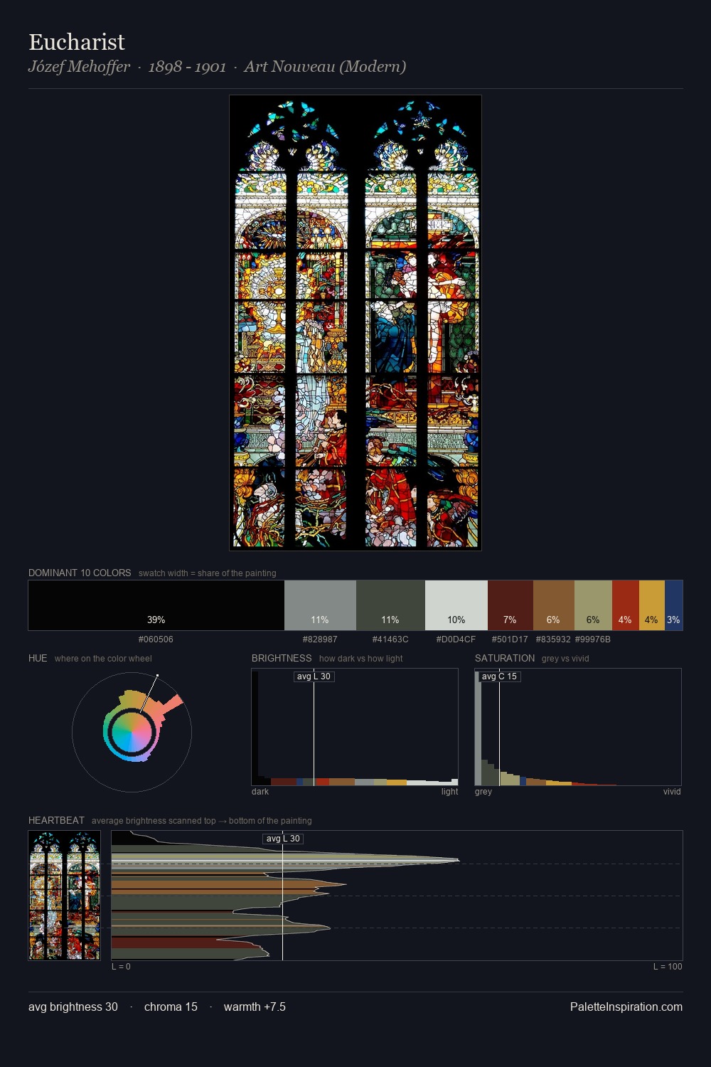
Andrei Ryabushkin sits in the centre of the value range, lending the palette a sense of even, sustained light. Cool tones set the register here - the blues and greens easily outweigh any warm accents. All colours lean toward grey, building depth through value rather than colour punch. #41291F delivers the chromatic peak at only 11.1% - a small shot of colour with outsized visual impact. At 66 units of value range, the palette has the tonal breadth to sustain complex spatial readings. The mid-to-high key, cool bias, and moderate chroma point to outdoor observation - sky and diffused daylight as the dominant light source. Andrei Ryabushkin's palette 7 carries its own internal logic while remaining in conversation with the artist's broader colour intelligence.
Example use cases
- exhibition design
- foundation branding
- estate management
- art education
- museums & galleries
I Love This!
Copy, export, or download for your project