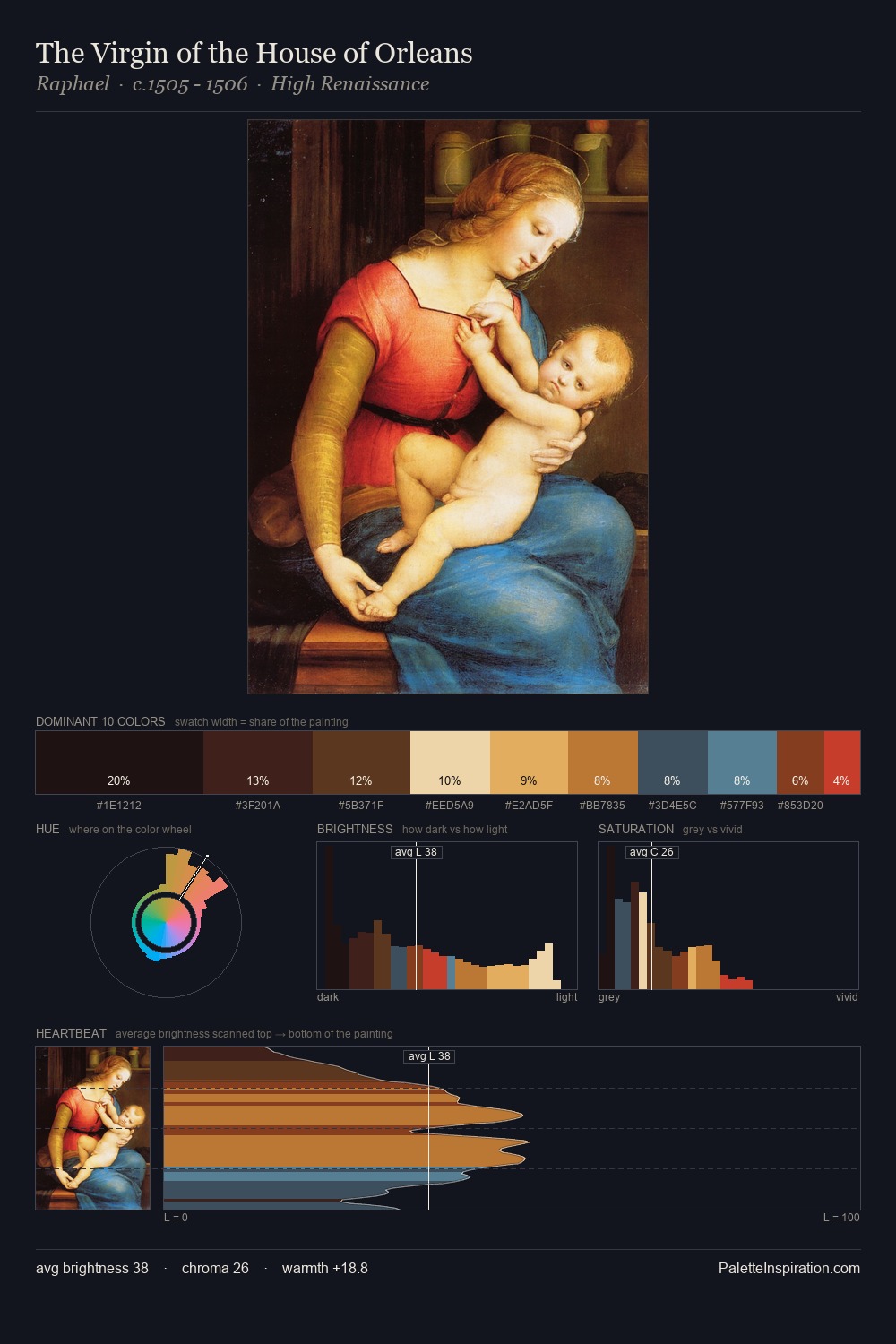
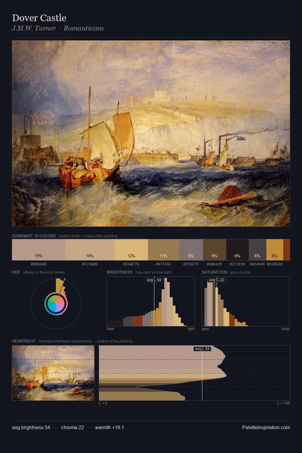
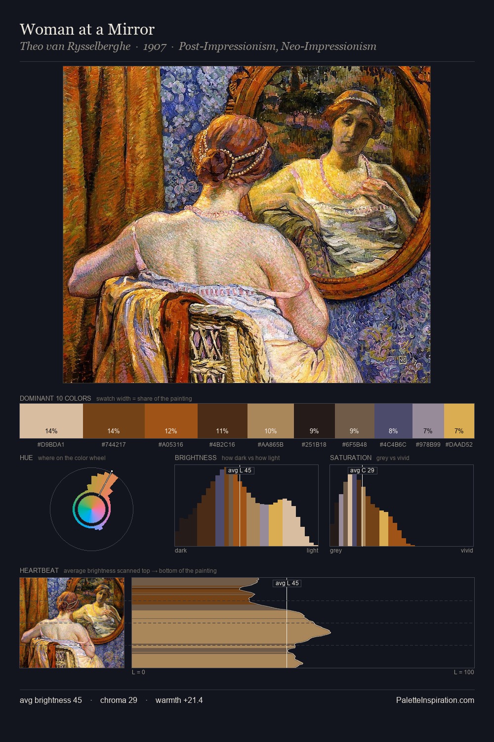
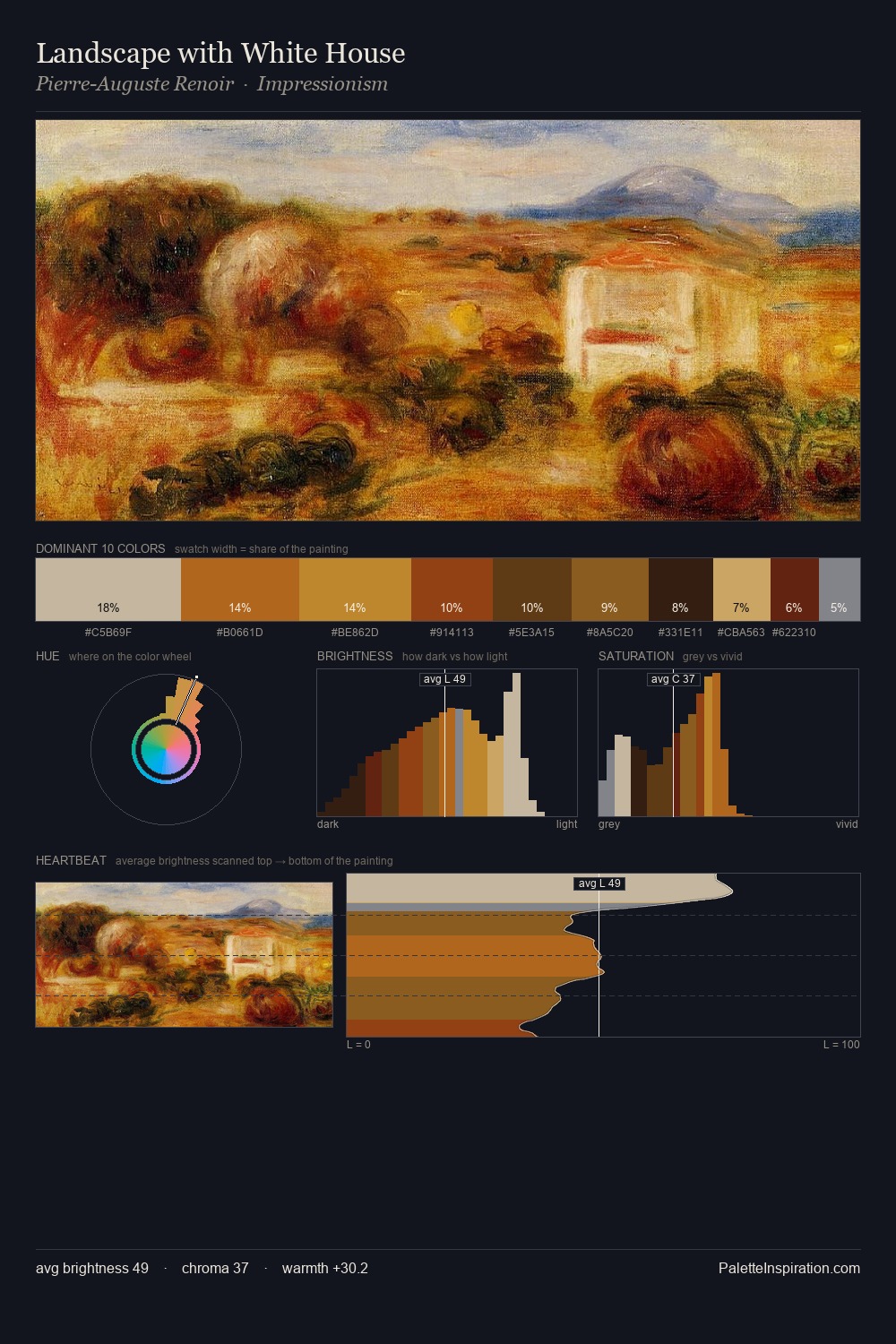
Andrea del Verrocchio Palette 3

Palette Analysis
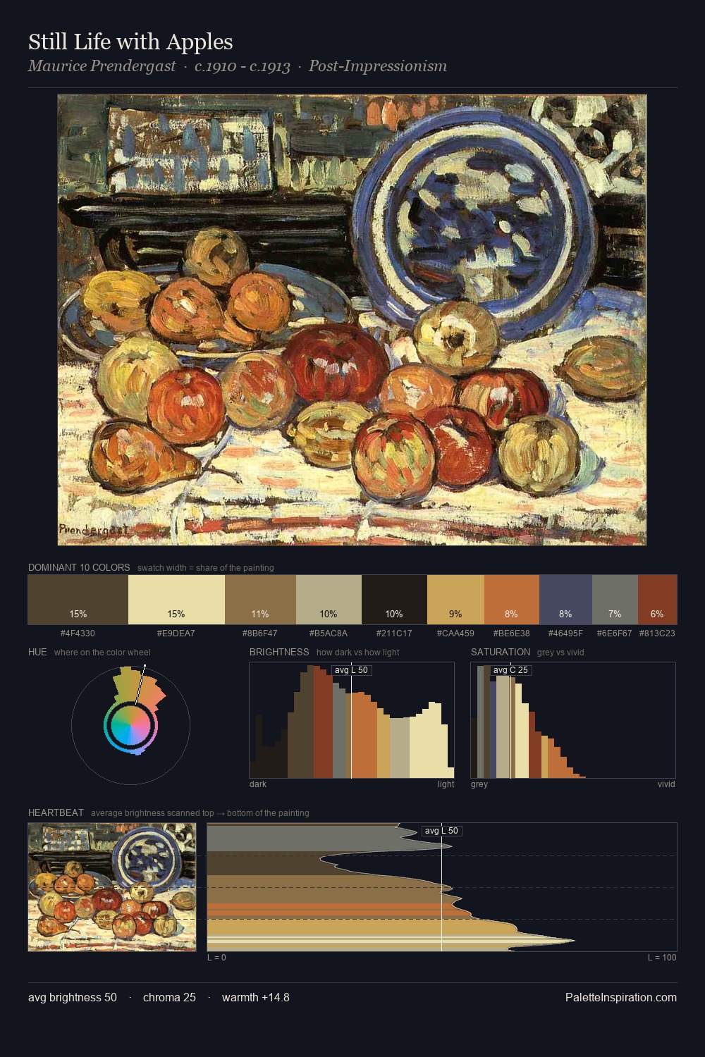
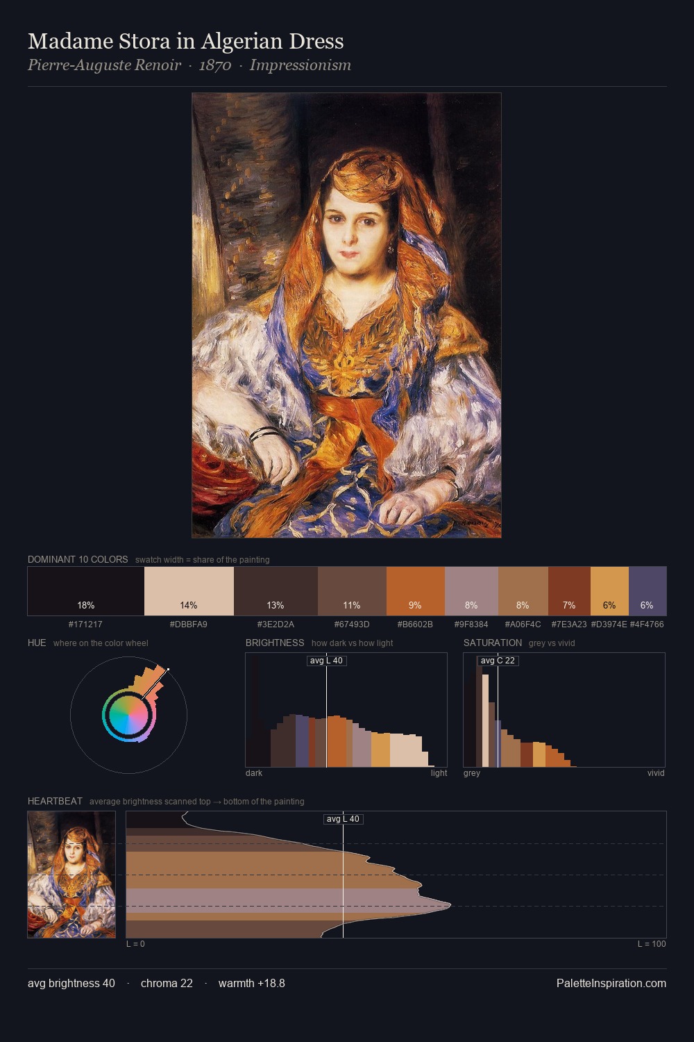
Andrea del Verrocchio distributes its values across the middle register, creating harmony without high contrast. Andrea del Verrocchio keeps warm and cool in parity, a balance that lends the work a perceptual shimmer. Chroma is held at a comfortable level - distinct colours, but no single hue is allowed to overwhelm. The most saturated colour, #80270F, is reserved to 4.6% of the surface, where it acts as a focal punctuation. 59 units of value range underpin the palette's structural clarity: the eye always knows where light falls. The palette reads as an Impressionist one - light-biased, chromatically direct, and built on temperature contrast rather than value opposition. In the context of Andrea del Verrocchio's full range of palettes, group 3 represents one movement in an ongoing chromatic dialogue.
Example use cases
- art galleries
- creative studios
- consumer goods
- lifestyle media
- professional services
I Love This!
Copy, export, or download for your project