Anders Zorn Palette 1

Palette Analysis
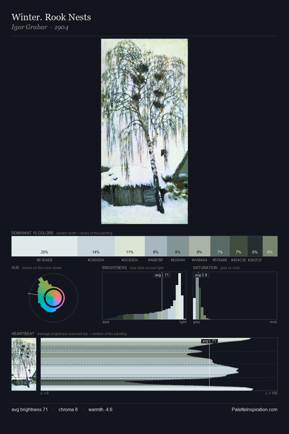
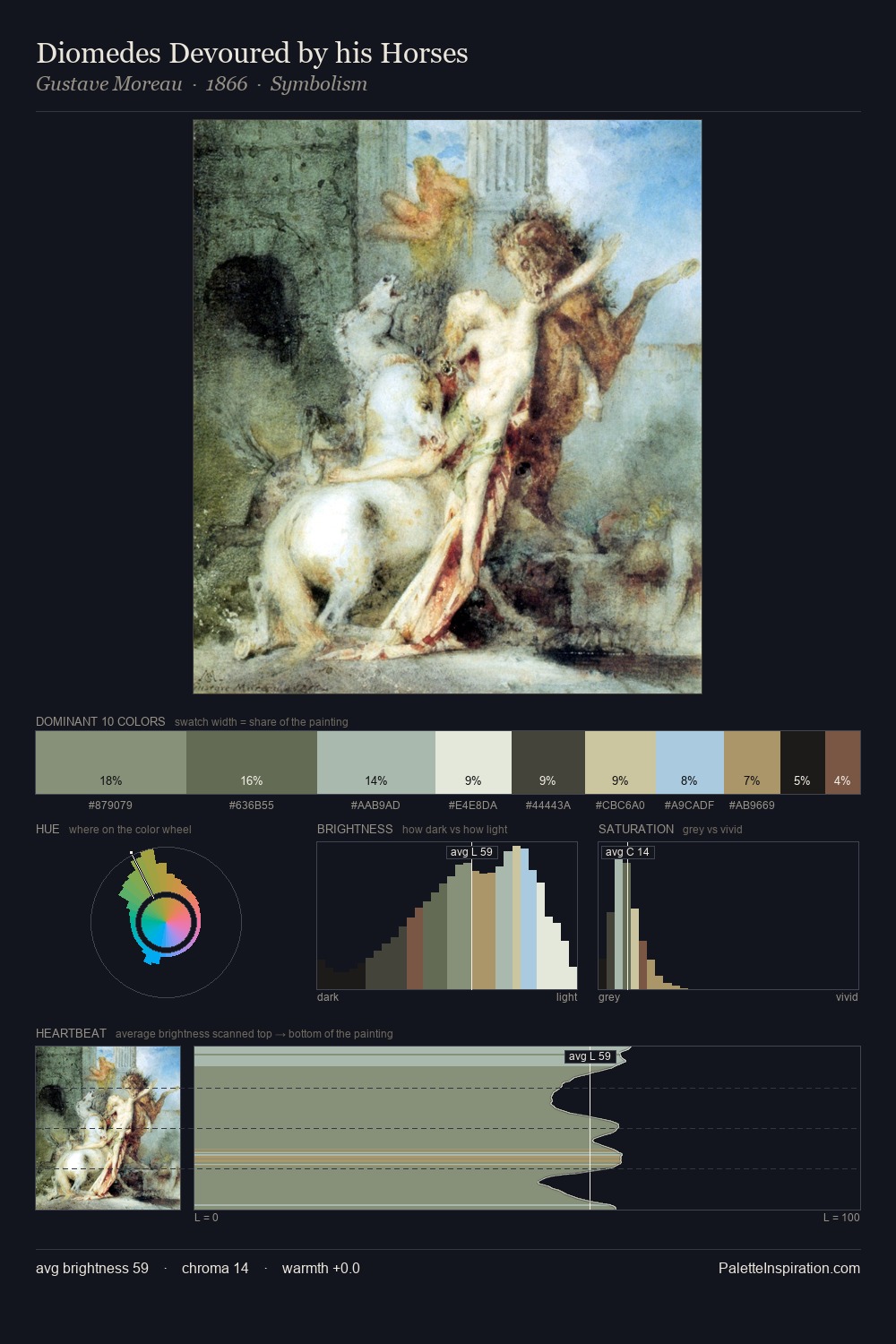
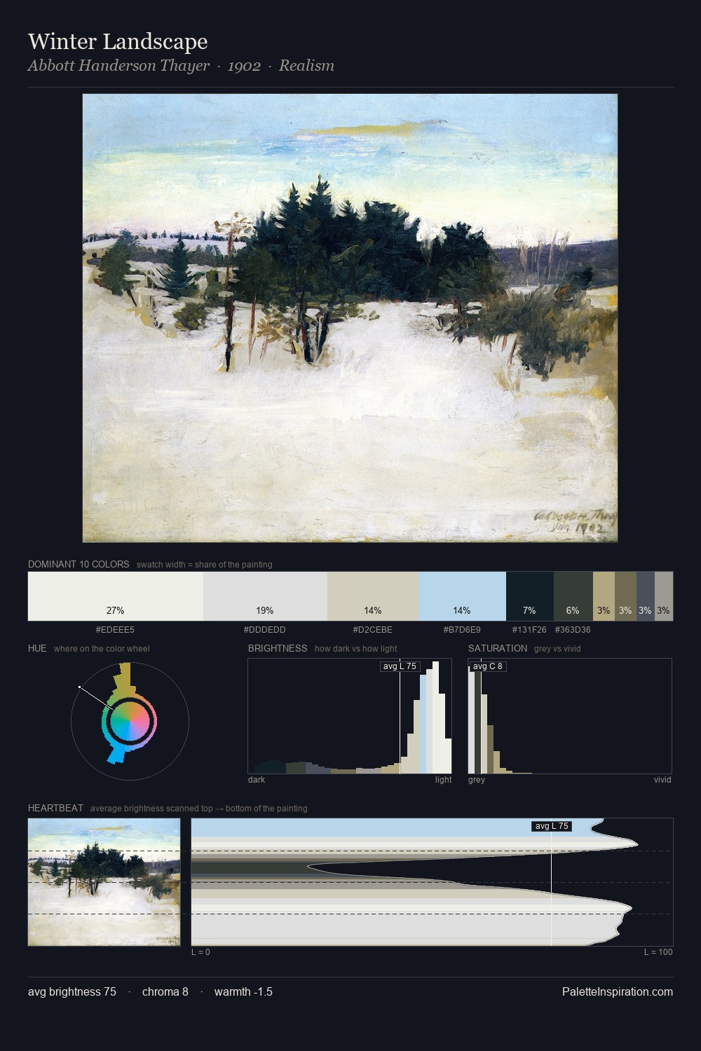
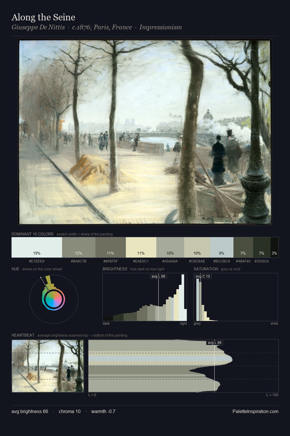
Values in Anders Zorn tilt decisively toward white, giving the palette its luminous character. Anders Zorn builds on cool foundations: the palette favours the blue-cyan-green arc. Chroma hovers near zero; colour declares itself through subtle shifts in hue rather than outright saturation. At 4.5%, #161B23 carries the palette's sharpest chromatic charge: an accent that earns its place precisely because it is withheld. A value spread of 72 units gives the palette both depth and air - shadows are genuinely dark, lights genuinely light. High luminosity and cool temperature suggest the plein-air condition: unfiltered daylight and open sky. In the context of Anders Zorn's full range of palettes, group 1 represents one movement in an ongoing chromatic dialogue.
Example use cases
- publishing
- product photography
- design studios
- luxury retail
- museum collateral
I Love This!
Copy, export, or download for your project